Sherwin Williams Agreeable Gray – A Timeless Neutral
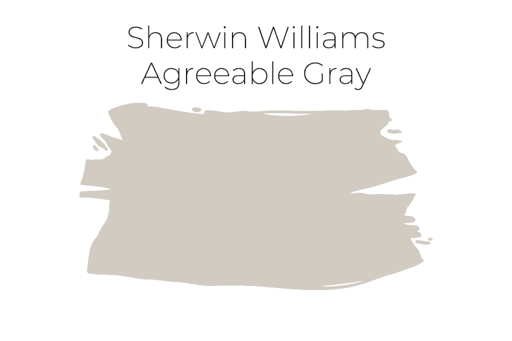
Today’s paint color spotlight is a top neutral paint color, Sherwin Williams Agreeable Gray SW7029. It’s one of the most recommended and used paint colors today and has been for years.
Read on to find out all the specs, compare it to other colors, and see it in some real homes.
This post contains affiliate links for your convenience. I may make a small commission on products purchased with my link, but your price does not change. For full disclosure go here: Disclosure and Policies. Thank you for supporting my site.
Sherwin Williams Agreeable Gray SW7029 Review & Color Palettes
Agreeable Gray is one of the classic colors that almost everyone loves. It’s one of the top 50 colors from Sherwin Williams and has been for years and works with so many different colors and decorating styles.
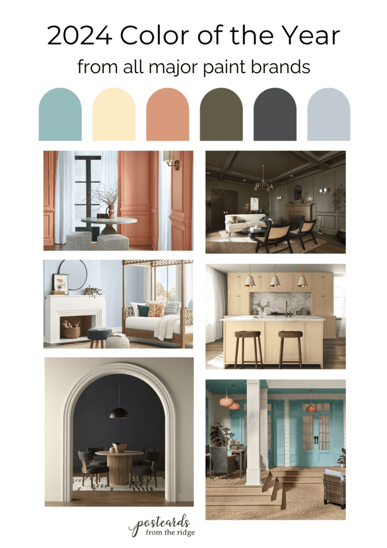
FYI: The 2024 Sherwin Williams color trends have just been released and you can see them all here: 2024 Sherwin Williams Colors
Why is Agreeable Gray so popular?
Agreeable Gray is extremely popular because it’s light, neutral, has just a touch of color, and goes with almost everything! It’s specified by designers, architects, and builders because of how versatile and easy it is to live with it is.
Some say it’s the perfect greige with it’s balance of gray and beige.
All About Agreeable Gray
What are the undertones of Agreeable Gray?
Agreeable Gray is a classic neutral paint color with slightly warm undertones. It’s what’s called a “greige” or a color that’s in between gray and beige.
In certain lighting situations it looks warmer so it’s crucial that you test the color in the space you’re painting.
Agreeable Gray LRV
All paint colors have a number that indicates how much light it reflects, or basically how light or dark it will appear. This number is called light reflective value, or LRV.
A low LRV number means that the color doesn’t reflect much light and is dark. Higher LRV numbers are found on light colors that reflect a higher percentage of light.
On the scale that ranges from 0 to 100, the LRV for Agreeable Gray is 60.

Is Agreeable Gray still popular?
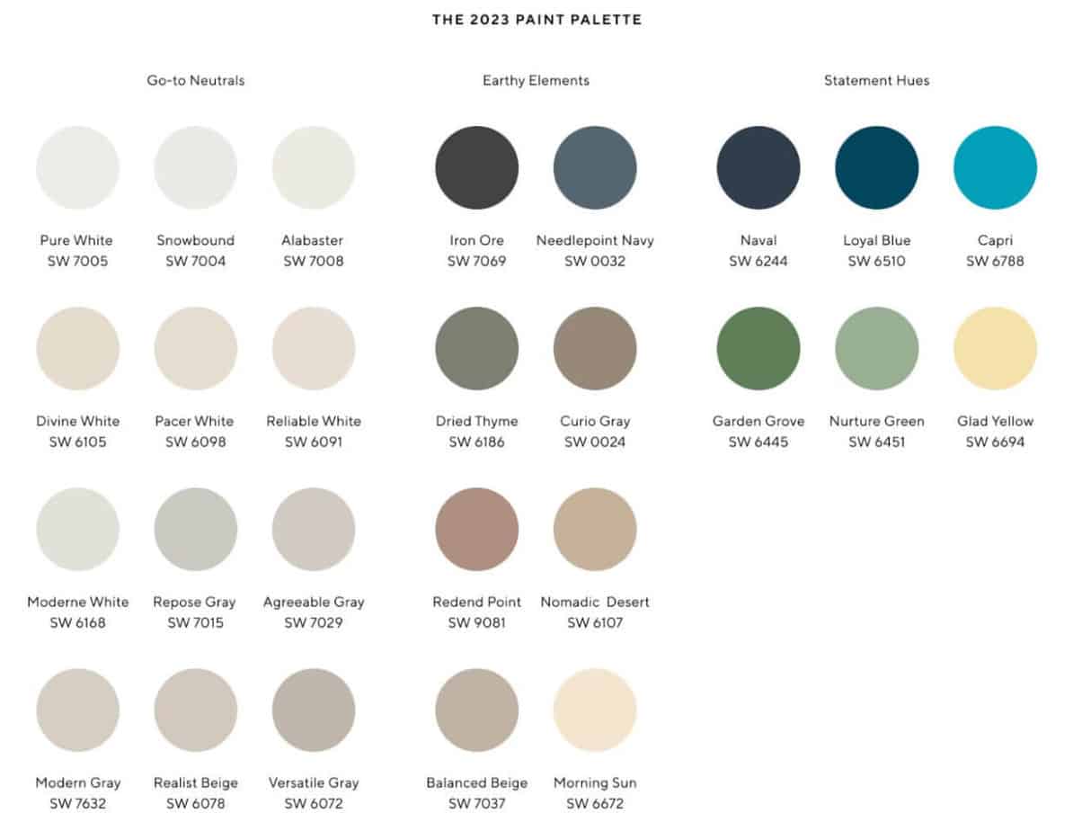
Yes! Year after year Agreeable Gray is in the top 50 most popular colors from Sherwin Williams and this trend doesn’t seem to be changing. It’s also part of the Spring 2023 Palette of Paint Colors from Pottery Barn.
Where to use Agreeable Gray
Since it’s such a light and neutral color you can use Agreeable Gray in any room. Keep in mind that colors will look different depending on the lighting in the room and the colors that are next to them.
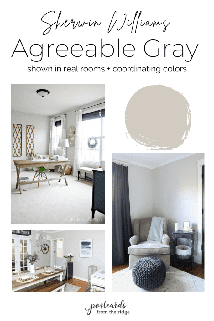
Let’s tour some rooms that are painted with Agreeable Gray to get an idea of how it looks on the walls.
Rooms painted with Sherwin Williams Agreeable Gray
Agreeable Gray is one of the most popular neutral paint colors today. It's a timeless color that can be used almost anywhere. It's one of Sherwin Williams' top 50 colors and is still popular after being on the list for years. Let's look at it in some real life rooms and get an idea of how it might look in your home.
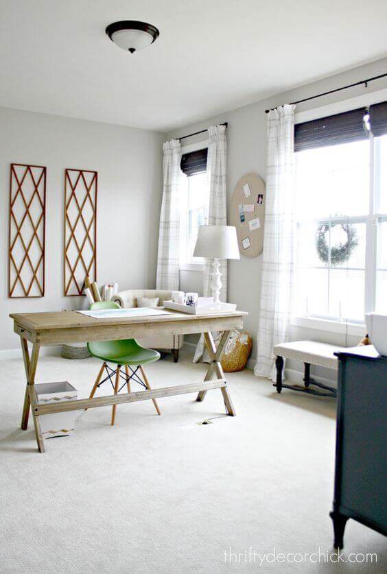
This home office with Agreeable Gray walls is classy and beautiful. Any color of decor, rugs, art and more will work beautifully in here.
A family room painted with Agreeable Gray makes it easy to decorate with a variety of colors. It's a top 50 color for good reason.
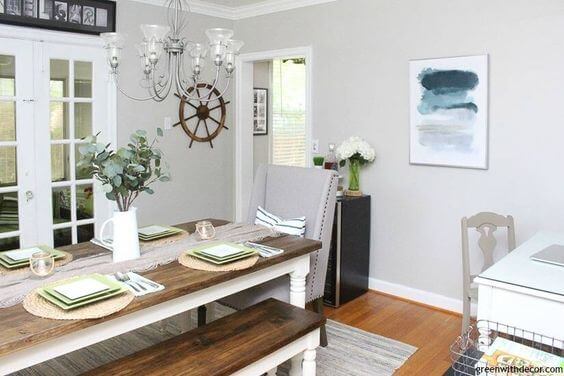
If you're looking for a great neutral for your dining room, look no further than Agreeable Gray. This dining room is soothing and timeless and can be decorated with any color.
Painting a guest bedroom with Agreeable Gray will allow you to change out your decor depending on the season. You can use any color accents in here including holiday reds and greens.
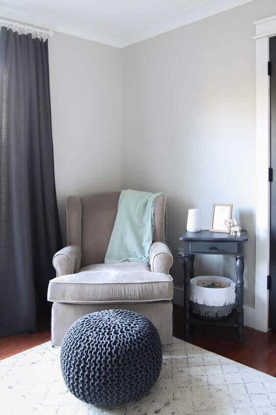
This sweet nursery painted with Agreeable Gray could work for a boy or girl. And when they get older you won't have to repaint the walls to match their evolving style.
How does Agreeable Gray compare to other popular greiges?
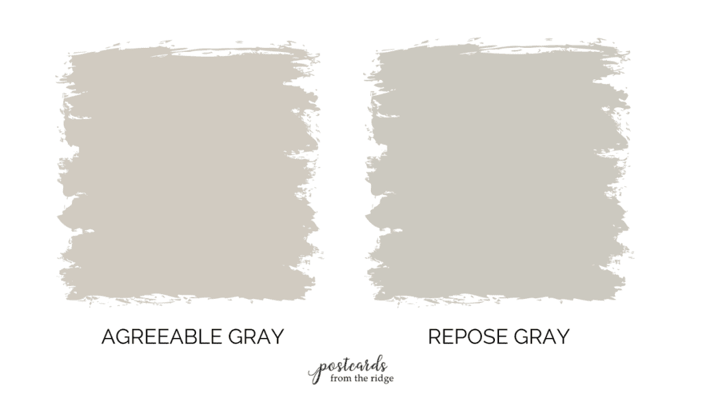
Let’s take a look at how Agreeable Gray looks when next to other top greige paint colors.
Agreeable Gray vs. Repose Gray
- Cooler or Warmer: Repose Gray is slightly cooler and grayer than Agreeable Gray
- Undertones: It has a tiny bit more blue and green undertones than Agreeable Gray
- Lighter or Darker: With a light reflective value of 58 compared to 60 for Agreeable Gray, Repose Gray is slightly darker.
- Both colors are in the top 50 most popular paint colors from Sherwin Williams and would be perfect in any room.
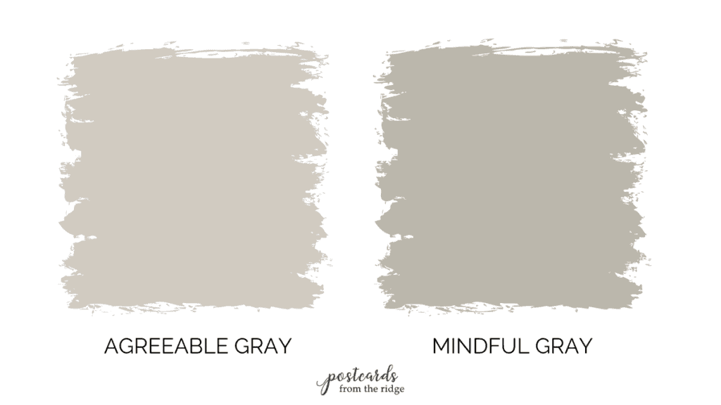
Agreeable Gray vs. Mindful Gray
- Cooler or Warmer: Mindful Gray is somewhat cooler and grayer than Agreeable Gray
- Undertones: It has a tiny bit more blue and green undertones than Agreeable Gray
- Lighter or Darker: With a light reflective value of 47 compared to 60 for Agreeable Gray, Mindful Gray is noticeably darker. It’s one shade darker than Repose Gray.
- It’s also one of the top 50 most popular paint colors from Sherwin Williams and would be perfect in any room.
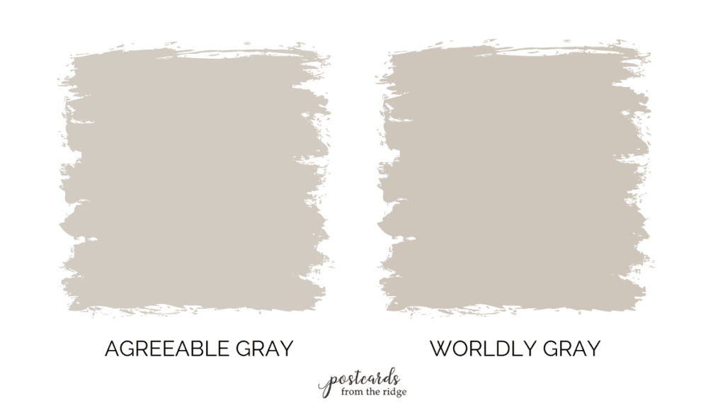
Agreeable Gray vs. Worldly Gray
- Cooler or Warmer: Worldly Gray is slightly warmer than Agreeable Gray
- Undertones: It has a tiny bit more red undertones than Agreeable Gray
- Lighter or Darker: With a light reflective value of 57 compared to 60 for Agreeable Gray, Worldly Gray is very slightly darker.
- Both colors are in the top 50 most popular paint colors from Sherwin Williams and would be perfect in any room.
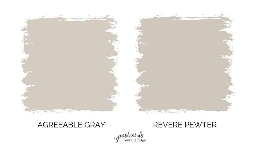
Agreeable Gray vs. Revere Pewter
- Cooler or Warmer: Revere Pewter is slightly cooler and grayer than Agreeable Gray
- Undertones: It has a tiny bit more violet and green undertones than Agreeable Gray
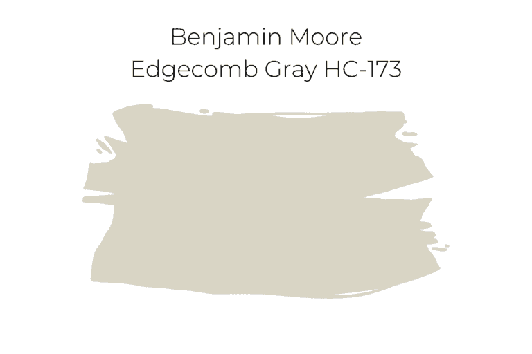
- Lighter or Darker: With a light reflective value of 5.058 compared to 60 for Agreeable Gray, Revere Pewter is slightly lighter.
- Both colors have enough depth that they contrast nicely against whites and slightly off whites for trim.
- It’s one of the most popular neutral paint colors from Benjamin Moore and it’s very similar to but not quite as warm Agreeable Gray.
Lighter shades of Agreeable Gray
Using lighter and shades will give you a cohesive monochromatic color scheme. These are the lighter versions of Agreeable Gray:
- High Reflective White
- Snowbound
- Incredible White

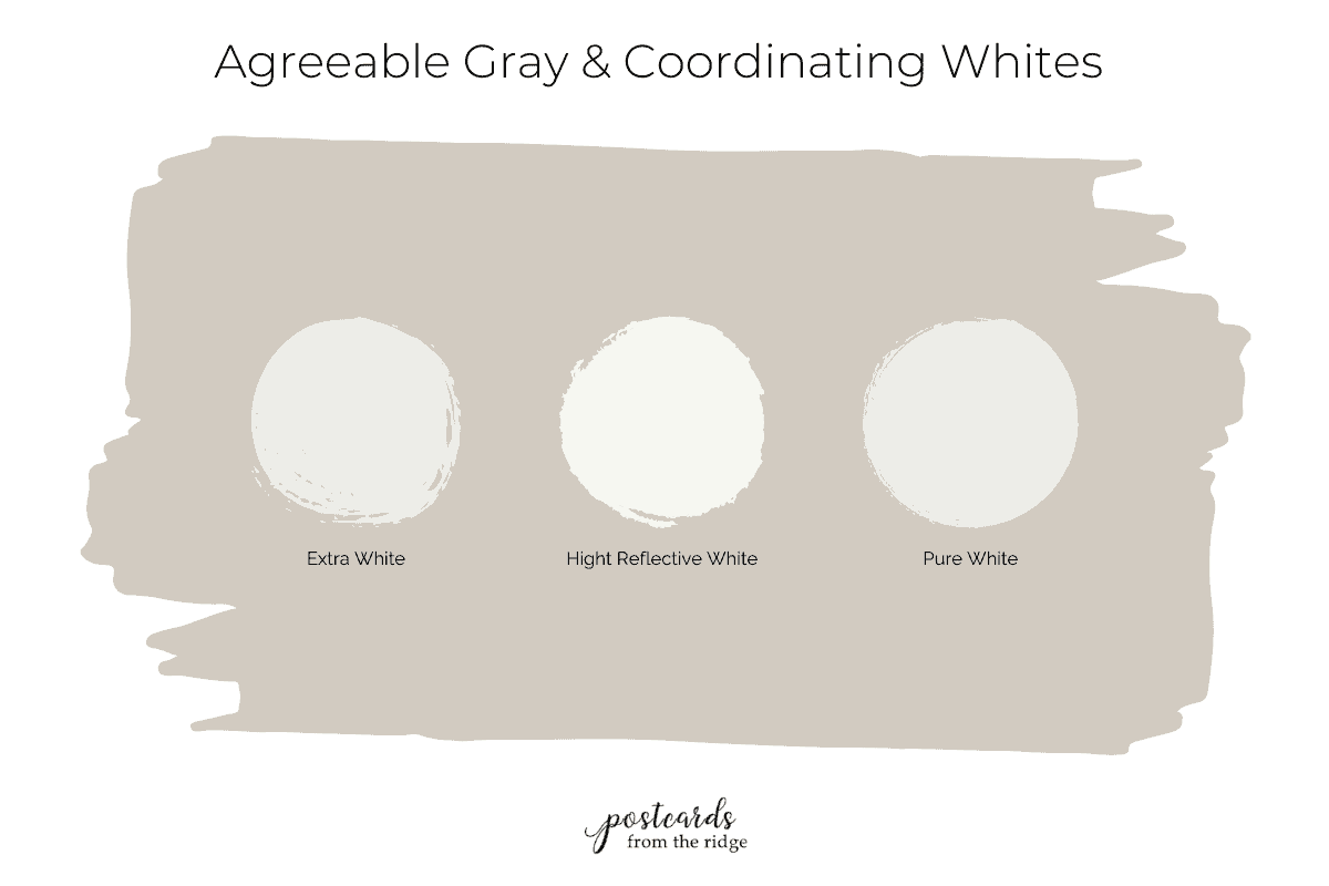
White Paint Colors that go with Agreeable Gray
There are several good choices of white paints that go with Agreeable Gray. The best one depends on how much contrast or how white you want your trim to be. Here are my recommendations:
- Extra White – a cool white with slight gray undertones
- High Reflective White – this is the cleanest white or the one with the least undertones. It’s a true white.
- Pure White – still very white, but not as crisp as High Reflective White or as gray as Extra White.
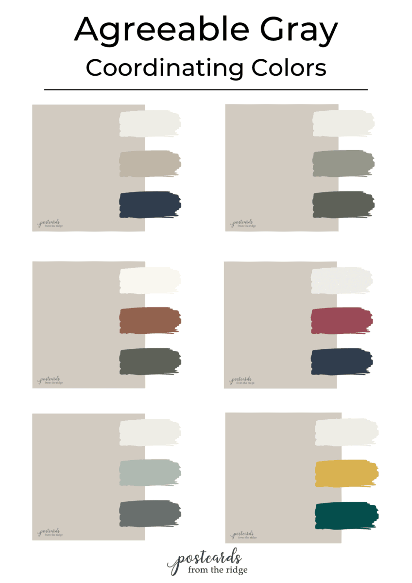
Agreeable Gray Color Palette
Since it’s so neutral you could use many different colors with Agreeable Gray. Although it’s extremely versatile, it looks best with colors that have cool undertones like blue, gray-green, burgundy, and teal.
Here are a few ideas for you to use in your home. You can grab the free printable chart with all the color names when you sign up for my newsletter below.
My favorite paint brush for the past 20 years is also a favorite of nearly 11,000 amazon reviewers. Grab this affordable and comfortable-to-hold brush here -> MY FAVORITE PAINT BRUSH
Try a sample
Now that you’ve seen all there is to love about Agreeable Gray are you ready to give it a try? It’s a good idea to test it before you invest in a gallon.
I use and recommend peel and stick samples from Samplize. They’re painted with 2 coats of paint, are reusable, moveable, and ship overnight for $5!
Leave me a comment below and let me know what you think of this wonderful color and if you’ve used it anywhere in your home!
Got a paint color you want me to review? Email me at angie@postcardsfromtheridge.com or comment below with your favorites!
More paint color reviews and inspiration
- NEW – 2023 Sherwin Williams Color of the Year
- NEW – 2023 Sherwin Williams Color Forecast
- NEW – Sherwin Williams Shoji White Color Review
- Sherwin Williams Clary Sage Spotlight
- Coastal Grandmother Decor & Paint Colors
- 9 No-Fail Neutral Paint Colors from Benjamin Moore
- Best Benjamin Moore Whites & Off Whites
- Best Bedroom Paint Colors
- 13 Gorgeous Interior Door Paint Colors
- 37 Front Door Paint Colors Plus Tips for Choosing One
These color forecast from years past are chock full of great paint color ideas:
- 2022 Benjamin Moore Paint Colors
- 2022 Sherwin Williams Paint Colors
- 2021 Benjamin Moore Paint Colors
- 2021 Sherwin Williams Paint Colors
- 2020 Benjamin Moore Paint Colors
- 2019 Benjamin Moore Paint Colors
- 2019 Sherwin Williams Paint Colors
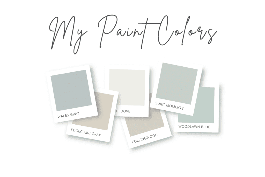
Paint colors in our home
Looking for the paint colors I’ve used in my own home? Take a quick tour and see them all here:




I have signed up twice now for the
newsletter and have not received an email. Please advise. I would love the agreeable gray color palette. Thanks! Amber.voorhees@fuse.net
Hi Amber. I see where you signed up but it looks like the emails both bounced. Please check your settings and also add angie@postcardsfrontheridge.com as a contact and I’ll try resending it in the next 24 hours. I’m sorry for any trouble!!