Sherwin Williams 2023 Paint Colors
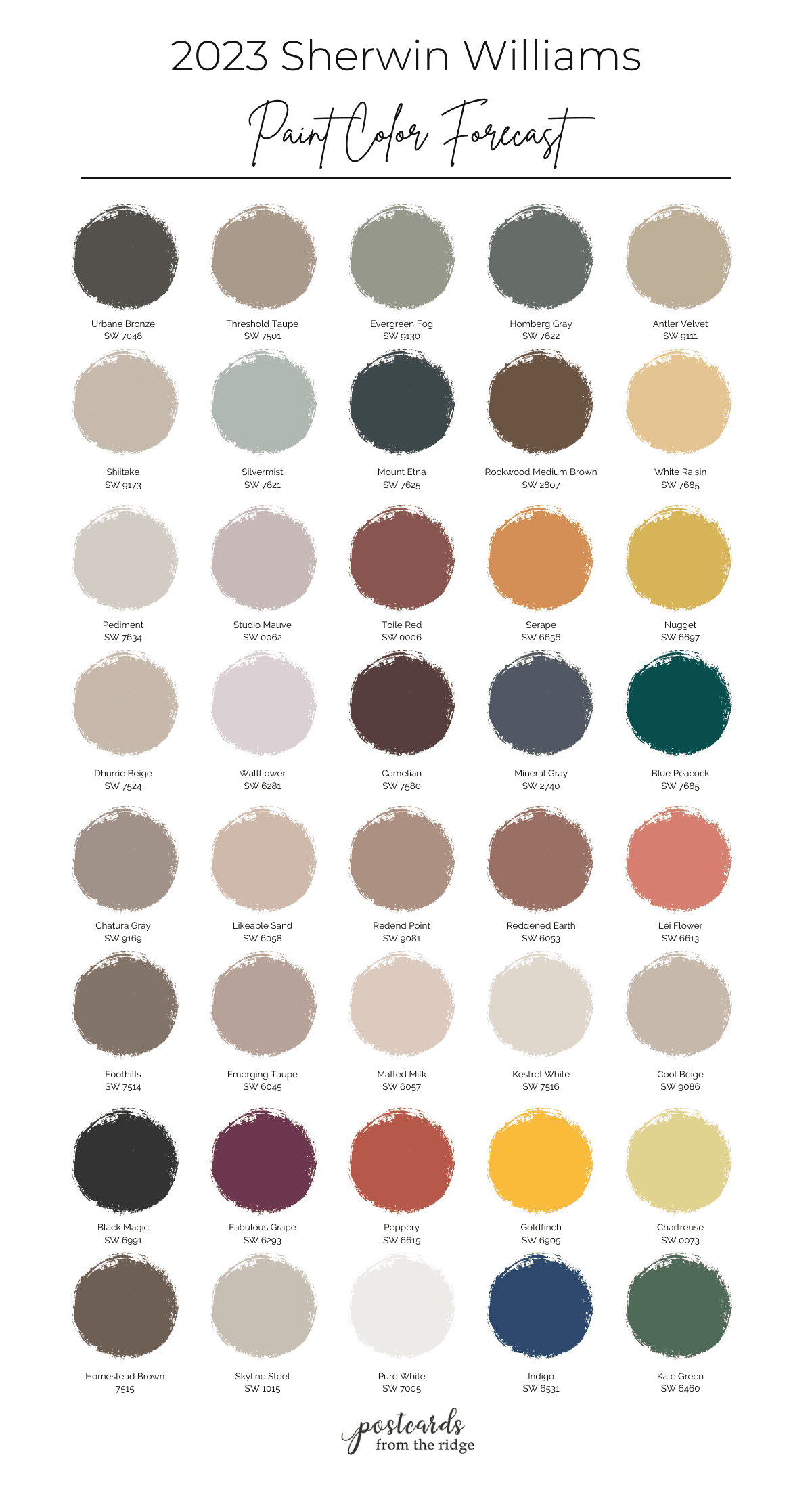
The Sherwin Williams 2023 paint colors have just been released. Their color experts have chosen 40 colors from their full line to make up their Colormix Terra collection paint color trends and there are some beautiful ones included.
This post contains affiliate links for your convenience. I may make a small commission on products purchased with my link, but your price does not change. For full disclosure go here: Disclosure and Policies. Thank you for supporting my site.
FYI: The 2024 Sherwin Williams color trends have just been released and you can see them all here: 2024 Sherwin Williams Colors
2023 Sherwin Williams Paint Colors
Update: The 2023 Sherwin Williams color of the year has been announced and you can read all about it here: 2023 SW Color of the Year
If there ever was a bigger paint color nerd than me I’d be surprised. I’ve worked with paint colors for most of my life and look forward to the color forecast like some people look forward to winning the lottery.
Anyway….Sherwin Williams has just released their color forecast for 2023 and you can see them all here today. The overall theme is “terra” and more than half of the colors have names that are somehow related to nature.
Within the “Terra” theme there are 4 separate color palettes ranging from soft and muted to bright and bold and many in between.
According the the Sherwin Williams website, the palettes are “inspired by the natural interweaving of ourselves and our spaces.”
Tips for choosing paint colors
Read my tips for finding the right paint color here: How To Choose the Right Paint Color
Read on for a breakdown of each palette with photos and descriptions.
2023 Sherwin Williams Color Forecast – Biome palette
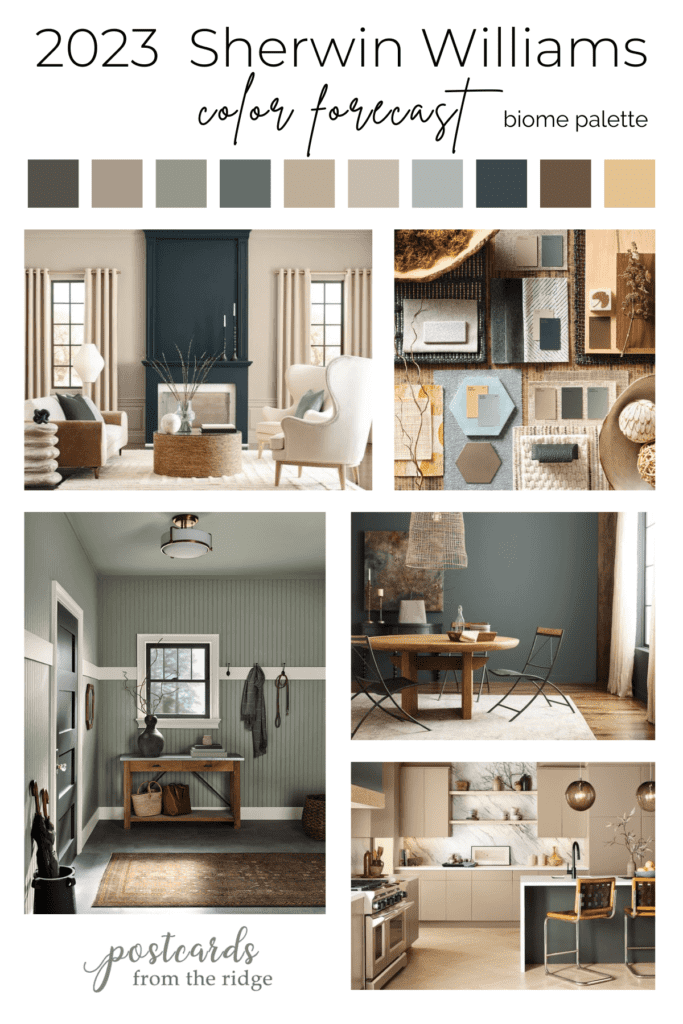
Let’s take a look at the “Biome” palette, which happens to be my personal favorite. It’s inspired by the earth and sky and has colors that reminds us of them.
You’ll see color names with natural items such as fog, antler, shiitake, raisin, and more. These harmonious hues all work together to create a peaceful and soothing atmosphere in your home.
Where to use these colors
Any room that would benefit from the addition of serenity and zen is ideal for the Biome palette. As a general rule cooler colors, like the blues, grays, and greens, look better in rooms that face south or west. The more direct sunlight warms them up a bit.
And warmer colors like the beiges and gold in this palette typically work best in rooms that face north or east and don’t receive as much natural light. They provide warmth and energy to rooms that are lacking in light.
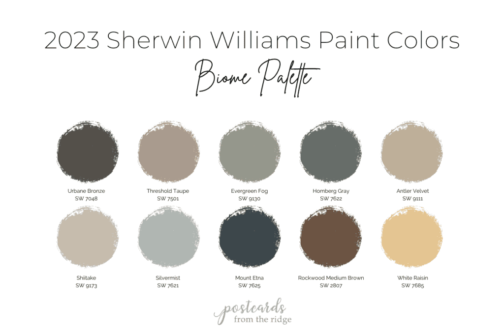
Sherwin Williams 2023 Biome palette paint colors and samples
Most of these colors are available in large 9″ x 12″ peel and stick paint samples. Click on any color name from the list below to order one.
- Urbane Bronze SW 7048 sample
- Threshold Taupe SW 7501 sample
- Evergreen Fog SW 9130 sample
- Homburg Gray SW 7622 sample
- Antler Velvet SW 9111 sample
- Shiitake SW 9173 sample
- Silvermist SW 7621 sample
- Mount Etna SW 7625 sample
- Rockwood Medium Brown SW 2807 (not available yet)
- White Raisin SW 7685 sample
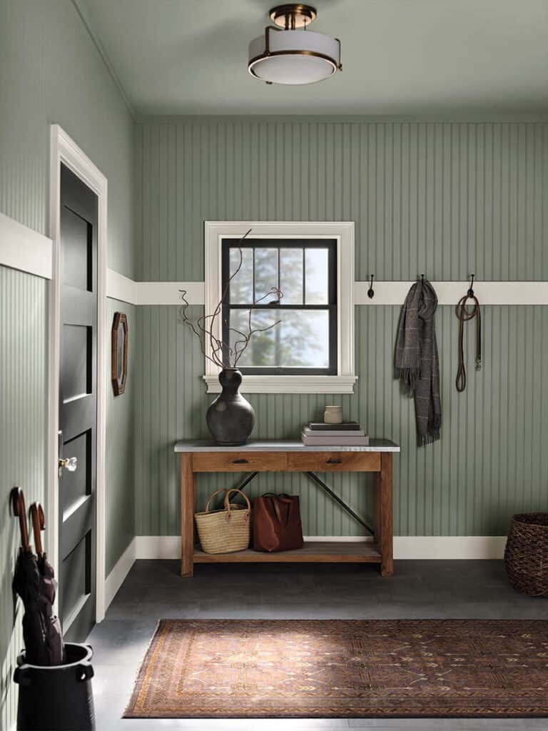
SW Evergreen Fog
Evergreen Fog, the 2022 color of the year for Sherwin Williams, is part of this peaceful palette. It’s a soft sage green paint color that’s very neutral and works in any space.
FYI – the 2024 Sherwin Williams color of the year has just been released and you can read all about it here >> SW 2024 COTY
This mudroom would be a welcome sight to come home to every evening, wouldn’t it? See the full palette of SW 2022 colors here: Sherwin Williams 2022 Color Forecast
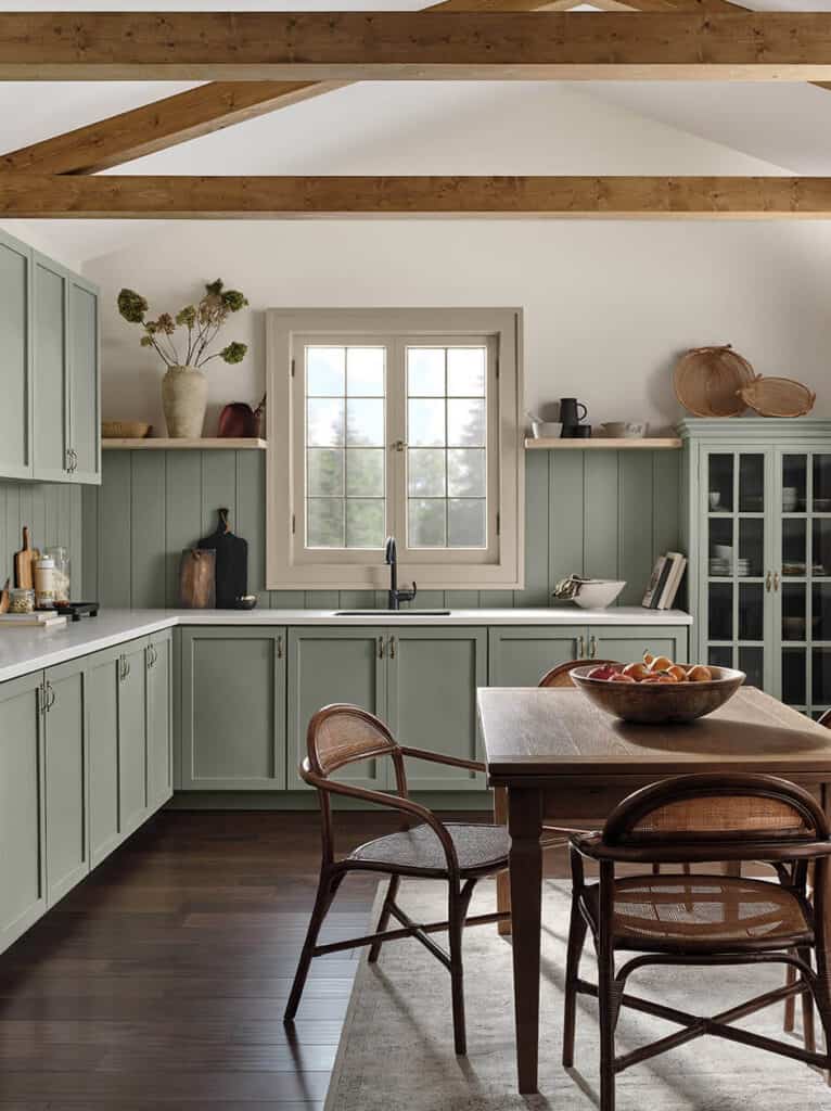
Here we see how lovely Evergreen Fog looks on kitchen cabinets. The warm woods, stoneware, and woven items perfectly balance the space. And the beige trim is perfect with it.
For a similar sage green visit this post: Sherwin Williams Clary Sage SW 6178 Color Spotlight
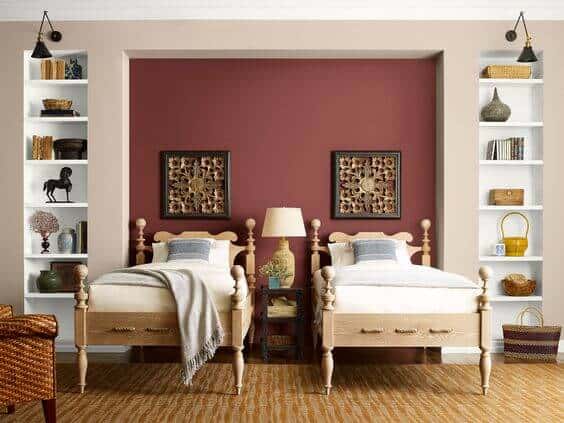
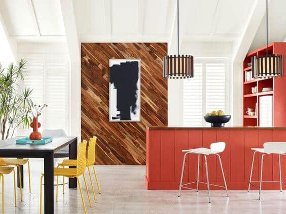
Antler Velvet SW 9111 and Urbane Bronze SW 7048
In this kitchen the cabinets are painted with a warm beige that makes the room feel cozy and warm. The stark contrast on the island adds interest and drama to the room.
For more neutral paint colors read this post: 9 No-Fail Neutral Paint Colors
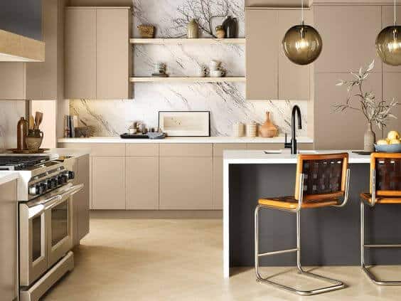
Cabinet color – Antler Velvet, Island paint color – Urbane Bronze.
SW Homburg Gray SW 7622
If you’re looking for a bit more depth, consider using Homburg Gray.
It’s a muted medium dark gray with slight blue and green undertones and looks great with wood tones and natural linens. The iron chairs are a nice accent as well.
White Raisin SW 7685
If you’re looking to warm up a room and add a punch of personality, then look no further than White Raisin SW 7685.
It’s a lovely golden hue with a hint of orange undertones that will brighten any space. It’s also the June 2023 color of the month.

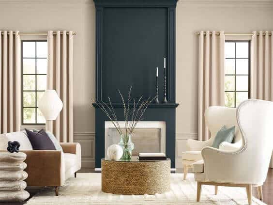
Mount Etna SW 7625
Make a statement in your living room by painting the fireplace a deep rich color like Mount Etna. And balance the room with a soft neutral on the walls like Shiitake.
Paint Like a Pro
Learn all the trade secrets from professional painters and save hundreds of dollars here: Beginner’s Guide to a Professional Paint Finish
2023 SW Color Forecast – Lore Palette
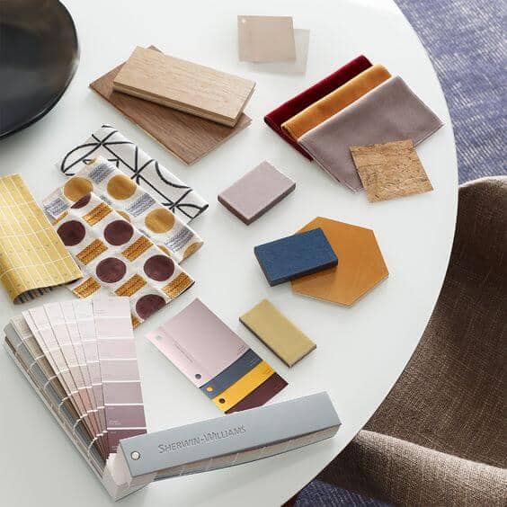
The second 2023 paint color palette from Sherwin Williams is “Lore”. Inspiration for these rich colors comes from old world textiles and art.
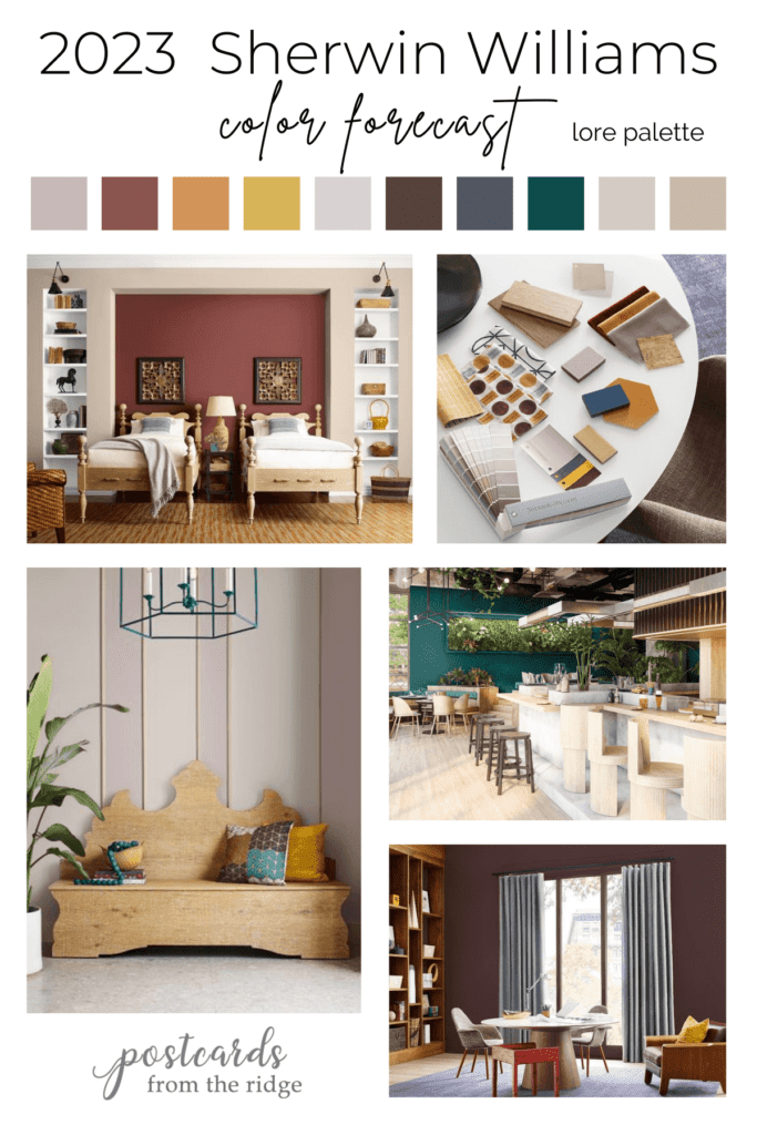
Colors in this palette are fueled by creativity and global cultures.
Rooms that would look good with these colors
Rich, deep colors like the Toile Red, Carnelian, Mineral Gray, and Blue Peacock can add a sense of drama to a room and are nice in areas like dining rooms, half bathrooms, and accent walls. Additionally they look wonderful on accent furniture and built-in bookcases.
The more muted colors in this palette are ideal for common areas like living rooms, hallways, and foyers. The mauve hues give a warmth unlike other colors are work nicely in bedrooms and bathrooms.
Paint Like a Pro
Learn all the trade secrets from professional painters and save hundreds of dollars here: Beginner’s Guide to a Professional Paint Finish
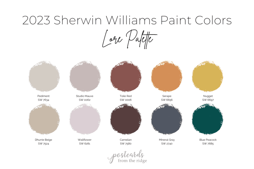
Sherwin Williams 2023 Lore palette paint colors and samples
These colors are available in large 9″ x 12″ peel and stick paint samples. Click on any color name from the list below to order one.
- Pediment SW 7634 sample
- Studio Mauve SW 0062 sample
- Toile Red SW 0006 sample
- Serape SW 6656 sample
- Nugget SW 6697 sample
- Dhurrie Beige SW 7524 sample
- Wallflower SW 6281 sample
- Carnelian SW 7580 sample
- Mineral Gray SW 2740 sample
- Blue Peacock SW 7685 sample
Toile Red SW 0006 and Dhurrie Beige SW 7634
This bedroom is warm and welcoming with the rich accent wall and golden accents. More bedroom paint colors can be seen here: Best Bedroom Paint Colors
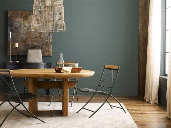
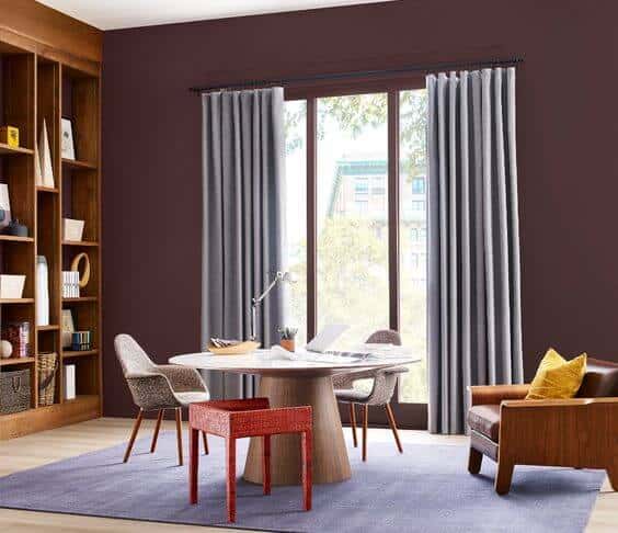
Carnelian SW 7580
For a dash of drama, paint your dining room walls in a deep regal hue like Carnelian. It’s rich and elegant. And it looks lovely with the warm wooden built-ins.
See more deep paint colors here: 25 Best Deep Paint Colors
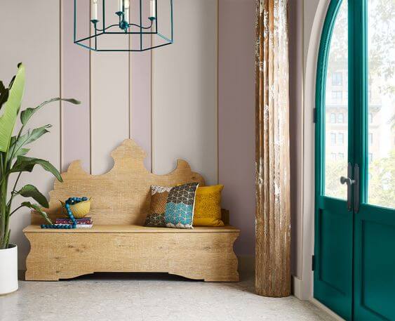
Blue Peacock SW 7685, Wallflower SW 6281, Pediment SW 7634
Add a vibrant global look to any space with lively colors like Blue Peacock or Wallflower. The accent pillows and light fixture tie it all together.
To see more ideas for door paint colors read this: 13 Gorgeous Interior Door Paint Colors
Test the Color
See all the options for sampling paint colors here: 5 Ways to Test Paint Colors
2023 SW Color Forecast – Nexus Palette
The next palette is full of warmth and earthy hues and reminds us what it feels like when we return home.

This soulful and energetic palette is comprised of sunbaked desert sands, natural clays, grounding browns, and soulful whites.
Do you remember the grayish mauves and blues from the 80’s? There’s a strong tie in to that era with the taupes and mauves in this collection of colors.
Where to use colors from this palette
When I look at this palette it reminds me of the makeup counter in a luxury department store. And now you see it too, don’t you?
These warm hues are neutral enough to use anywhere in your home. The Lei Flower, Foothills, and Reddened Earth would be amazing as accent colors or would really make a statement in an entire room.
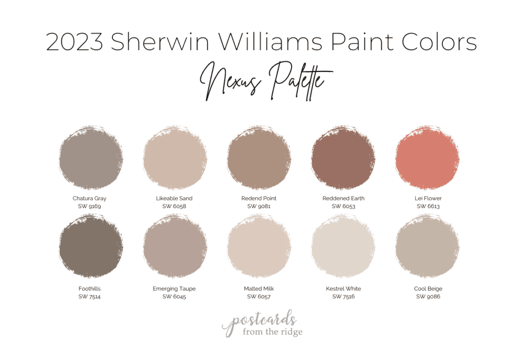
Sherwin Williams 2023 Nexus palette paint colors and samples
These colors are available in large 9″ x 12″ peel and stick paint samples. Click on any color name from the list below to order one.
- Chatura Gray SW 9169 sample
- Likeable Sand SW 6058 sample
- Redend Point SW 9081 sample
- Reddened Earth SW 6053 sample
- Lei Flower SW 6613 sample
- Foothills SW 7514 sample
- Emerging Taupe SW 6045 sample
- Malted Milk SW 6057 sample
- Kestrel White SW 7516 sample
- Cool Beige SW 9086 sample
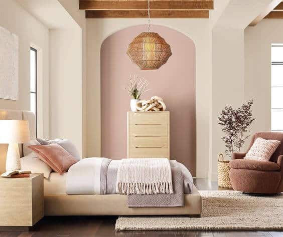
Kestral White SW 7516 and Likeable Sand SW 6058
The soft textures and curved features in this bedroom make it a space to feel safe in. And it looks like what a soft hug would feel like, doesn’t it?
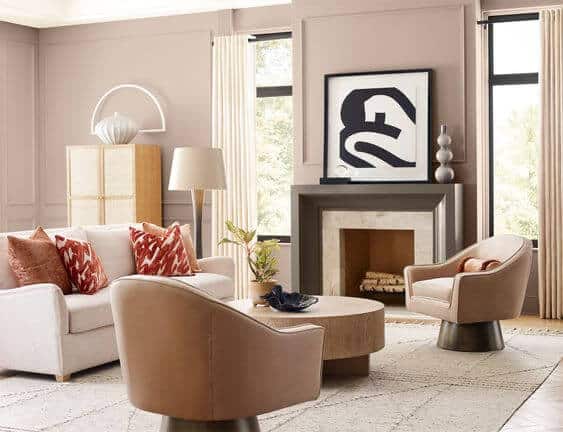
Emerging Taupe SW 6045 and Foothills SW7514
This living room with the soft warm colors and curved elements is peaceful and soothing. It has subtle modern elements reminiscent of the early 1980’s.
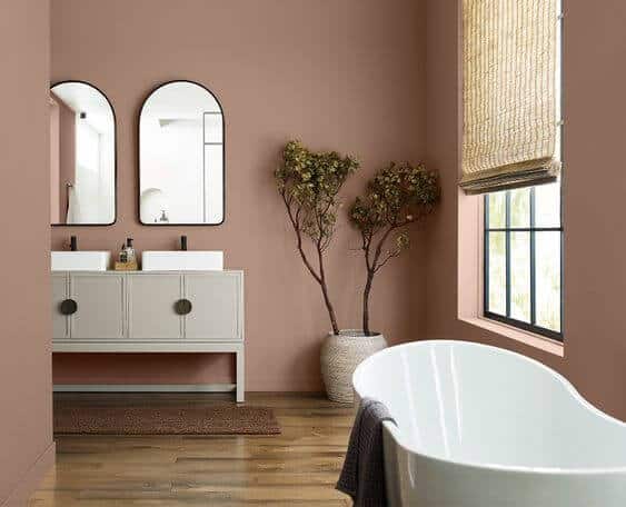
Redend Point SW 9081
This warm, deep blush color is the perfect shade for a bathroom. It actually makes your skin glow when you look in the mirror. And who doesn’t want that?
Reddened Earth SW 6053
We all need a light-filled office space with natural plants and a paint color that inspires us. The Reddened Earth walls are energetic without being overwhelming.
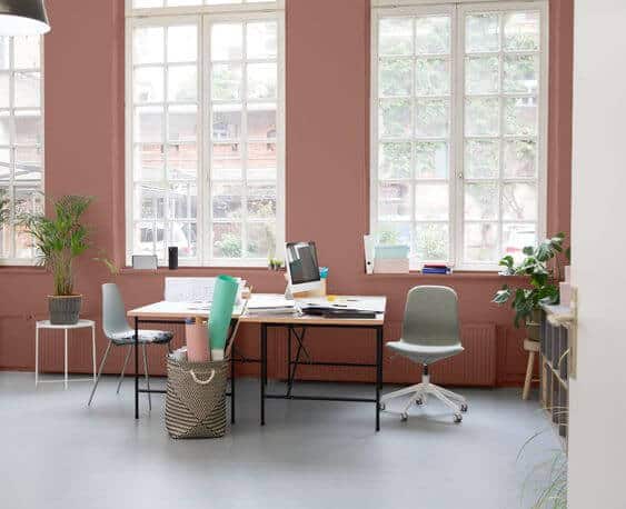
See ideas for home offices here: 25 Ideas for Home Offices You’ll Love
Try a Sample
Always test paint colors before you buy. I use and recommend Samplize Peel and Stick Paint Samples because they’re mess-free painted with two coats of real paint!
2023 Sherwin Williams color forecast – origin palette
The last palette of colors is called “origin” and is inspired by fond memories and future hopes. It’s a mix of free-spirited brights, magnetic deeps, and soft restful neutrals.

In this bold palette you’ll find black, white, primary, and jewel tones.
Best places to use these paint colors
Depending how bold you are with your paint colors will determine the best rooms for this palette of colors. Of course, the Pure White and Skyline Steel would work in any space.
The remaining bold colors are great for any room that you want to make an impact and add personality. And they’re all ideas for accent furniture, kitchen islands, built-ins, etc.
Keep in mind that warm colors like Peppery and Goldfinch will look best in north facing rooms. And cooler colors like Indigo and Kale Green work well in south facing rooms.
Lighting makes such a huge difference in how a paint color appears on your walls.
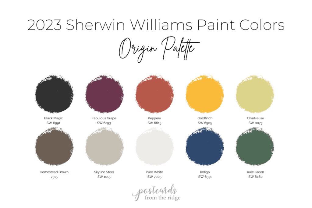
Sherwin Williams 2023 Origin palette paint colors and samples
These colors are available in large 9″ x 12″ peel and stick paint samples. Click on any color name from the list below to order one.
- Black Magic SW 6991 sample
- Fabulous Grape SW 6293 sample
- Peppery SW 6615 sample
- Goldfinch SW 6905 sample
- Chartreuse SW 0073 sample
- Homestead Brown 7515 sample
- Skyline Steel SW 1015 sample
- Pure White SW 7005 sample
- Indigo SW 6531 sample
- Kale Green SW 6460 sample
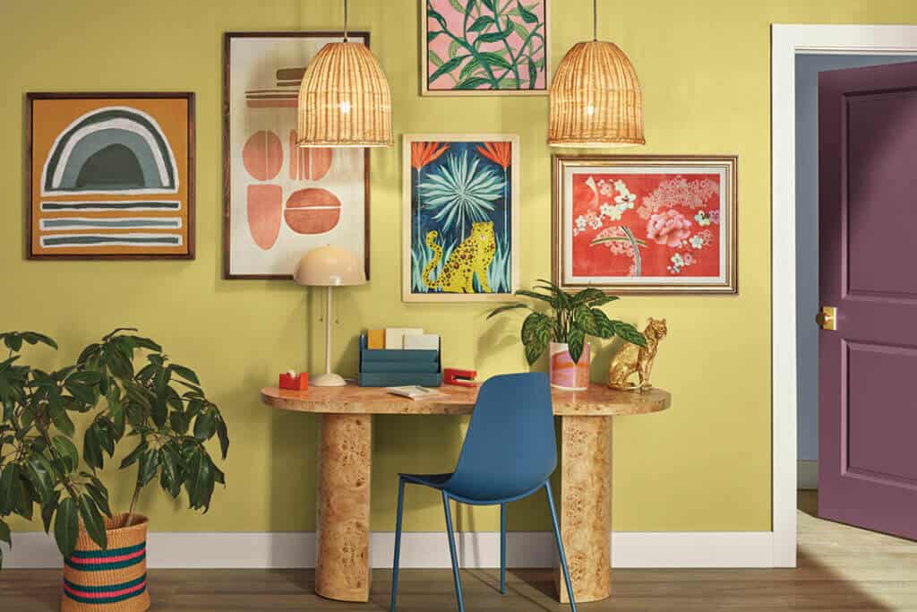
Chartreuse SW 0073
This room is quirky and bold and bursting with energy. The colorful artwork adds even more personality and the plants and woven textures keep it grounded.
See ideas for creating your own artwork here: 28 Affordable DIY Art Ideas
Pure White SW 7005 and Peppery SW 6615
Add a pop of color to a white room with bold cabinets and accent furniture. The Pure White walls in this space are the perfect backdrop for colors with strong personality.
My favorite paint brush for the past 20 years is also a favorite of nearly 11,000 amazon reviewers. Grab this affordable and comfortable-to-hold brush here -> MY FAVORITE PAINT BRUSH
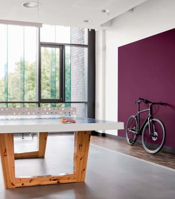
Pure White SW 7005 and Fabulous Grape SW 6293
The purple wall in this game room is a real winner. You can just feel the energy and drama in this room that would otherwise be a sterile room.

What are your favorites?
Which palette or color is your favorite? Leave me a comment below and let me know what you thing!
Paint Samples
Are you inspired and ready to paint something with one of these gorgeous colors? Always keep in mind that they will look different in person so it’s always best to try a sample before painting an entire room.
See my best tips for sampling a color here: 5 Ways to Sample Paint and Get the Right Color
PRO TIP: I use and recommend peel and stick paint samples because they’re painted with two coats of real paint, are easy to move from one wall to another, and are mess free. You can get 9″ x 12″ peel and stick paint samples here: Samplize Peel and Stick Paint Samples
More Paint Color Ideas
Read my comprehensive post about choosing paint colors here: How to Choose the Right Paint Color and learn how to paint like the pros do in this post: How to Paint a Room and get a professional finish
If you love paint palettes and color inspiration you’ll want to visit these posts:
- Sherwin Williams Clary Sage Spotlight
- Sherwin Williams Agreeable Gray Spotlight
- Coastal Grandmother Decor & Paint Colors
- 9 No-Fail Neutral Paint Colors from Benjamin Moore
- Best Benjamin Moore Whites & Off Whites
- Best Bedroom Paint Colors
- 13 Gorgeous Interior Door Paint Colors
- 37 Front Door Paint Colors Plus Tips for Choosing One
And these annual paint color palettes are full of ideas:
- NEW! 2023 Benjamin Moore Paint Colors
- 2022 Benjamin Moore Paint Colors
- 2022 Sherwin Williams Paint Colors
- 2021 Benjamin Moore Paint Colors
- 2021 Sherwin Williams Paint Colors
- 2020 Benjamin Moore Paint Colors
- 2019 Benjamin Moore Paint Colors
- 2019 Sherwin Williams Paint Colors
Tips for choosing your paint colors:
- If you don’t know where to begin, start with any items that won’t be changing like large furniture pieces, flooring, or any other permanent features in the area to be painted.
- Look for inspiration on pinterest, instagram, or in home magazines.
- Once you’ve decided on the direction you want to go, narrow your choices down to 5 or less paint colors, ideally.
- Keep in mind that paint colors will look more intense on your walls than they do on paint color strips with multiple shades. This means light colors will look lighter and dark colors will look darker.
- Look at the color you’re considering in the room that you will be painting, not outside in the bright sun.
- See how the paint color looks in that room during different lighting situations…on a sunny day, on a cloudy day, with and without the lights on, and at night. They look different in each of these situations.
- I strongly recommend testing the color either by painting areas of the room (next to the trim) or by using a peel and stick paint samples. You can get them here: Samplize Peel and Stick Paint Samples. They’re reusable, affordable, and you don’t even have to wash out a brush.
- Most importantly, remember that there’s not a “perfect” color. There are likely a few good choices that will look beautiful in your room.
Paint colors in our home
Looking for the paint colors I’ve used in my own home? Take a quick tour and see them all here: