
2023 Benjamin Moore Color of the Year and Trends
It’s mid-October and in addition to all things pumpkin, that means it’s time for the 2023 color of the year and paint color picks from Benjamin Moore.
Somewhat like fashion week for those who love to dress in the latest styles, the yearly paint color trends are a reflection of what’s going on in the world and how people are reacting to it.
This post contains affiliate links for your convenience. I may make a small commission on products purchased with my link, but your price does not change. For full disclosure go here: Disclosure and Policies. Thank you for supporting my site.
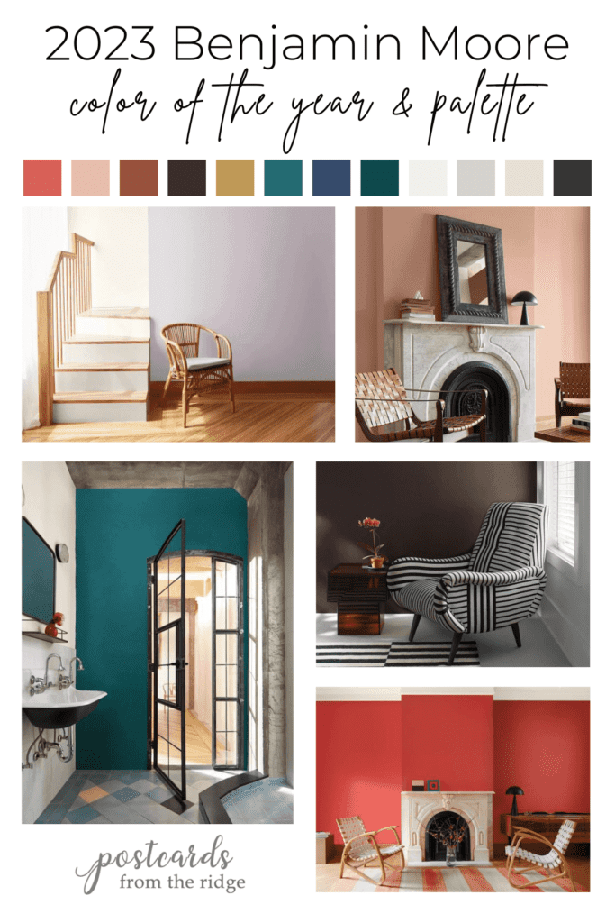
Benjamin Moore 2023 Paint Color Trends
This year’s paint color palette from Benjamin Moore includes 8 hues that make are full of personality, plus 4 neutrals that work with them.
The palette is created to inspire you to try new colors and this group has some that might push you out of your comfort zone. But using what you love is always the best choice since you’ll be seeing it every day.
tell me what you want
Request a Color Palette
Is there a paint color that you need help finding colors to coordinate with? My new site, Decorate With Ease, has a growing collection of meticulously curated color palettes (and much more) that’s being added to each week. I would love to know what you need help with. Send me your request and it might be the next color palette that I create.
Previous colors of the year
I’ve been writing about Benjamin Moore colors of the year and color trends since 2012 and it’s always fun to see their annual picks. Here are the paint color trends from the past years for more inspiration:
- 2022 Benjamin Moore Color of the Year and Trends
- 2021 Benjamin Moore Color of the Year and Trends
- 2020 Benjamin Moore Color of the Year and Trends
- 2019 Benjamin Moore Color of the Year and Trends
- 2018 Benjamin Moore Color of the Year and Trends
- 2017 Benjamin Moore Color of the Year and Trends
- 2015 Benjamin Moore Color of the Year and Trends
- 2014 Benjamin Moore Color of the Year and Trends
Just announced – the 2024 Benjamin Moore color of the year and trends!
There are always some winners in the palette and one color is chosen as their color of the year. Let’s take a look at all of the choices for this year!
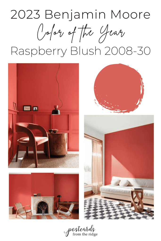
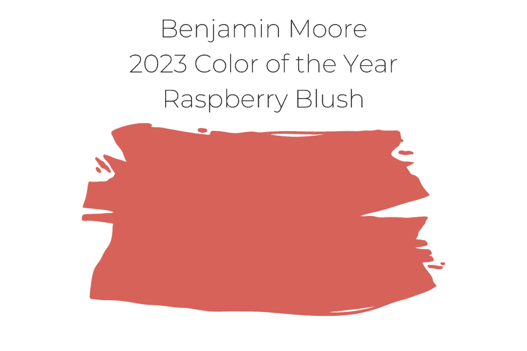
Benjamin Moore 2023 Color of the Year Raspberry Blush 2008-30
And the Benjamin Moore color of the year for 2023 is…..Raspberry Blush 2008-30! Wow, what a bold color choice!
I’ve seen this rich coral color in nail polish and lipstick but haven’t thought of it as a paint color before. But in this day and age, why not?
Tips for choosing paint colors
Read my tips for finding the right paint color here: How To Choose the Right Paint Color
What color is Raspberry Blush?
Raspberry Blush is a lively shade of coral with hints of pink. It’s a bold red-orange that’s bursting with energy.
What is the LRV of Raspberry Blush?
This bold color is on the lower end of the light reflective value at 21.12. It won’t make a room any lighter but will certainly liven it up.

How does Raspberry Blush make a room feel?
Any room painted with this color would feel energetic, lively, optimistic, and on-trend.
What whites and off whites that go with Raspberry Blush?
Using a white or off-white paint color for trim or accents will really make this color pop. Here are some complementary white and neutral colors to use with it:

What are the lighter and darker shades of 2008-30 Raspberry Blush ?

What are the undertones of Raspberry Blush
You’ll find red, coral, pink, and orange undertones in this vivacious color.
Rooms painted with Raspberry Blush
Are you curious to see how this vibrant color looks in a room? Let’s look at a few.
Raspberry Blush Accent Wall
If painting an entire room with this bold color is too much for you, think about trying it on an accent wall. Here’s a living room with Raspberry Blush on the wall behind the sofa.
The other walls and ceiling are painted with White Heron. The black and white checked area rug really makes a statement in here too.
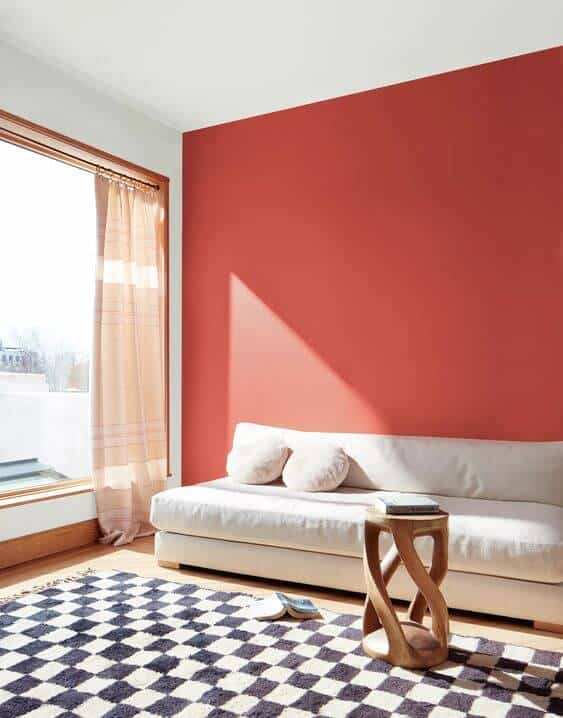
Photo courtesy of Benjamin Moore. Accent wall is Raspberry Blush. Other wall is White Heron.
Raspberry Blush Dining Room with metallic accents
Dining rooms are ideal for this color. Why? Well first of all, red is a color that stimulates appetite so your guests will always be hungry in a dining room painted with this color.
Also, we tend to tire quickly of bold colors like this one but when it’s in a room that you don’t spend too much time in you can live with it for a longer time.
Half bathrooms are also a good choice for strong colors like this.

Photo courtesy of Benjamin Moore. Wall color is Raspberry Blush.
Raspberry Blush modern living room
The natural wood furniture and marble mantel are nice complements for Raspberry Blush. And artwork on the wall would be a wonderful addition in here.

Photo courtesy of Benjamin Moore. Wall color is Raspberry Blush.
Similar colors
If this color isn’t exactly the one for you but you want something similar, consider these other Benjamin Moore shades:
- Habanero Pepper 1306
- Dark Salmon 2009-30
- Adobe Orange 2171-30
- Rose Quartz 2002-30
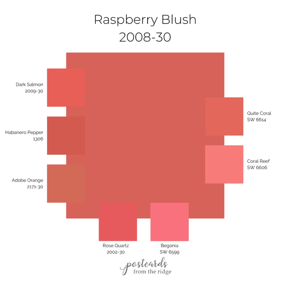
And these are the closest colors from Sherwin-Williams:
- (Closest Match) Quite Coral SW 6614 – a little more orange but a close match
- Begonia SW 6599 – slightly pinker than Raspberry Blush
- Coral Reef SW 6606 – a bit lighter but about the same undertones
Color Scheme
Since Raspberry Blush is a strong color, you’ll need just the right hues and I’ve curated a couple of palettes. Accenting with complementary colors like greens will give you a good balance. A lighter coral shade is a bit more subtle. And for a little pop of color use a gold color.
Here are the colors on the complementary palette:
- Pinelands 446
- Greenwich Village 445
- Coral Spice 2170-40
- Pan for Gold 181

For more of a monochromatic color scheme you’ll want to use lighter shades of Raspberry Blush. Accenting with a white and dark neutral keeps the palette less busy.
Here are the colors on the more monochromatic palette:
- Conch Shell 052
- Coral Spice 2170-40
- White Heron OC-57 – good choice for trim
- Wenge AF-180 – nice accent color

How and where to use Raspberry Blush
Where to use this color depends on how much you like bold bright hues. If you like them in small doses, try it on an accent wall, piece of furniture, or even a picture frame.
You could also use this color in a half bathroom, dining room, or any space you don’t spend a lot of time in.
If your mantra is “Go big or go home”, then you might love it in your living room or bedroom.
Guide to Paint Gloss
Learn all about paint gloss levels and where to use each one here: Ultimate paint Sheen Guide Printables
2023 Benjamin Moore Paint Color Palette
In addition to the color of the year, there are 11 more colors. This year for the first time, neutrals are separated from the rest of the palette and are intended to be used with any of the main colors.
Here’s a list of the entire 2023 color trends from Benjamin Moore:
- Raspberry Blush 2008-30
- Conch Shell 052
- Cinnamon 2174-20
- Wenge AF-180
- Savannah Green 2150-30
- Starry Night Blue 2067-20
- North Sea Green 2053-30
- New Age 1444
- White Heron OC-57
- Etiquette AF-50
- Gray Owl OC-52
- Onyx 2133-10
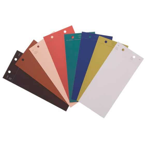
And here’s a color chart for you to pin for reference.

My favorite paint brush for the past 20 years is also a favorite of nearly 11,000 amazon reviewers. Grab this affordable and comfortable-to-hold brush here -> MY FAVORITE PAINT BRUSH
How to use these colors
Although it’s always fun to see what the paint manufacturers choose as their color of the year and their annual trends, there’s no need to feel like you have to repaint your home.
These are merely suggestions and they’re following the trends seen in fashion and beauty.
But if you do want to try one of more of them you can be brave and paint an entire room, put it on an accent wall, paint your built-in bookcases, or a piece of accent furniture.
The sky is the limit on how you could use any of them.
Let’s take a look at each one of them in rooms to get an idea of how they might look in your home.
Test the Color
See all the options for sampling paint colors here: 5 Ways to Test Paint Colors
Wenge AF-180
What color is Wenge?
Benjamin Moore Wenge AF-180 is a deep chocolate brown with hints of black, brown, and violet. It’s bold and dramatic and will create a rich, dark space with an LRV of 2.65.

Where to use Wenge
Use this velvety hue anywhere you want an elegant, bold space. It’s ideal for dining rooms, bedrooms, and accents walls.
Use it with natural wood tones, antique brass, black and white accents, and white trim for a strong statement in any room.

Photo courtesy of Benjamin Moore. Wall color is Wenge.

Photo courtesy of Benjamin Moore. Wall color is Wenge.

Photo courtesy of Benjamin Moore. Accent wall color is Wenge. Trim and ceiling is White Heron.
Cinnamon 2174-20
Cinnamon 2174-20 is such a beautiful color. It’s a warm rich brown with orange undertones and looks like the color of ground cinnamon.
The low LRV of 11.2 means that it won’t reflect much light and will appear quite dark.

Where to use Cinnamon 2174-20
With it’s warm rich hue it would be ideal for kitchens, dining rooms, and living rooms. And it would make any bedroom feel warm and cozy.
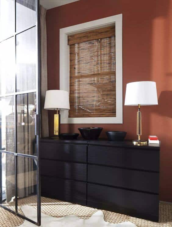
Photo courtesy of Benjamin Moore. Wall color is Cinnamon. Window trim is White Heron.

Photo courtesy of Benjamin Moore. Wall color is Cinnamon.
Conch Shell 052
Doesn’t the name of this dusty color make you want to take a trip to the beach? The peach and beige undertones of Conch Shell 052 give it an earthy and welcoming feeling.
It’s considered to be a mid-tone color with an LRV of 54.99.

Where to use Conch Shell 052
This cozy gentle shade is a lovely color to use in bathrooms, living rooms, entries, or anywhere you want a warm and welcoming hue without being too dark.
Interiors with modern, traditional, or contemporary decor could have this color as a neutral with stronger hues.
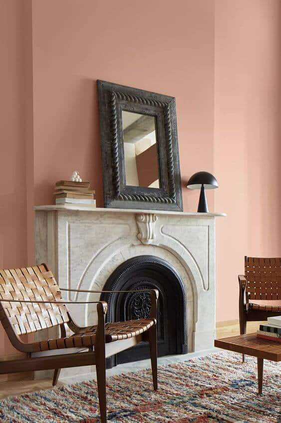
Photo courtesy of Benjamin Moore. Wall color is Conch Shell.
Or you can use it on an accent wall to infuse color into a room. It looks so pretty with the White Heron walls in this living room.

Photo courtesy of Benjamin Moore. Accent wall color is Conch Shell. Walls and ceiling are White Heron.
New Age 1444
For a calming color, consider New Age 1444. It’s a light purple with a touch of gray and would be ideal for a serene bedroom.

Where to use New Age
Colors like New Age 1444 provide peace and serenity in bedrooms. The black bed and wall sconces add a nice contrast. And the White Heron ceiling and beams keep the room light and airy.

Photo courtesy of Benjamin Moore. Wall color is New Age. Ceiling and trim is White Heron.
An accent wall in New Age 1444 gives this space a soft addition of color without overwhelming it. The natural wood tones and White Heron walls are perfect accents.

Photo courtesy of Benjamin Moore. Accent wall color is New Age. Other walls and ceiling is White Heron.
North Sea Green 2053-30
One of my favorites of the palette, North Sea Green 2053-30 is definitely on trend with the saturated teal hues. It has slight gray undertones that keep it from being too harsh.

Where to use North Sea Green 2053-30
This moody hue adds character to any room but looks especially pretty in living rooms, bedrooms, and bathrooms.
Pair it with lilac, chartreuse, and yellow for a bold palette.
Photo courtesy of Benjamin Moore. Wall color is North Sea Green. Ceiling is Etiquette. Trim is White Heron.
Liven up your bathroom by painting an accent wall with North Sea Green. It works wonderfully with the Etiquette walls, black metal accents, tiles, and concrete in this sparse room.
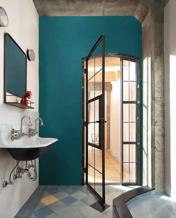
Photo courtesy of Benjamin Moore. Wall color is North Sea Green. Wall behind sink is Etiquette.
My favorite paint brush for the past 20 years is also a favorite of nearly 11,000 amazon reviewers. Grab this affordable and comfortable-to-hold brush here -> MY FAVORITE PAINT BRUSH
Starry Night Blue 2067-20
Make a bold statement with Starry Night Blue 2067-20. It’s a saturated, inky blue with hints of violet. It’s definitely on the dark side with an LRV of 5.52.
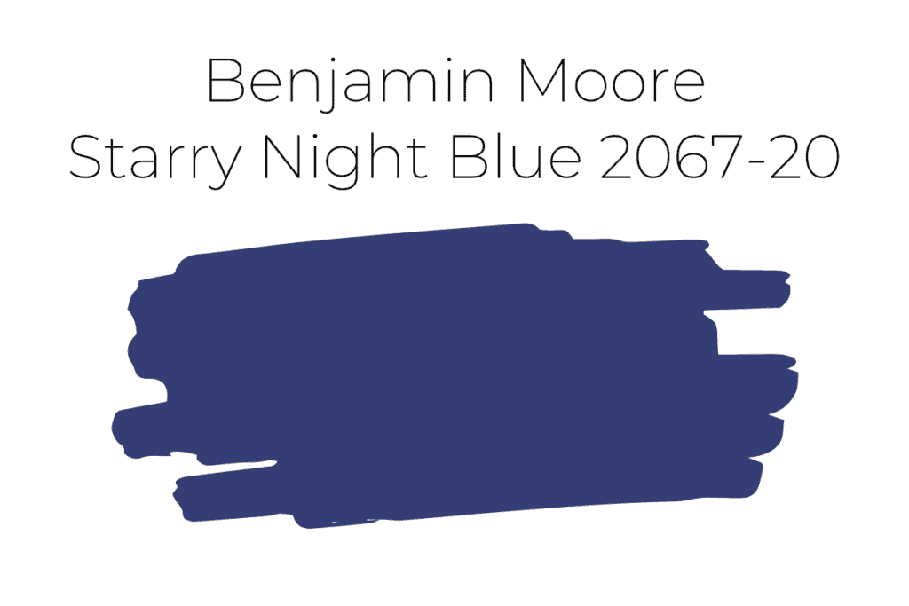
Where to use Starry Night Blue 2067-20
Create a bedroom oasis where you can sleep off your worries with this deep hue. Or add drama and depth to your living room.
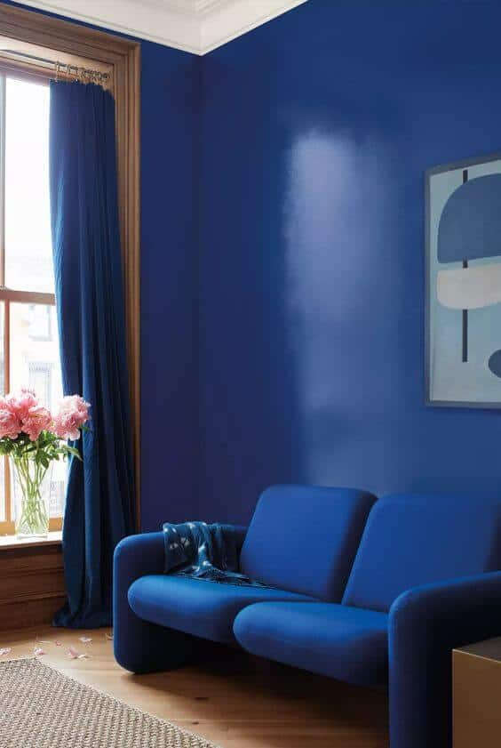
Photo courtesy of Benjamin Moore. Wall color is Starry Night Blue. Trim color is White Heron.
Savannah Green 2150-30
If you’re ready to break out of the box then you’ll want to consider using Savannah Green 2150-30. It’s an ochre with yellow and green undertones and will add an artsy look to your home.

Where to use Savannah Green 2150-30
Use this unique color in a dining room with rich woodtones and white trim for a deep, earthy vibe.

Photo courtesy of Benjamin Moore. Wall color is Savannah Green. Trim color and accent wall is White Heron.
Add black and white accents to this color for a bold and dramatic look that will enliven any space.

Try a sample
What do you think of this palette of colors? They’re daring and dynamic and would add personality to any area. Are you ready to try one or more of them?
Always test paint colors in your own home because they will appear different based on your lighting and the direction that your room faces. See my best tips for sampling paint here: 5 Ways to Sample Paint and Get the Right Color
I use and recommend Samplize Peel and Stick Samples or Color Testers from Benjamin Moore painted on these boards. You can also purchase sample sheets of the 8 colors directly from Benjamin Moore here: 2023 Color of the Year Bundle
More paint color reviews and inspiration
Want more ideas for paint colors? See my curated collection of paint color and design books here: Favorite Color and Decorating Idea Books
And be sure to visit these posts:
- NEW – 2023 Sherwin Williams Color Forecast
- NEW – Sherwin Williams Shoji White Color Review
- Sherwin Williams Clary Sage Spotlight
- Sherwin Williams Agreeable Gray Spotlight
- Coastal Grandmother Decor & Paint Colors
- 9 No-Fail Neutral Paint Colors from Benjamin Moore
- Best Benjamin Moore Whites & Off Whites
- Best Bedroom Paint Colors
- 13 Gorgeous Interior Door Paint Colors
- 37 Front Door Paint Colors Plus Tips for Choosing One