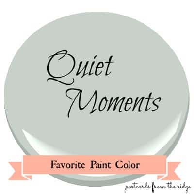
Benjamin Moore Quiet Moments Paint Color Spotlight
Today’s favorite paint color is Benjamin Moore Quiet Moments, #1563. It’s one
of my very favorites and will go in virtually any room.
Benjamin Moore Quiet Moments 1563
This post contains affiliate links for your convenience. I may make a small commission on products purchased with my link, but your price does not change. For full disclosure go here: Disclosure and Policies. Thank you for supporting my site.
What color is Quiet Moments?
Quiet Moments is a very soft, muted gray with a hint of blue and a tiny touch of green. One of Benjamin Moore’s most popular paint colors, here’s what one pinner says about it:
“My favorite color ever. The outcome depends on many factors such as lighting and wood tones in the room. This color also takes on undertones from fabrics in the room. In my bathroom it looks suede blue but in my living room it looks like dull seafoam.“
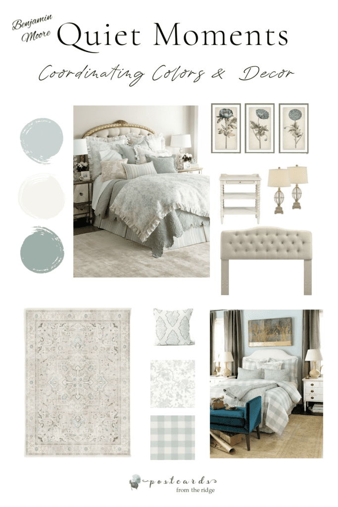
ruffled duvet cover // wall art // nightstand // lamps // tufted headboard // medallion throw pillow // area rug // buffalo check fabric // buffalo check bedding // Toile shams & bedskirt
Looking for an area rug to go with Quiet Moments? See my recommendations here: Area Rugs that go with Benjamin Moore Quiet Moments Paint
Tips for choosing your paint colors:
- Look for inspiration on pinterest, instagram, or in home magazines
- Once you’ve decided on the direction you want to go, narrow your choices down to 5 or less, ideally.
- Keep in mind that paint colors will look more intense on your walls than they do on paint color strips with multiple shades.
- Look at the color you’re considering in the room that you will be painting, not outside in the bright sun.
- See how the paint color looks in that room during different lighting situations…on a sunny day, on a cloudy day, with and without the lights on, and at night. They look different in each of these situations.
- I strongly recommend getting a color tester sample and painting areas of the room (next to the trim) or by using a peel and stick paint samples. You can get one here:
Benjamin Moore Quiet Moments Peel and Stick Paint Sample
What rooms look good painted with Benjamin Moore Quiet Moments?
With its subtle undertones, Quiet Moments can be used in any room in your home, but it looks especially nice in bedrooms and bathrooms.
It has a calming, peaceful vibe that can provide a spa-like atmosphere which is perfect for those areas.
Here are a few beautiful rooms to inspire you.
Charming Cottage Bedroom Painted with Quiet Moments
I adore this charming cottage bedroom from patina and pearl. The soft colors on the bedding and furniture combined with the warm wood floors and woven basket make this such a dreamy bedroom.
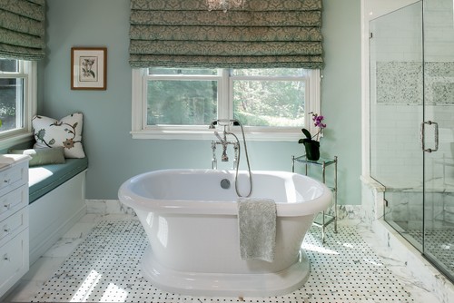
Bathroom painted with Quiet Moments from Benjamin Moore
In this classically styled bathroom, the Quiet Moments paint color beautifully complements the Carrera marble and white porcelain elements.
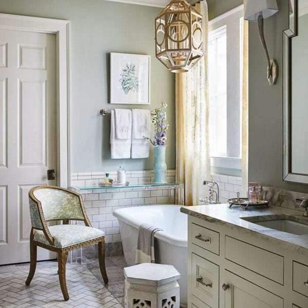
It works nicely with the gray undertones as well as the warmer ones in the draperies. And the nickel cabinet hardware and towel bars look perfect with it.
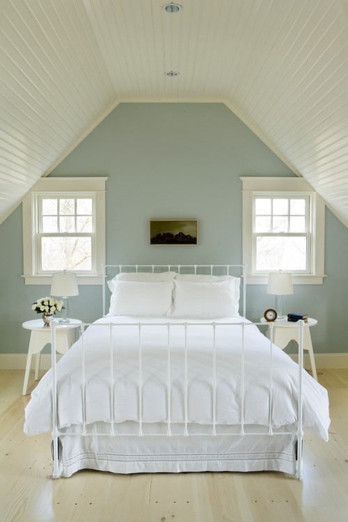
Traditional Bedroom Painted with Quiet Moments
Quiet Moments is a great paint color choice for bedrooms. In the above room, the wood tones, fabrics, and trim all work together beautifully to create a calming, serene space that’s very desirable in any bedroom.
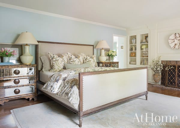
Above: Design by Brittany Nixon Brun, Brittany Nixon Creative. Paint color: Benjamin Moore’s “Quiet Moments.” Photo by Rett Peek
Cottage Style Bedroom painted with Benjamin Moore Quiet Moments
In this more casual bedroom, the warm wood tones, white trim, and gray accents have a classic look that will never go out of style. It’s fresh and relaxing and looks like the perfect place to unwind after a long day.
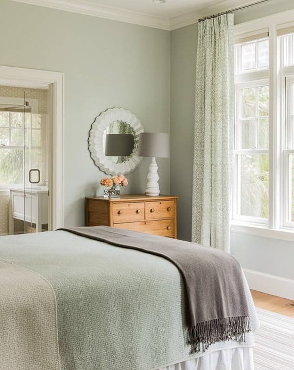
houzz – Elms Interior Design
For more bedroom color ideas, visit this post: 14 Popular Bedroom Colors Shown in Real Rooms
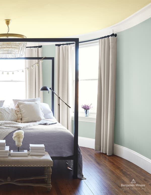
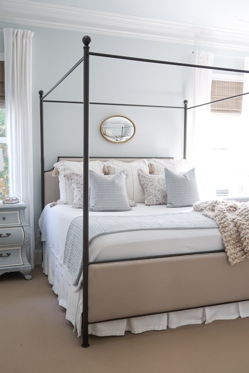
Spa-like Bedroom in Benjamin Moore Quiet Moments Paint Color
In this image, you can see how the paint looks lighter on a bright and sunny day. It still looks beautiful and the accents are perfect with the color.
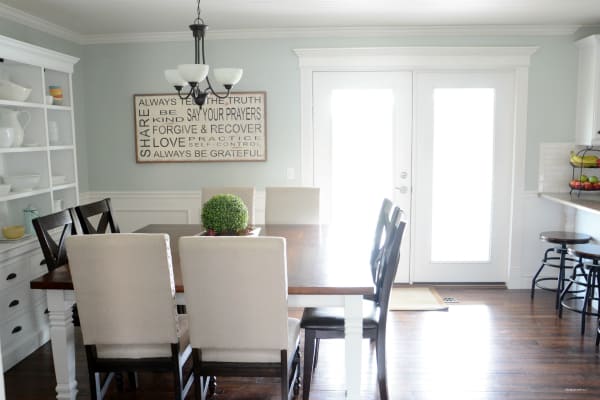
Dining Room Painted with Benjamin Moore Quiet Moments
Give your dining room a classic and elegant aura by painting the walls with Quiet Moments. It works for all seasons and with any design style.

Luxurious Bathroom in Benjamin Moore Quiet Moments
For a refreshing bathroom, Quiet Moments is a great paint color choice. It’s soft and elegant and looks wonderful with the crisp white trim paint and bathtub.
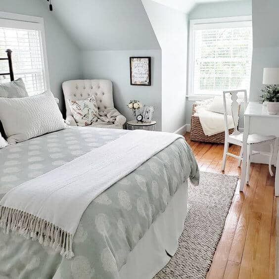
Benjamin Moore Quiet Moments in Farmhouse Bedroom
Who doesn’t want Quiet Moments in the bedroom? It pairs nicely with the cottage-y whites in this serene room. See more bedroom paint color ideas here: Best Bedroom Paint Colors
Contemporary Bedroom by Middletown Design-Build Firms Aquidneck Properties
Dining Room with Benjamin Moore Quiet Moments
The Quiet Moment walls are the perfect complement to the warm wood floors and white trim in this remodeled kitchen and eating area from The Idea Room.
Sophisticated Living Room painted with Benjamin Moore Quiet Moments
In this living room it takes on a more sophisticated look with the black piano and sleek furnishings.
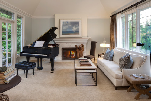
Traditional Living Room by Woodinville Interior Designers & Decorators Interiors
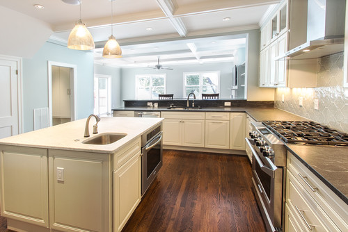
Benjamin Moore Quiet Moments in a Traditional Kitchen
This traditional kitchen is gorgeous. I love the dark wood floors and the Moroccan looking tiles on the back-splash.
The Quiet Moments doesn’t overwhelm the room but instead makes a nice subtle backdrop for all of the other items in the space.
Porch Ceiling Painted with Benjamin Moore Quiet Moments
I want to be sitting here, drinking my coffee in the morning…or maybe my wine in the evening. The Quiet Moments on the ceiling is reminiscent of an old Southern farmhouse.
The whole porch is just lovely!
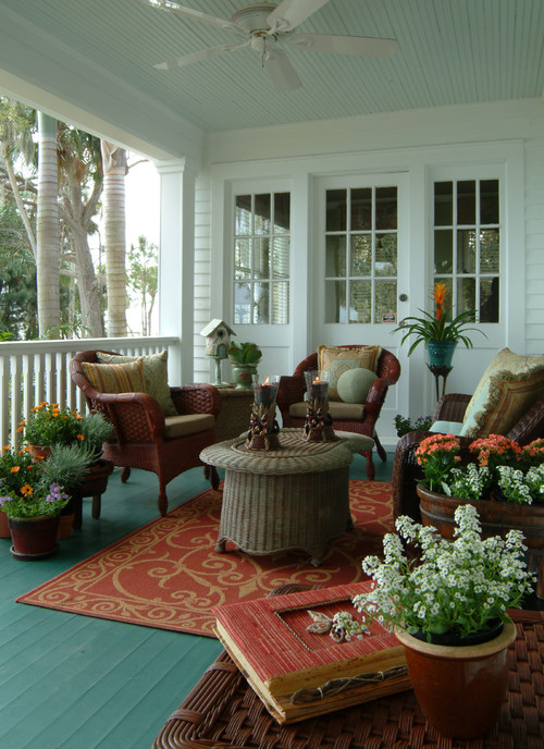
Eclectic Porch by Merritt Island Interior Designers & Decorators Island Paint and Decorating
Retro Kitchen in Benjamin Moore Quiet Moments
This kitchen is such a fun and lively space with the mint green, vintage-looking stove. And the orange lights add just the right pop of color.
Again, the Quiet Moments is a nice subtle backdrop for everything else going on in the space.
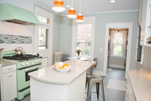
Eclectic Kitchen by Frederick Interior Designers & Decorators Meredith Ericksen
What colors are similar to Quiet Moments?
If Quiet Moments is close but not quite what you need, these are the closest ones:
What colors coordinate with Quiet Moments?
What trim color goes with Quiet Moments?
I often get emails from readers wanting to know what trim colors work with various wall paint colors. There are so many nice white paint colors to use with it. Here are my favorite trim colors to use with Quiet Moments:
What are some complementary colors that work with Quiet Moments?
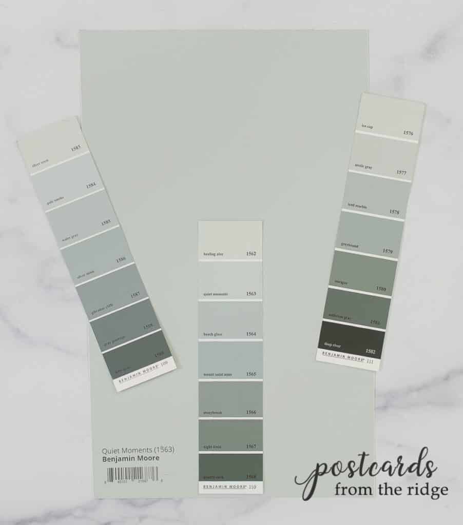
I’ve had so many people ask me about this that I got out all of my Benjamin Moore paint color fan decks and curated some coordinating colors for Quiet Moments.
I looked at my large samples and narrowed it down from dozens of choices to the best ones.

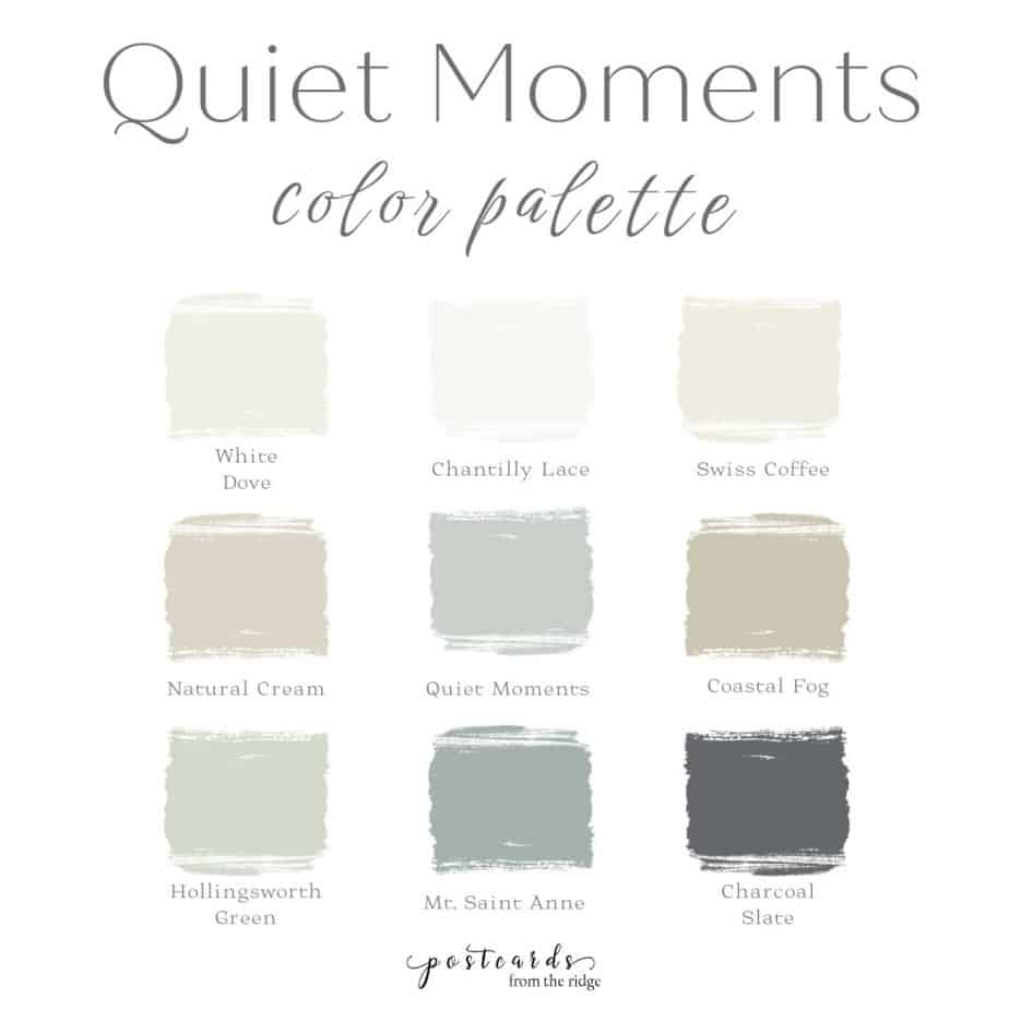
Here’s a breakdown of the colors on this Quiet Moments color palette:
- Top row: three whites that would work beautifully as trim or cabinet colors
- Middle row: Quiet Moments and two mid-tone neutrals that complement it
- Bottom row: a complementary gray-green, a darker shade of Quiet Moments, and a dark contrasting color that’s perfect for an accent color
You can grab a free downloadable copy of it when you subscribe to my newsletter at the bottom of this post. If you’re already a subscriber, check your latest email for the link and password to this and all my free printable color palettes and art.
And here’s an additional palette for you to use.
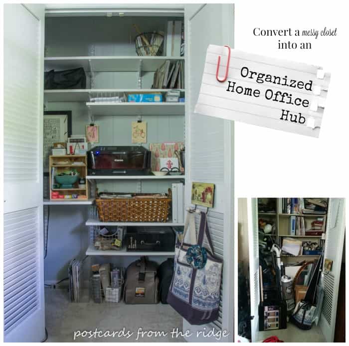
Last but not least, here it is used inside of our home office closet that we recently transformed. The trim color is Benjamin Moore Soft Chamois. You can go here to see more of that space.

TEST THE COLOR FIRST! As with any color, always try a sample first. And never choose a color based on a photo seen on a computer. Lighting and editing as well as screen setting in online images may make them appear different than they look in reality. Get a peel and stick sample of this color here: Benjamin Moore Quiet Moments Peel and Stick Paint Sample
So what do you think of this color? Would you use it in a bedroom, bathroom, kitchen, anywhere?
For more great paint color ideas plus tips for choosing them, visit these posts:
- NEW- 2023 Sherwin Williams Paint Color Forecast
- 2022 Benjamin Moore Paint Colors
- 2022 Sherwin Williams Paint Colors
- 2021 Benjamin Moore Paint Colors
- 2021 Sherwin Williams Paint Colors
- 2020 Benjamin Moore Paint Colors
- 2019 Benjamin Moore Paint Colors
- 2019 Sherwin Williams Paint Colors
- 16 Popular Bedroom Paint Colors from your Favorite Home bloggers
- 10 Wonderful White Rooms

Such a pretty color! I have a friend who is moving into a new home and all the walls are gray.
I love this color too! Is she keeping the walls gray or changing the color? Gray is so "in" these days!
It's beautiful. Seems very blue. I think I will consider it for my porch ceiling.
It looks gray on the color swatch, but the blue shows up when the walls are painted with it. It would be great for a porch ceiling!
Beautiful color. I really love that porch and how the color goes so.well with all the pieces!!!
I'm in Canada and cannot find either Quiet Moments OR colour #1563 in the Benjamin Moore fan deck. Please help.
Hi Sara,
Benjamin Moore has several color fan decks so it might not be on the one you're looking at. Quiet Moments is part of the Classic Color Collection Fan Deck. I hope that helps! ~ Angie
Hi Angie
Would this color do well in a north facing bedroom and east facing bathroom?
Would this color look good with charcoal buffalo check bedding?
I think it would look great with charcoal!
I love this color and your ideas for it. We have a similar color as spring and summer accents…linen chair covers in the kitchen, throws, pillows etc and in the master bedroom as well with bedding and a painted dresser, We even just painted the exterior of the house a version, a deeper one with ivory and black accents. Literally over 30 people have stopped and admired it. A great restful color.
This is my all-time favorite color! I’ve used it in two houses now and it looks wonderful, yet different, in every space. I just painted my dining room with it (lots of natural light), and I’m thinking of using it in my north-facing/dark master bedroom. It’s a fail-safe color!
I’m sure it’s beautiful in your dining room! And it’s a great color for creating a restful bedroom. Perfect in just about any room!
Hello,
Would Quiet Moments work on exterior of 100 year old house with white trim and a brown roof?
Thank you,
Laura
Hi Laura. I think it would, but I recommend trying a sample first to make sure it will give you the look you’re wanting.
I painted my small dining room in Quiet Moments plus the “music room” that opens up on the back of it ( think “not so great room”). Now I’m trying to decide on complimentary rugs. The furniture is a warm medium oak color. What would you suggest for the Dining Room rug? To give you an idea of size, the table is 48″ round. I love the color, I’m just not sure where to go with the accessories.
Hi Cindy. Thank you for your comment. I think your rug choice has a lot of variables. Do you need it to be washable? What are your accent colors (art, dishes, curtains, etc)? What color is your floor? Also, do you want a round, square or rectangular rug? Leave a comment with a few more specifics and I’ll try to recommend a rug for you!
The rug doesn’t need to be washable as I don’t have kids or pets but often have summer guests. Right now the rooms are more or less an open palette. I don’t have curtains yet, my dishes are white and besides the dining room table, a round table with a lamp, and a tall oak cabinet with glass doors, there is little else to determine how I decorate. The floors right now are 70’s wood parquet. I do have a walkway through to the music room that is tiled with flagstone but it is mostly covered by a rug that runs
green/blue that will be staying since it is new and looks very good with the new paint. I could use a rectangular rug in the music room and a 6 or 8′ round in the dining room. My house is a quaint Cape Cod (code for small rooms and low ceilings :0) I tend toward traditional or transitional but I’m open to new ideas.
Hi Cindy. Thanks for the details of the space. My last house was a quaint Cape Cod so I understand small rooms and low ceilings. Since Quiet Moments is in between blue, green, and gray, it might be hard to match it exactly so I recommend a rug that will complement it. I added more than a dozen rugs that will work with it to a collection that you can take a look at. They all either have a dash of that or a similar color, or have colors that complement it. Here’s the collection: https://www.amazon.com/shop/postcardsfromtheridge/list/5V0ZQST45KWA
Thank you so much for your assistance. I’ve ordered the Loloi II Jocelyn Collection JOC-03 Mist / Multi, Transitional 7′-10″ x 10′ Area Rug. My husband and I agree its the perfect rug for our space!
Hi Angie,
I’m having trouble finding a 7 ft round rug to put in the dining room, which is adjacent to the room where the Loloi II Jocelyn rug is. The walls in both rooms are Quiet Moments. Can you help me?
Hi Cindy. I’ve been super busy with the blog and local consultations. If you want me to do a custom search for you it would be considered a design consultation due to the amount of time that it takes to find specific design items.
Email me directly at postcardsfromtheridge@gmail.com it you want to set this up. Thank you!