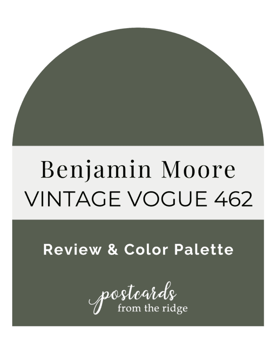
Benjamin Moore Vintage Vogue 462 Ultimate Review & Color Palette
Benjamin Moore Vintage Vogue 462 is a gorgeous dark green paint color that’s currently trending. We’ll take a look at it in real homes and learn which colors to pair with it here today.
This post contains affiliate links for your convenience. I may make a small commission on products purchased with my link, but your price does not change. For full disclosure go here: Disclosure and Policies. Thank you for supporting my site.
Benjamin Moore Vintage Vogue 462
Dark green paint colors are trending but are also actually quite timeless. They look perfect in new builds, remodels, and centuries-old homes. Today we’re exploring the popular Vintage Vogue from Benjamin Moore in the latest from my favorite paint color series.
What color is Benjamin Moore Vintage Vogue?
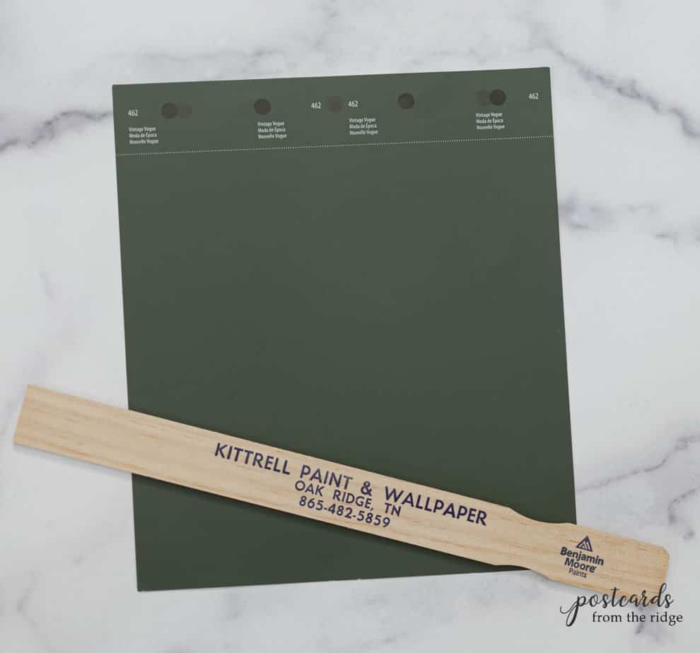
Vintage Vogue 462 is a deep, earthy, sage green with hints of black and brown. It’s less saturated than some dark green colors and will give your space a cozy and rich feeling.
Undertones of Vintage Vogue
You’ll see black and a bit of brown undertones but it’s definitely a green color. Tints/colorants used to make this color are green, black, and oxide yellow and maybe even a drop or two of orange to neutralize the green a bit.
Vintage Vogue LRV
WHAT’S LRV? All paint colors are rated with a number from 0 to 100 indicating the amount of light that reflects from them. Colors with low numbers reflect less light, making them appear darker. And colors with high numbers reflect more light, giving them a lighter appearance.
Vintage Vogue 642 has a light reflective value of 11.85, indicating that it’s a very dark color as you can plainly see.

Best Places to Use Vintage Vogue
No room is off limits when it comes to this color. But it looks especially nice on kitchen cabinets, built-ins, and living rooms.
It could appear more black in rooms that don’t get much natural light. So if you use it in a room that faces north or east, be sure to have sufficient lighting. And always test the color in the actual room that it will be used. Get samples here: Peel and Stick Vintage Vogue Sample, 8 oz Sample Paint Pot Benjamin Moore Vintage Vogue
What Colors go with Benjamin Moore Vintage Vogue?
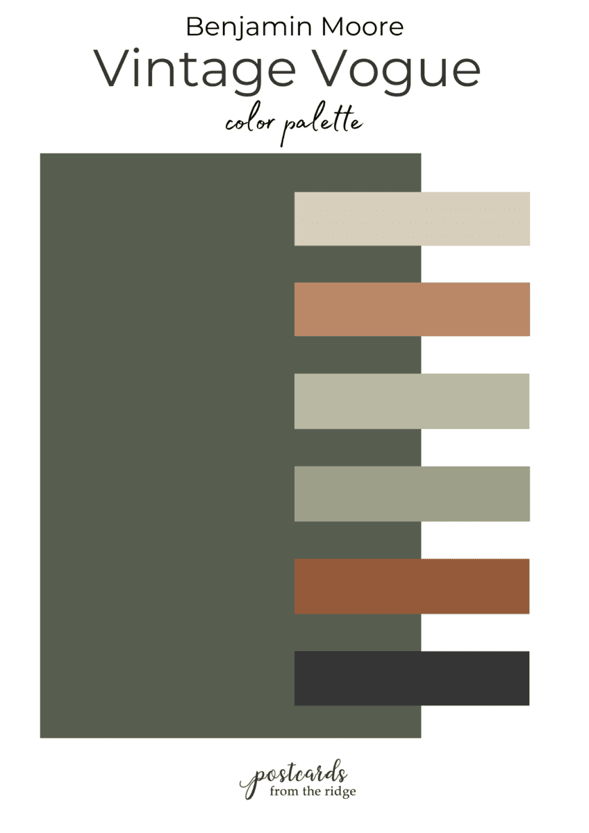
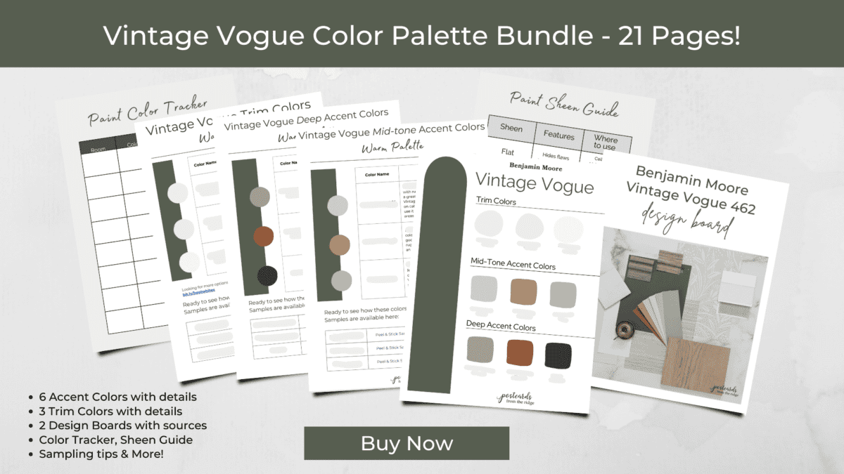
Warm earthy colors look amazing with Vintage Vogue. Clay, sage green, and slightly warm neutrals all work well with it. Pair it with brass or copper and warm natural wood tones. Get all the color names, numbers, and so much more in my color palette bundle here: Vintage Vogue Color Palette Bundle

Shop this look: tile // bamboo window shades (samples shown are Kula Sandy Beach and Barcelona Moss) // leaf wallpaper // faux grasscloth wallpaper // light fabric // linen fabric items (flax color) // white oak wood floor

Best trim colors to use with Vintage Vogue
You can use several different trim colors with Vintage Vogue depending on the look you’re trying to achieve. For a rich, elegant style, simply paint the trim the same color.
If you like contrasting trim, here are my recommendations:
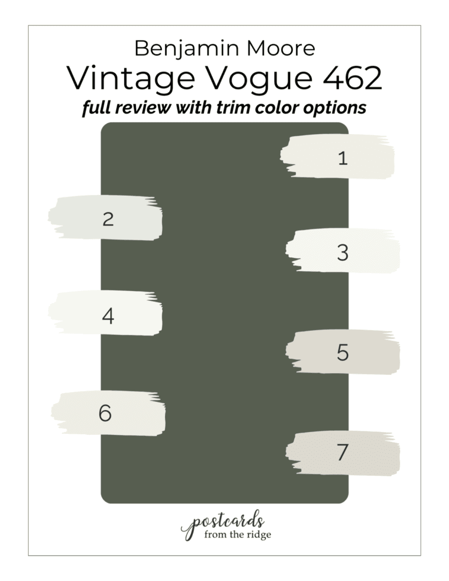
Key: 1- White Dove, 2 – White Wisp , 3 – Simply White, 4 – Chantilly Lace, 5 – Pale Oak, 6 – Swiss Coffee, 7 – Light Pewter
Vintage Vogue compared to other popular dark green paint colors
Vintage Vogue is one of several popular dark green paint colors. Let’s compare it to some others that are currently trending.
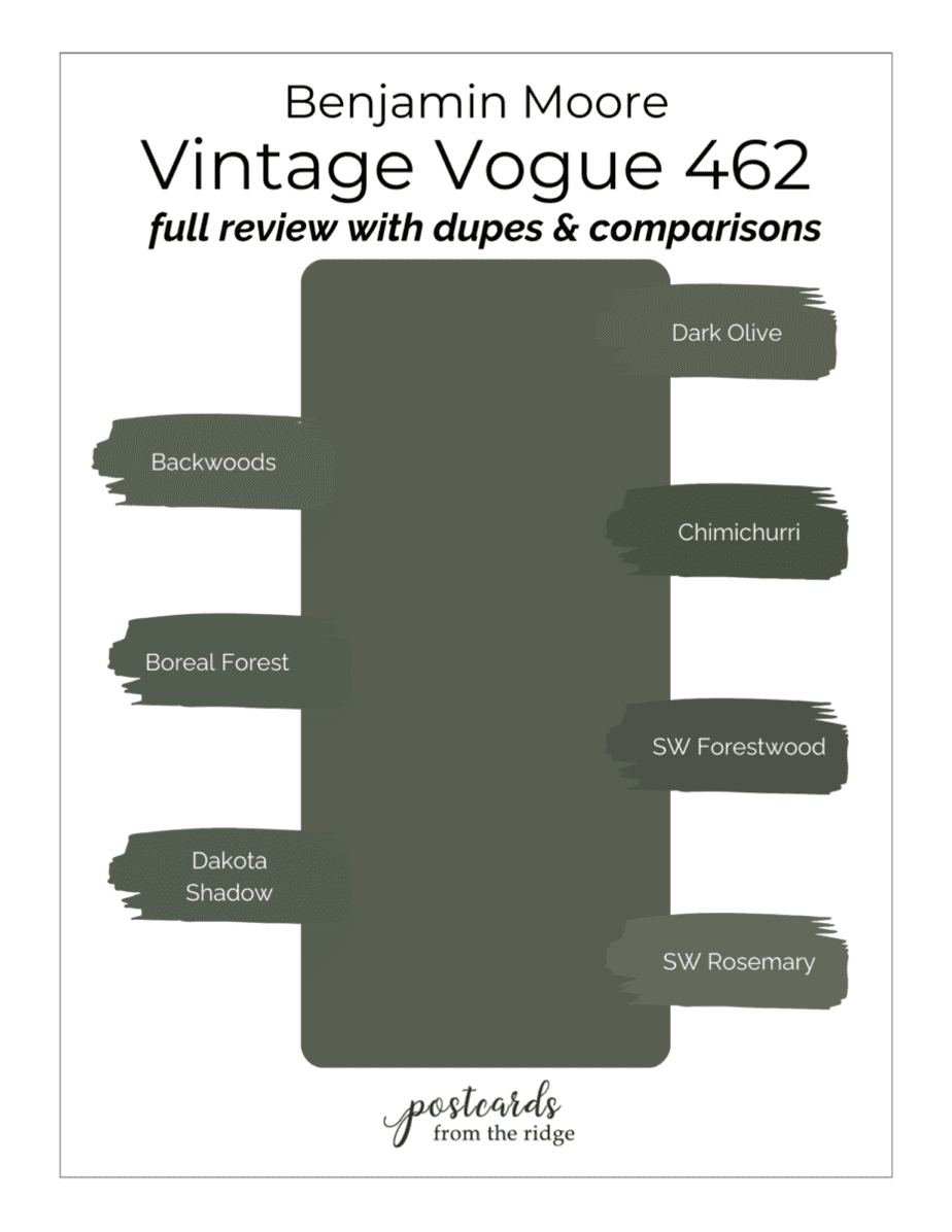
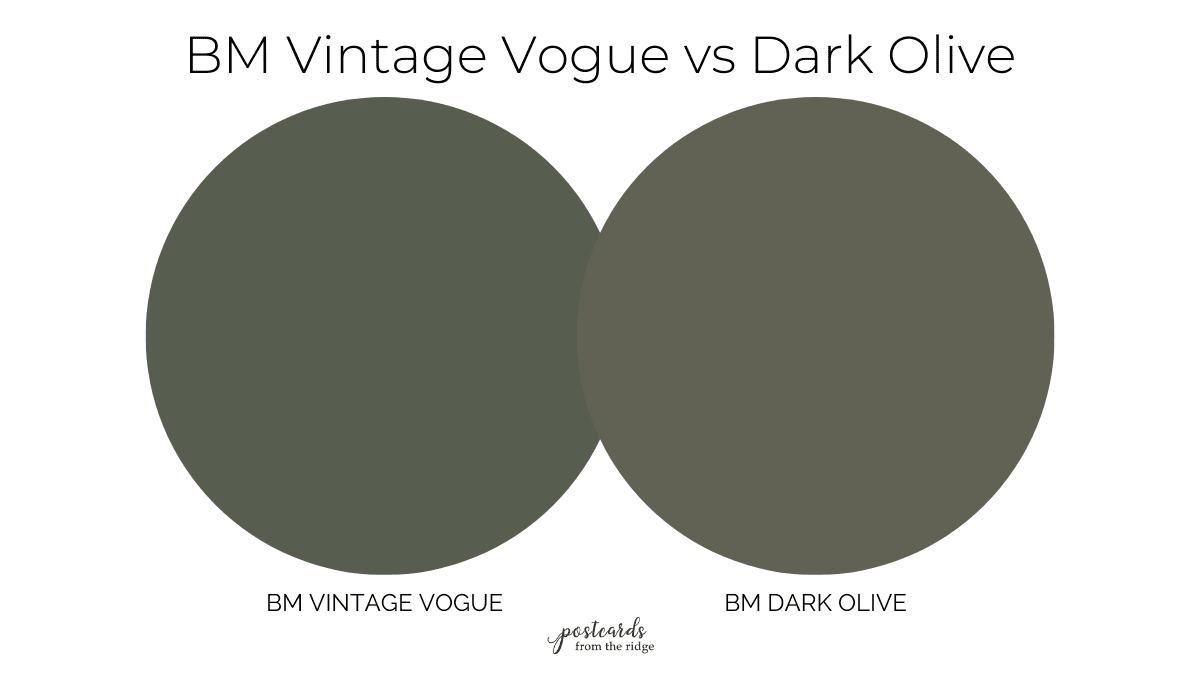
BM Dark Olive vs Vintage Vogue
Both Dark Olive and Vintage Vogue are softer than other dark green colors. Dark Olive has a bit more brown undertones and is slightly lighter than Vintage Vogue.

| Compared to Dark Olive | LRV | Undertones |
| Vintage Vogue | 11.85 | gray, brown, slight yellow |
| Dark Olive | 13.52 | gray, brown |
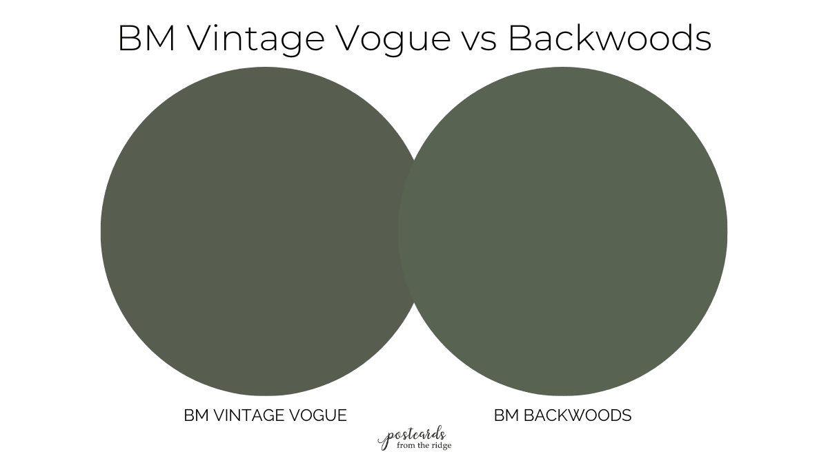
Benjamin Moore Backwoods vs Vintage Vogue
Backwoods 469 is another uber popular dark green paint color. It’s lighter and not quite as brown as Vintage Vogue. But it will give a similar appearance overall. If your room doesn’t get a lot of natural light, this might be a good option for you.
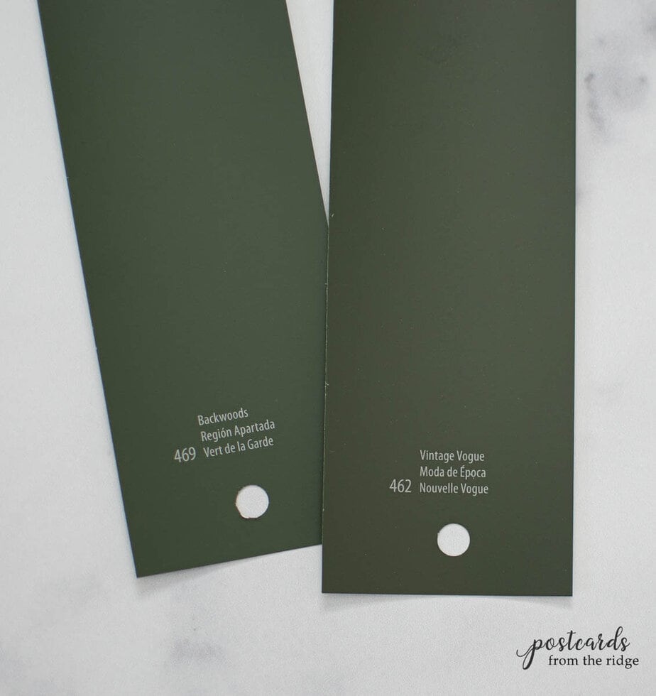
| Compared to Backwoods | LRV | Undertones |
| Vintage Vogue | 11.85 | gray, brown, slight yellow |
| Backwoods | 12.68 | green, slight gray |
Vintage Vogue vs Boreal Forest
Boreal Forest AF-480 is from the Affinity color collection and is slightly lighter than Vintage Vogue. It has similar gray undertones, but isn’t quite as brown as Vintage Vogue. You’ll get a similar look from either color.
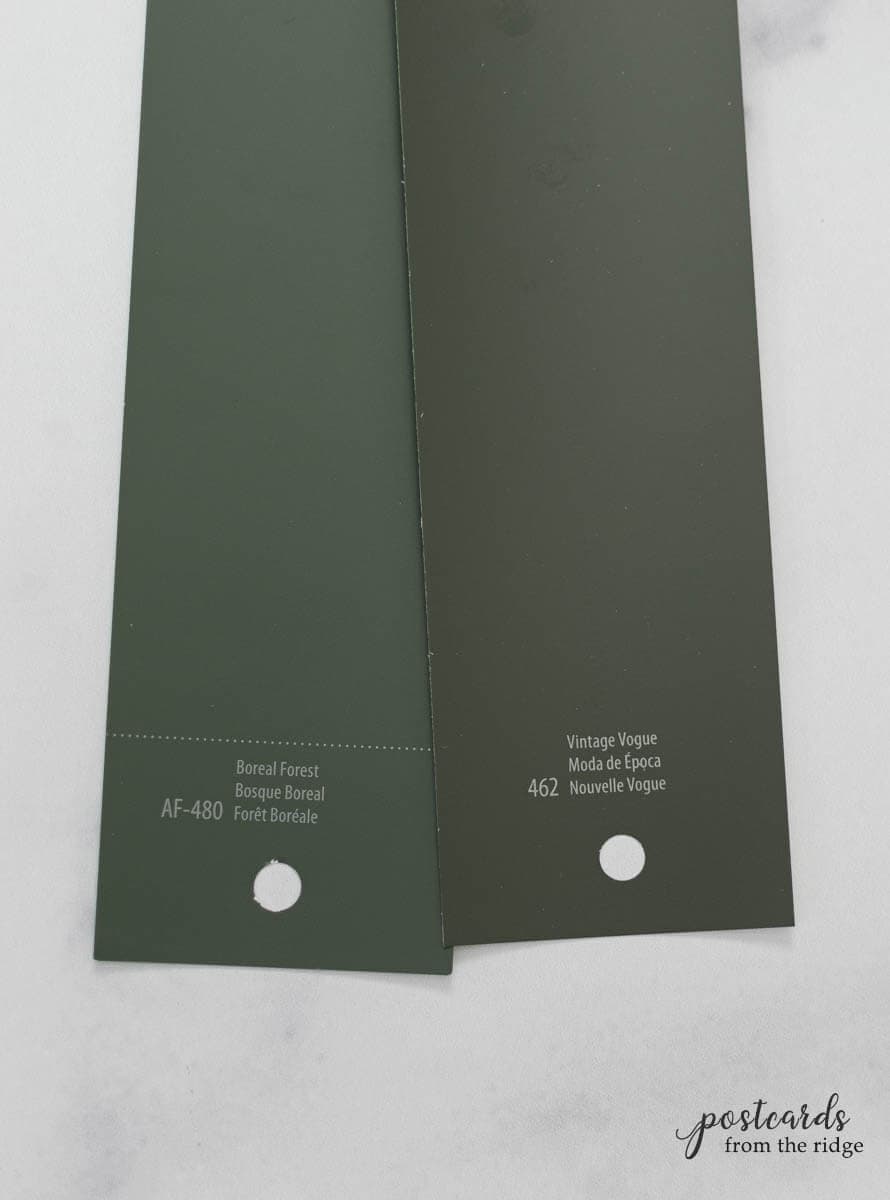
| Compared to Boreal Forest | LRV | Undertones |
| Vintage Vogue | 11.85 | gray, brown, slight yellow |
| Boreal Forest | 12.17 | black, slight blue |

Vintage Vogue vs Dakota Shadow
Dakota Shadow 448 is also a bit lighter than Vintage Vogue and has less brown undertones. It has a bit of gray and blue in it and slightly cooler than Vintage Vogue.

| Compared to Dakota Shadow | LRV | Undertones |
| Vintage Vogue | 11.85 | gray, brown, slight yellow |
| Dakota Shadow | 11.6 | gray, slight blue |

Vintage Vogue vs Chimichurri
Chimichurri CSP-810 is from the Color Stories collection and is actually darker than Vintage Vogue. It has an almost black appearance with strong black undertones.
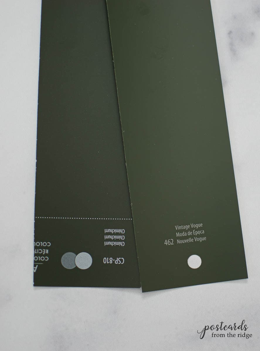
| Compared to Chimichurri | LRV | Undertones |
| Vintage Vogue | 11.85 | gray, brown, slight yellow |
| Chimichurri | 9.7 | brown, black |

Vintage Vogue vs Hunter Green
Hunter Green has strong blue undertones and is darker than Vintage Vogue. It’s also much more saturated and vibrant than Vintage Vogue.

| Compared to Hunter Green | LRV | Undertones |
| Vintage Vogue | 11.85 | gray, brown, slight yellow |
| Hunter Green | 6.39 | black, blue |

Sherwin Williams Closest Match to Vintage Vogue
Although you’ll get the most accurate color from Benjamin Moore, there are a couple of very close colors from Sherwin Williams if you prefer that brand. It’s in between Pewter Green and Forestwood.
Vintage Vogue Seen in Real Rooms
We’ve seen how Vintage Vogue compares to similar colors and learned which colors look best with it. Now let’s see it in some real homes.
NOTE: As great and helpful as it is to see pictures of this or any paint color, you should always test it in your home before making your final decision. Colors often look slightly different in reality and you don’t want to be surprised. Find Vintage Vogue samples here: Peel and Stick Sample or 1/2 Pt. Sample Paint Pot
Vintage Vogue Kitchen Cabinets
Some of the most stunning, cozy kitchens have cabinets (or islands) painted with dark green paint. Add some brass cabinet hardware and white paint on the walls for a classic style that will never look dated.
Here’s a lovely kitchen in an English home with Vintage Vogue cabinets and white walls. Emma at The Trebleo Home has made it so beautiful with her accents, don’t you think? The natural wood tones, light counters and floors, and the pops of yellow are perfect. Wall color is Farrow & Ball Strong White.

Image courtesy of The Trebleo House
Paint the walls and cabinets in Vintage Vogue and the space will actually look larger. This kitchen from Metro Design Build has done that and it’s so beautiful. The brass accents and natural wood open shelves add warmth to the space.

Image courtesy of Metro Design Build
Or leave off upper cabinets and paint the cabinets and island with Vintage Vogue. The light upper walls give it a clean, modern look.
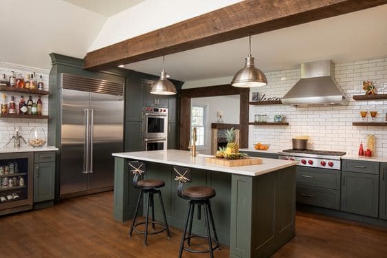
Image courtesy of Creative Design Construction
Benjamin Moore Vintage Vogue Walls
If you’re not sure about painting an entire room with Vintage Vogue, consider using it on an accent wall. Mark and Torrey Bishop did that in their updated office space and it looks amazing. The white desks, chairs, and shelving give a nice contrast to the dark green.

Image courtesy of Mark & Torrey Bishop
Vintage Vogue Living Room
Kate and Mark Shaw created a cozy living room by painting their walls Vintage Vogue. The warm wood floors and window shades and the white trim all work together to create a timeless space.
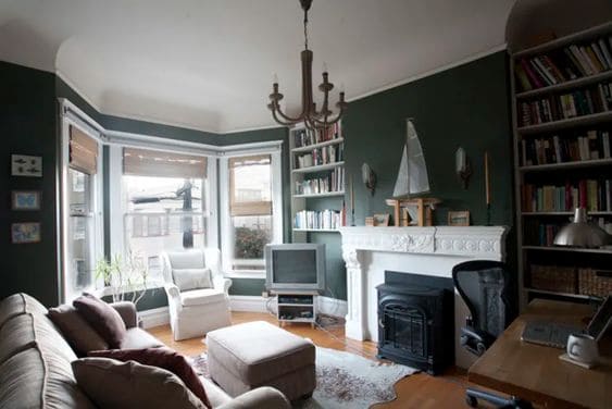
Image courtesy of Apartment Therapy
Vintage Vogue Built-ins
These built-in bookcases from Sarah at Thrifty Decor Chick are painted with Vintage Vogue and the look incredible. She added wallpaper to the back to keep it light, and the wood shelf and brass cabinet hardware give it a classic look that will never go out of style.

Image courtesy of Sarah at Thrifty Decor Chick
Vintage Vogue Entry
Here’s another classic space. The mudroom walls and ceiling are white and the Vintage Vogue cabinets really take the room to a new level. The brass lights and wood accents are perfect in here.

Image courtesy of Elliot Meyers Design
Vintage Vogue Kitchen Island
This light and airy kitchen got an infusion of color with the Vintage Vogue island. Again, the brass hardware looks perfect. The lighter cabinets are painted with Benjamin Moore Light Pewter

Image courtesy of Shere Kitchens
Vintage Vogue Exterior
Don’t limit the use of Vintage Vogue to interior use only. Make a statement on the outside of the house by painting it this color. It has a rustic, modern look, especially with the black trim and natural wood accents on this home by F.M. Studio, LLC.
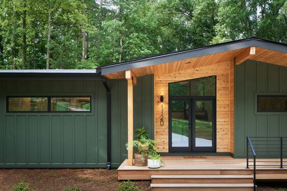
Image courtesy of F.M. Studio, LLC
Recap of Vintage Vogue
Now that you’ve seen Vintage Vogue used in real homes, what do you think?
It might be the right color for you if:
- You love dark, rich, earthy colors
- Your room gets a decent amount of natural light, or you have ample artificial light
- You’re looking for a color that’s timeless but also trending
Want more ideas for dark green paint colors? Visit this post: 10 Best Dark Green Paint Colors from Sherwin Williams
