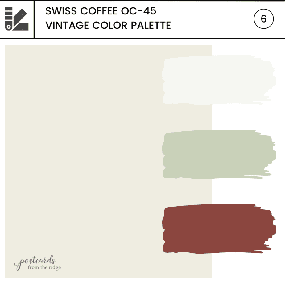
Benjamin Moore Swiss Coffee OC-45 Color Palettes and Review
If you’re on the hunt for a soft off white paint color then Benjamin Moore Swiss Coffee is definitely one that you should consider.
It’s part of the Off White Collection and is one of the 75 Favorite Paint Colors hand picked by experts at Benjamin Moore. .

This post contains affiliate links for your convenience. I may make a small commission on products purchased with my link, but your price does not change. For full disclosure go here: Disclosure and Policies. Thank you for supporting my site.
Benjamin Moore Swiss Coffee OC-45

Today we’ll be taking an in-depth look at this classic color. It’s one that I’ve recommended many times over the years and have used in my own home.
Last year I repainted our family room built-in bookcases with Swiss Coffee and here’s a peek at how they look now. You can see how nicely it goes with all the various colors of decor.

Swiss Coffee FAQ’s
What color is Benjamin Moore Swiss Coffee
Swiss Coffee is a warm off white color that will keep your space light but not stark and sterile, like some brighter whites could do. It’s a subtle, cozy white that has a softness to it.
Why is Swiss Coffee so popular?
Homeowners, designers, and painters love using Swiss Coffee because it’s a versatile off white that can be used with a broad spectrum of colors. Or it can stand on its own beautifully.
It’s consistently one of the most popular colors from Benjamin Moore.
Is Swiss Coffee warm or cool?
Swiss Coffee is a warmish neutral off white.
What are the undertones of Swiss Coffee?
Swiss Coffee has undertones of yellow, gray, orange, and green. When combined in the right formula, this mixture of undertones actually appears neutral. That’s usually the case with Swiss Coffee.
However, in rooms with low lighting it could potentially have a very slight warm green undertone. It definitely isn’t green, but when looking at the darker versions of it you can see more of the green undertones. Color always varies depending on what it’s next to, so if you have it next to warm beiges or pinks, you could possibly see the tiniest bit of green in it.
Does Swiss Coffee look yellow?
In certain situations it could possibly look yellow. For example, if it’s next to a color with mostly gray or blue undertones Swiss Coffee could take on a slightly creamy appearance.
Let’s look at it on a chart with some of the most popular white and off white paint colors from Benjamin Moore.
Swiss Coffee is circled in the chart below. You can see that it leans to the warmer side of the spectrum, but it looks more neutral than many of the others that have more green, blue, and yellow undertones.

Like any color, Swiss Coffee can appear different depending on the lighting conditions and what other colors are next to it. For example, our living room is painted with Benjamin Moore White Dove and our yard is full of large trees.
In the spring and summer, the green color on the leaves reflects into the room and gives the walls a greenish tint. In the fall, there’s a warmer glow.
This can also happen if your floors/rugs are cool or warm. And your furniture can also reflect color onto the walls.
That’s why it’s crucial to test any paint color in the room that it will be used in and with all other colors that will be with it.
What is the LRV of Swiss Coffee
On a scale of 1 to 100, with 100 being the lightest, Swiss Coffee has a Light Reflective Value of 81.91. It’s very light but not quite white.

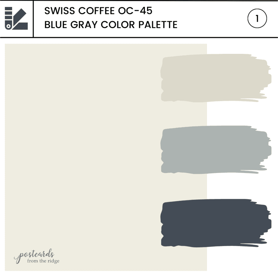
What are the lighter and darker shades of Swiss Coffee ?
Using lighter and darker colors is a great palette for an entire home. It will give you a clean and minimalistic look. Here’s a recommended palette for that look:
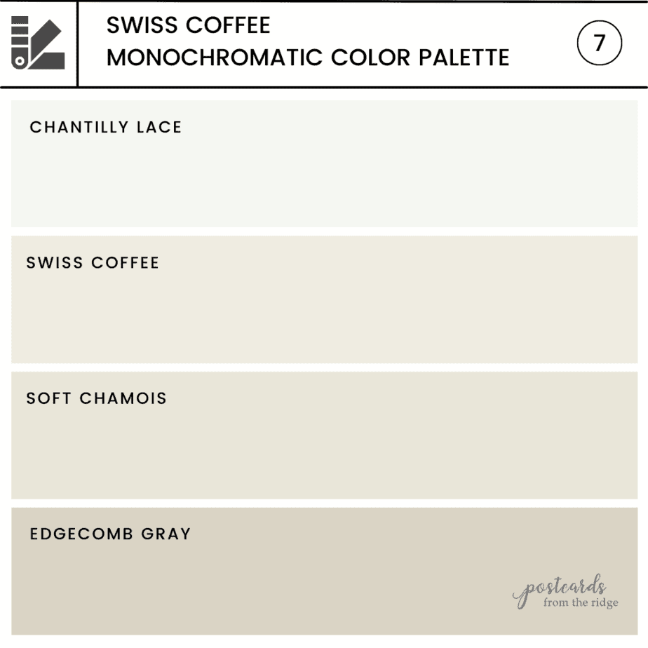
What whites and off whites go with Benjamin Moore Swiss Coffee?
Many people use Swiss Coffee for both walls and trim and it looks beautiful. But there are several good options if you prefer a lighter, whiter color for your trim. These are my favorites:
- Simply White
- Chantilly Lace
- Super White
Let’s take a look at them.
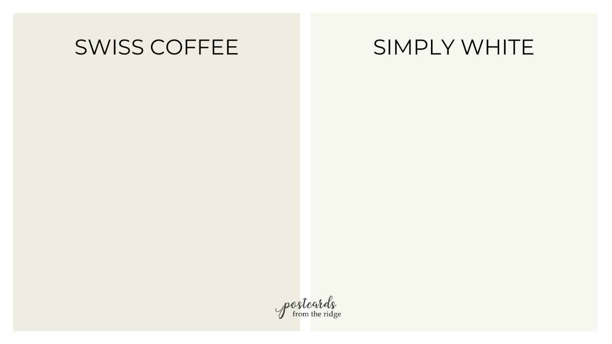
Swiss Coffee vs Simply White
Simply White is lighter and a tiny bit creamier than Swiss Coffee. It has a LRV of 91.7 compared to 81.91 for Swiss Coffee. It could be used as a trim color but might not be the absolute best choice.
| Swiss Coffee | Simply White | |
|---|---|---|
| LRV | 81.91 | 91.7 |
| Undertones | yellow, slight green | yellow |
| Warm, Cool, or Neutral | warm to neutral | warm |
Swiss Coffee vs Chantilly Lace

Chantilly Lace has an LRV of 90.04 is noticeably lighter than Swiss Coffee. It’s fairly neutral as far as undertones and would definitely be a good choice for a trim color with Swiss Coffee.
| Swiss Coffee | Chantilly Lace | |
|---|---|---|
| LRV | 81.91 | 90.04 |
| Undertones | yellow, slight green | neutral |
| Warm, Cool, or Neutral | warm to neutral | neutral |

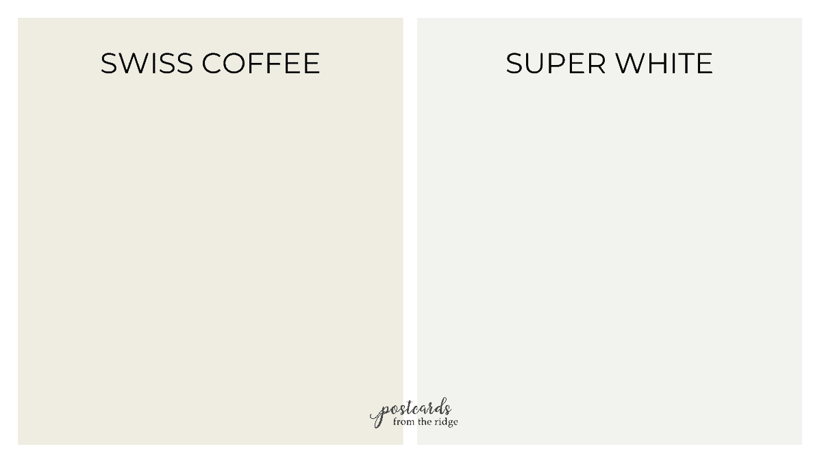
Swiss Coffee vs Super White
Super White is slightly cooler than Swiss Coffee but could they could still be used together. It has an LRV of 87.36 compared to the 81.91 for Swiss Coffee so there’s definitely enough difference for a nice contrast.
| Swiss Coffee | Super White | |
|---|---|---|
| LRV | 81.91 | 87.36 |
| Undertones | yellow, slight green | neutral, gray |
| Warm, Cool, or Neutral | warm to neutral | cool to neutral |
What are the best darker contrasting trim colors for Swiss Coffee?
One of the current trends from painting rooms is using a darker, contrasting trim color with light walls. You’ll want to choose a trim color that’s at least 2 shades darker than your wall color so you’ll have a noticeable contrast.
If you choose a color that’s too close, it will look like you tried to match the wall color but missed. And that’s not a good look.
Here are the best options for contrasting trim colors for Swiss Coffee.
- Natural Cream
- Pale Oak
- Edgecomb Gray – full color review here >> Edgecomb Gray Review & Color Palettes
- Collingwood
- Balboa Mist
- Revere Pewter – Full review here >> Revere Pewter Best Uses and Color Palettes

Swiss Coffee and Pale Oak

One of the most popular trim colors to use with Swiss Coffee if you want a contrasting color is Pale Oak.
It’s a warm gray and has just enough contrast to highlight your trim. But it’s not a stark contrast.
| Swiss Coffee OC-45 | Pale Oak OC-20 | |
|---|---|---|
| LRV | 81.91 | 68.64 |
| Undertones | yellow, slight green | gray, blue, purple |
| Warm, Cool, or Neutral | warm to neutral | neutral to warm |

Note: A satin or semi-gloss finish is usually best for trim, cabinets, and built-in bookcases.
What colors are similar to Swiss Coffee
If you’re unsure whether Swiss Coffee is right for your space then it might be helpful to look at how it compares to other whites. Let’s compare.
Swiss Coffee vs White Dove

One of the top selling colors from Benjamin Moore is White Dove OC-17. Although it’s very similar to Swiss Coffee, it’s slightly more neutral.
The LRV of White Dove is 85 which makes it just a tad lighter than Swiss Coffee.
| Swiss Coffee | White Dove | |
|---|---|---|
| LRV | 81.91 | 85 |
| Undertones | yellow, slight green | soft cream |
| Warm, Cool, or Neutral | warm to neutral | neutral to warm |

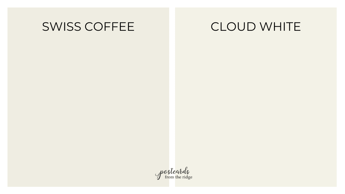
Swiss Coffee vs Cloud White
| Swiss Coffee | Cloud White | |
|---|---|---|
| LRV | 81.91 | 85.05 |
| Undertones | yellow, slight green | soft creamy yellow |
| Warm, Cool, or Neutral | warm to neutral | warm to neutral |
What’s the Sherwin Williams equivalent to Swiss Coffee?
If you or your painter prefer using Sherwin Williams, there are a couple of colors that are almost identical to Swiss Coffee.
You could also have it color matched, but it could still be slightly different. If you want any particular color it’s always the most accurate if you purchase it from the brand that developed it.
Swiss Coffee vs Alabaster
Sherwin Williams Alabaster is one of their top 50 colors and is a perennial favorite. Like Swiss Coffee, it’s a warm off white that works in most settings.
You can see below that they are extremely close in color. They have virtually the same LRV and the undertones are almost identical.

| Swiss Coffee | Alabaster | |
|---|---|---|
| LRV | 81.91 | 82 |
| Undertones | yellow, slight green | yellow |
| Warm, Cool, or Neutral | warm to neutral | warm to neutral |

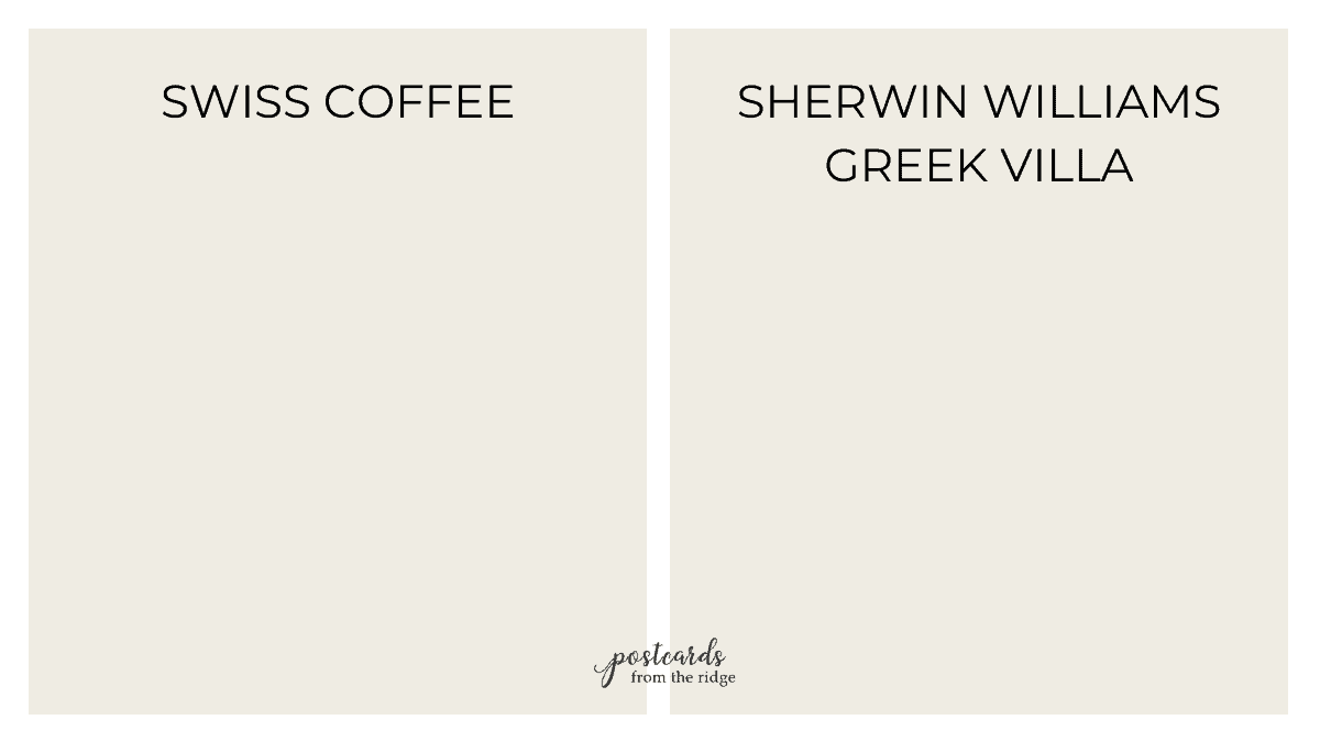
Swiss Coffee vs Greek Villa
Greek Villa is another great alternative to Swiss Coffee. It’s the tiniest bit lighter but has similar warm undertones.
It’s also one of the top 50 colors from Sherwin Williams.

| Swiss Coffee | Greek Villa | |
|---|---|---|
| LRV | 81.91 | 84 |
| Undertones | yellow, slight green | yellow |
| Warm, Cool, or Neutral | warm to neutral | warm to neutral |
What colors coordinate with Swiss Coffee?
Since Swiss Coffee is such a versatile color you can use many different colors with it. These are a few that I recommend:
- Boothbay Gray
- Hale Navy
- Beach Glass
- Sagebrush or various sage green colors
- Midsummer Night
- Tarrytown Green
- Ashwood

One of the best combinations is with blues and natural elements.

Shop this look: Floral Wallpaper // Woven bamboo window shade // Blue floral fabric // Ivory linen fabric curtains. Blue accent color: HC-159 Philipsburg Blue
Here are several more ideas for Swiss Coffee color palettes. All of these are exclusive and available to download and print when you subscribe to my newsletter at the bottom of this post.
Warm grays, blue grays, and navy blues paired with Swiss Coffee gives a classic look to any space.
If you’re using Swiss Coffee in a nursery or child’s room, or if you just happen to like pastel colors. use a soft rose or subtle pale blue gray.

Sage green colors and dark bronze pair beautifully with Swiss Coffee.

Bold colors like dark teal, deep bronze, and russet look amazing with Swiss Coffee.

Sage green colors and clay accents pair beautifully with Swiss Coffee.

For a vintage vibe, pair it with a jade green and barn red color.
Paint like a pro
See what the pros use for a beautiful paint finish in my Painter’s Toolbox Collection.
How to use Swiss Coffee
Swiss Coffee is such a versatile color. It looks best in rooms that face west and south. And these are all of the places it can be used:
- Walls
- Trim
- Doors
- Built-ins
- Cabinets
- Ceilings
- Exterior
It’s neutral enough to be used in any room. Let’s take a look at some rooms painted with it to get an idea of how it looks.
Real Rooms painted with Benjamin Moore Swiss Coffee
Swiss Coffee Bathroom walls
This bathroom from Juniper Hills Farmhouse has Swiss Coffee walls paired with natural wood elements. The soft warm grays in the floor and counter tops look perfect with the walls.

Swiss Coffee dining room
As mentioned earlier, Swiss Coffee looks amazing when paired with a medium or darker neutral shade.
This dining room from Camp Aldous features Swiss Coffee above and Stone Hearth below the chair rail. It’s such a cozy space with the warm wood furniture and floors.

Tips for choosing paint colors
Read my tips for finding the right paint color here: How To Choose the Right Paint Color
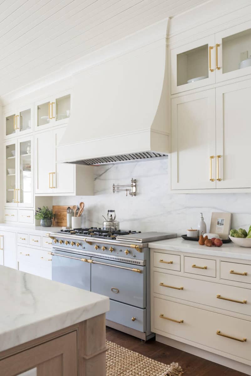
Swiss Coffee Kitchen Cabinets
If you like light cabinets but don’t want a stark white, Swiss Coffee might be the perfect choice for you.
These kitchen cabinets from McGee & Co are painted with Swiss Coffee and feature gorgeous unlacquered brass handles and a stunning blue French range.
This kitchen also has Swiss Coffee cabinets. The gray and white counters look great and the polished chrome pendant lights give it a more modern feeling.
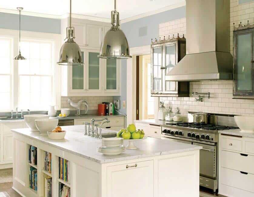
Cabinet color Swiss Coffee, Wall color Yarmouth Blue
Swiss Coffee Entry
If you want your entry to be light but still cozy and welcoming, paint it with Swiss Coffee. This one is fresh but not sterile.
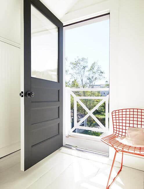
Door Color: Iron Mountain
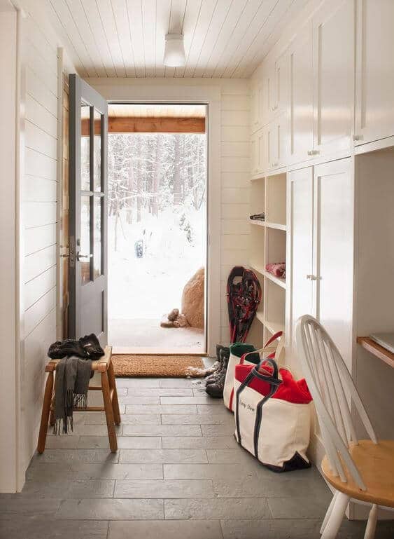
Swiss Coffee Mudroom with shiplap walls
This mudroom from Whitten Architects looks so fresh with the Swiss Coffee walls, cabinets, and ceiling. The slate floor tiles contrast beautifully with the soft, warm walls.
Swiss Coffee Bedroom
The Swiss Coffee walls in this bedroom keep it light and refreshing without making it cold or sterile. The blue bed and ceiling really add a punch of personality in this room.

Ceiling color: Smoke
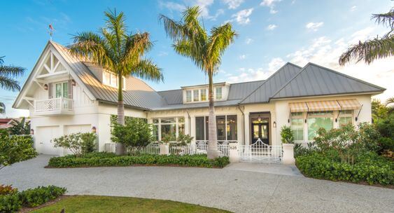
Swiss Coffee Exteriors
This charming Cape Cod home by Tim Barber Architects is painted with Swiss Coffee and looks so lovely. The black front door and copper gutters give it a timeless look.

Isn’t this beach home from Nautilus Homes gorgeous? The Swiss Coffee paint gives is a storybook cottage look. Shutter color is Benjamin Moore Silver Fox.
Recap
In summary, Swiss Coffee is a good choice if you’re looking for a paint color that’s soft and light but not a stark white. It’s not a beige or greige, but also not a crisp white. It’s somewhere in between.
Here are the main things to know about Swiss Coffee:
- It’s one of the most popular colors from Benjamin Moore
- The LRV, or light reflective value, is 81.91
- It’s a warm off white
- You can use it in any room but it looks especially nice in those that face west and south
- It’s perfect for walls, trim, doors, cabinets, built-ins, and exterior surfaces
- Almost any color pairs with it
Try a sample
Are you ready to see how Swiss Coffee looks in your home? I strongly recommend trying a sample before purchasing a gallon of paint. Samplize peel and stick samples are painted with 2 coats of real paint and are super easy to use. Get one here: Swiss Coffee Peel and Stick Paint
Or you can get a sample size pot of paint from Benjamin Moore and and paint a decent sized area of your wall. Get one here: Benjamin Moore Sample Paint Pots
More paint color reviews and inspiration
Visit these posts for more in-depth reviews and color palettes of popular paint colors:
- Benjamin Moore White Dove
- Benjamin Moore Pale Oak
- Sherwin Williams Alabaster
- Sherwin Williams Shoji White
- 25 Best Sage Green Paint Colors
- Sherwin Williams Agreeable Gray
- Benjamin Moore Edgecomb Gray
- Benjamin Moore Revere Pewter
- Benjamin Moore Simply White

Hello from Georgia! I subscribed to your
website in hopes of finding the color
palette for Swiss Coffee, but it just takes
me back to the original site about the
Paint. Where do I find the names of the
Color palette paints?
Thank you, and I am glad I found you!
Hi Leslie. In your subscriber welcome email, there should be a link and password that takes you to the color palette and printable art library. You can click on any of the images and go to the downloadable versions of them. If you don’t see the welcome email, check your spam/junk folder. I hope that helps!