
Benjamin Moore Pale Oak OC-20 Review and Color Palette
Are you looking for a versatile, fresh, neutral paint color? There are hundreds of options and today we’re taking an in-depth look into one of the best, Benjamin Moore Pale Oak.

This post contains affiliate links for your convenience. I may make a small commission on products purchased with my link, but your price does not change. For full disclosure go here: Disclosure and Policies. Thank you for supporting my site.
All about Pale Oak OC-20
Hey there! Are you in search of a good light neutral paint color for your home? The quest for the right color can be maddening but hopefully today’s post will help narrow it down for you just a bit.
Pale Oak from Benjamin Moore is one of those can’t-go-wrong colors that’s a favorite and we’re covering all there is to know about it. So grab a seat and get ready to learn everything concerning this popular color.
tell me what you want
Request a Color Palette
Is there a paint color that you need help finding colors to coordinate with? My new site, Decorate With Ease, has a growing collection of meticulously curated color palettes (and much more) that’s being added to each week. I would love to know what you need help with. Send me your request and it might be the next color palette that I create.
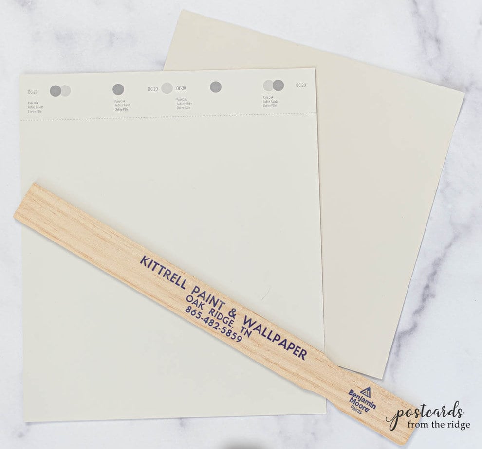
What color is Pale Oak OC-20?
Pale Oak OC-20 (aka 858) is a lovely light greige paint color that’s one of Benjamin Moore’s best selling colors and is popular with designers, painters, and homeowners. It’s a mixture of red, blue, and yellow colorants and has a warm gray appearance.
It has just enough color to give some contrast against white trim, but not so much that it would darken any room. It’s also known as Athena 858 and is part of the Off-White Collection.
What are the undertones of Pale Oak?
It’s a neutral but it has subtle undertones of gray, blue, and a hint of purple in certain lighting situations.
Is Benjamin Moore Pale Oak warm or cool?
It’s a warm gray. I know, you’re probably thinking that gray paint colors aren’t warm. But some grays are warmer than others and this is one of those.
Is Pale Oak more beige or gray?
Pale Oak is in between beige and gray and falls in the greige paint color category. It’s not too beige, and not too gray. See the top 15 greige paint colors here ==> 15 Best Greige Paint Colors
It can appear warmer or cooler depending the light source in the space. And it’s always best to test the color in your room to know exactly how it will look.
What is the LRV of Pale Oak
Pale Oak has a light reflective value of 68.64. It’s classified as an off-white, so you can be sure that it’s a light color. But it has enough color that it will contrast against white trim.

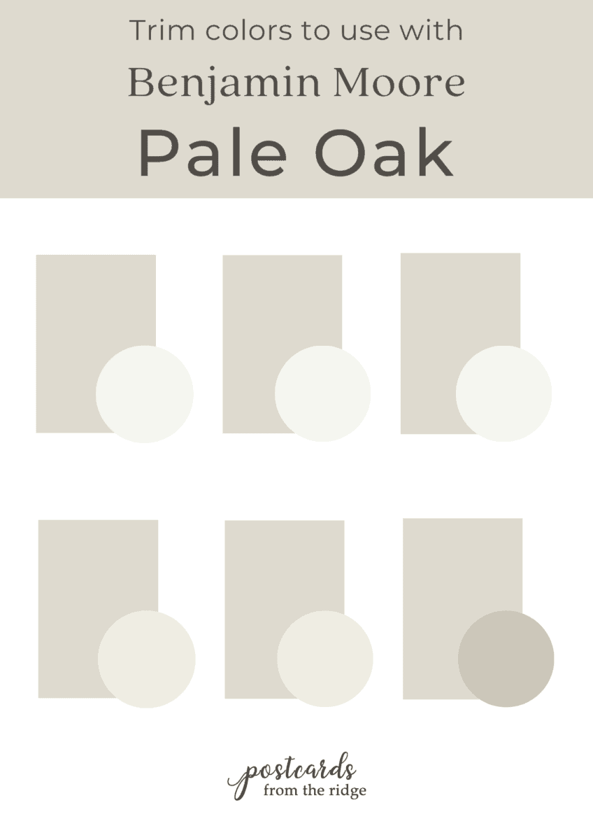
What whites and off whites go with Pale Oak?
The best trim colors for Pale Oak are those that aren’t too creamy or too gray. Any of these classics are good choices:
- Super White – a crisp white that’s ready-mixed and covers well.
- White Dove – a warm, barely off-white
- Chantilly Lace – a clean white that will give a stark contrast
- Simply White – a soft and warm off white
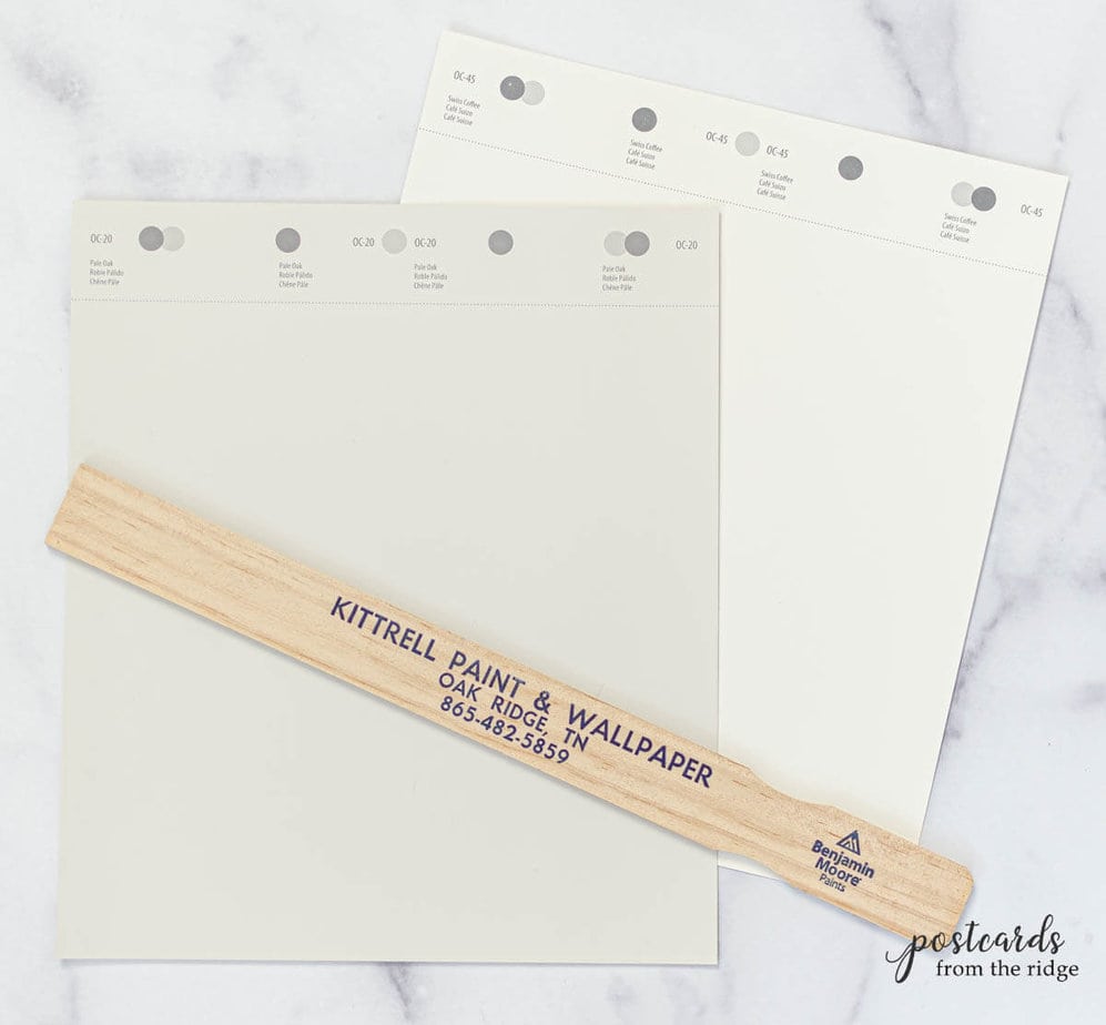
- Swiss Coffee – a warm off-white that will have a subtle contrast against Pale Oak
- Revere Pewter – use this color if you want a darker contrasting trim color.
You can grab a free downloadable and printable copy of the color charts at the bottom of this post.
Where are the best places to use Pale Oak?
Pale Oak looks great on these surfaces:
- walls
- trim
- cabinets
- exterior trim or siding
Rooms that look nice with Pale Oak walls are bedrooms, kitchens, nurseries, laundry rooms, hallways, and bathrooms.
As far as lighting goes, it will probably look best in rooms that face west with warm afternoon sunlight since technically it’s a gray. But it can work in any setting since it’s not too cool.
Colors that go well with Pale Oak
Even though Pale Oak is a warm gray, it’s still in the gray or greige family and on the cooler side of the color spectrum. So colors with cool undertones will look the best with it.
Blues, grays, and gray-greens are good coordinating colors for Pale Oak.
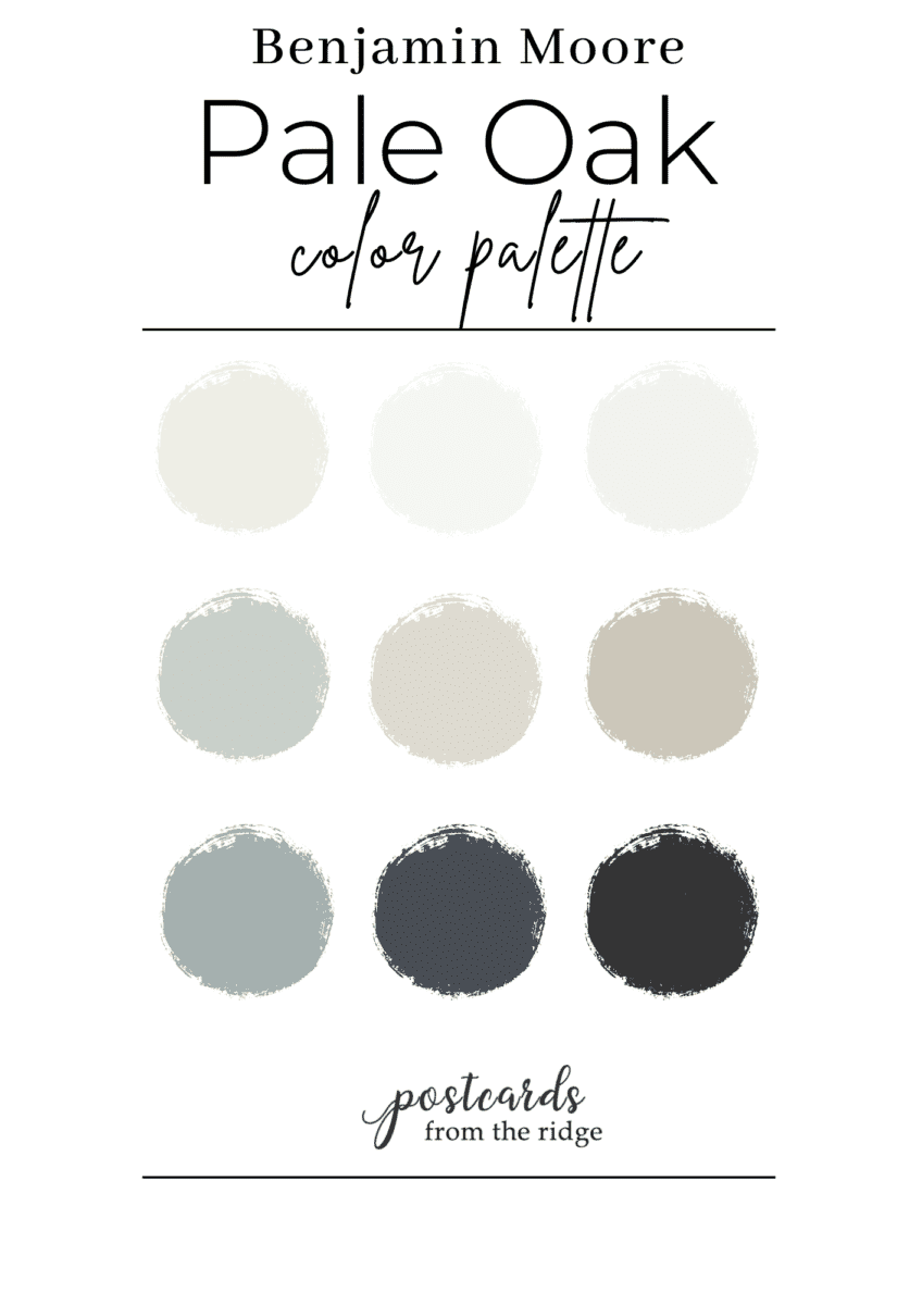
Benjamin Moore Pale Oak Color Palettes
Here’s a Pale Oak color palette I curated with soft muted blues, light neutrals, and a black for accents. You can download a free copy of this and all of my color palettes and printable art if you sign up for my newsletter at the bottom of this post.
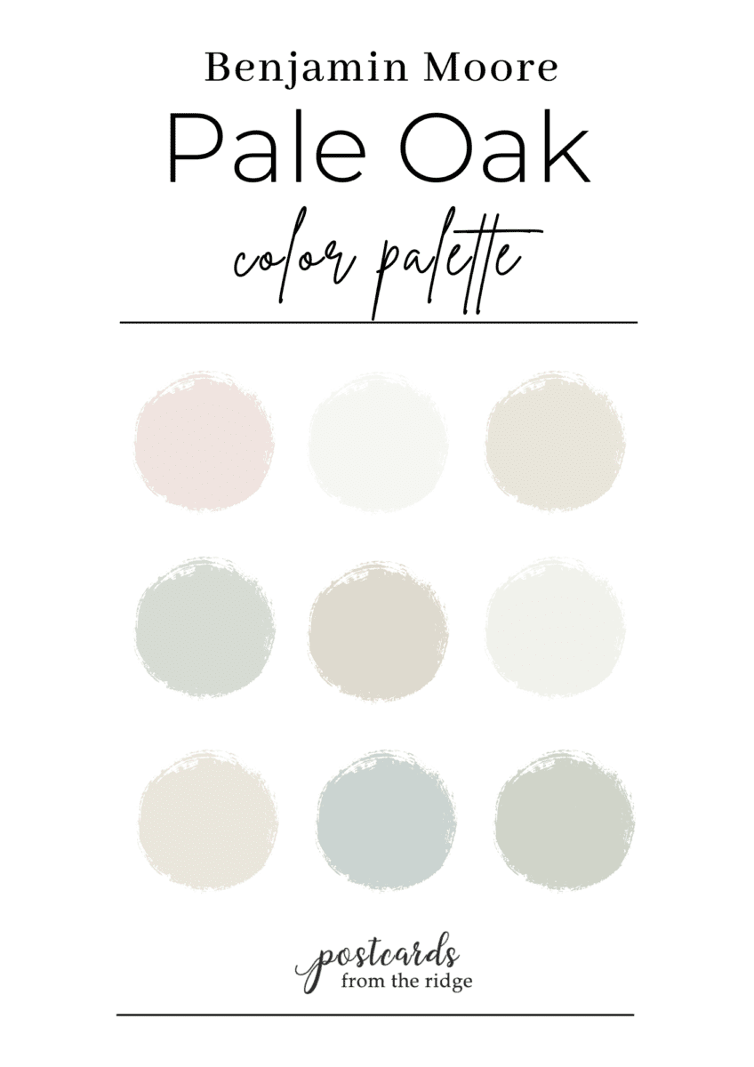
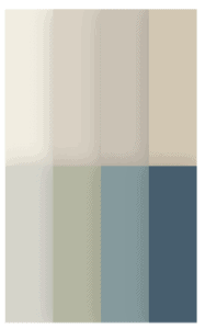
If you prefer a palette with pale, soft colors then you’ll love this one. There are soft gray-greens, blues, neutrals, and a muted pink with cool undertones. Perfect for a cottage look or nursery.
And just for fun because I’m such a paint color geek, I created a few more coordinating color palettes I with Pale Oak. This is what I’ve done for my real-life clients for the past 25+ years and it’s something I could do all day long, every day.
You can grab your copy of these color palettes with all the names when you sign up for my newsletter below.
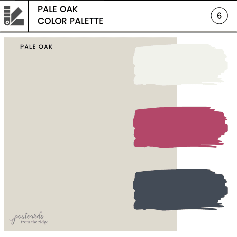
A pop of magenta is the perfect accent with Pale Oak and navy blue.
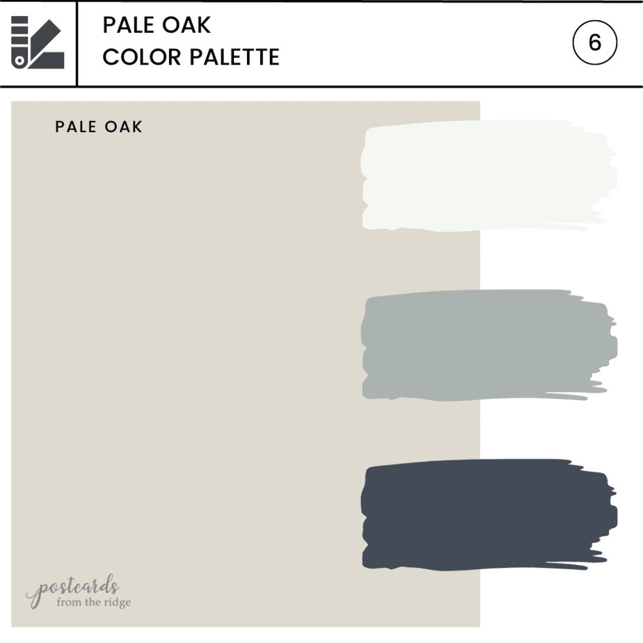
For a calm and relaxing palette, consider using blue-grays and dark blues.
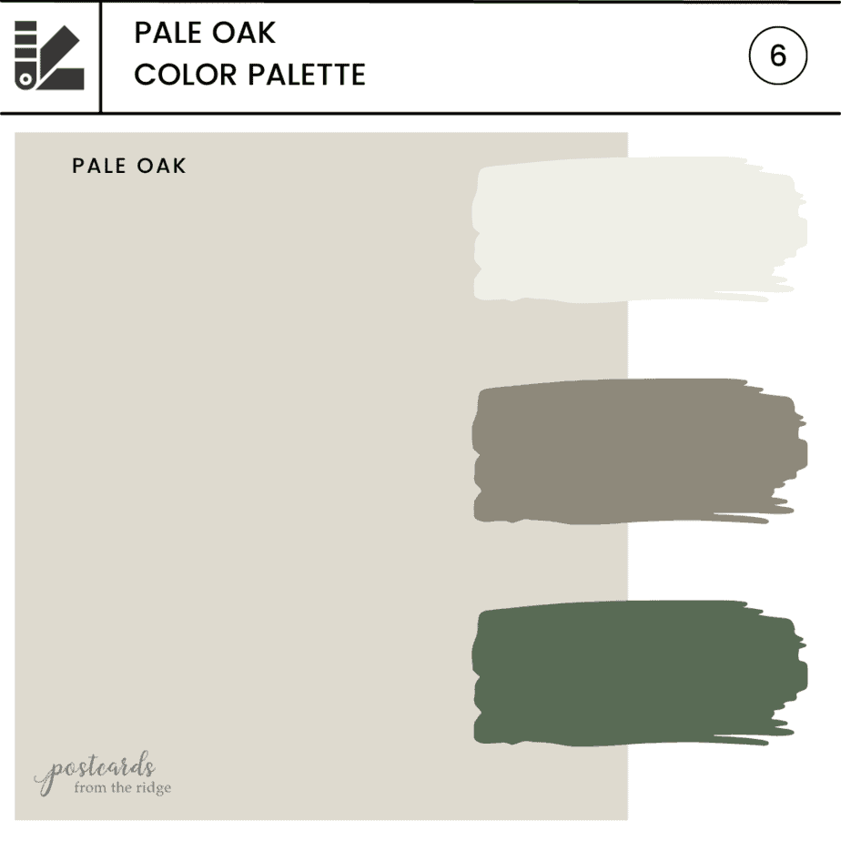
And for a more earthy palette, use a dark green and taupe as accent colors.
Coordinating Color Samples
Want more coordinating colors? See this group of colors in a curated collection of peel and stick samples here: Pale Oak Coordinating Colors
My favorite paint brush for the past 20 years is also a favorite of nearly 11,000 amazon reviewers. Grab this affordable and comfortable-to-hold brush here -> MY FAVORITE PAINT BRUSH
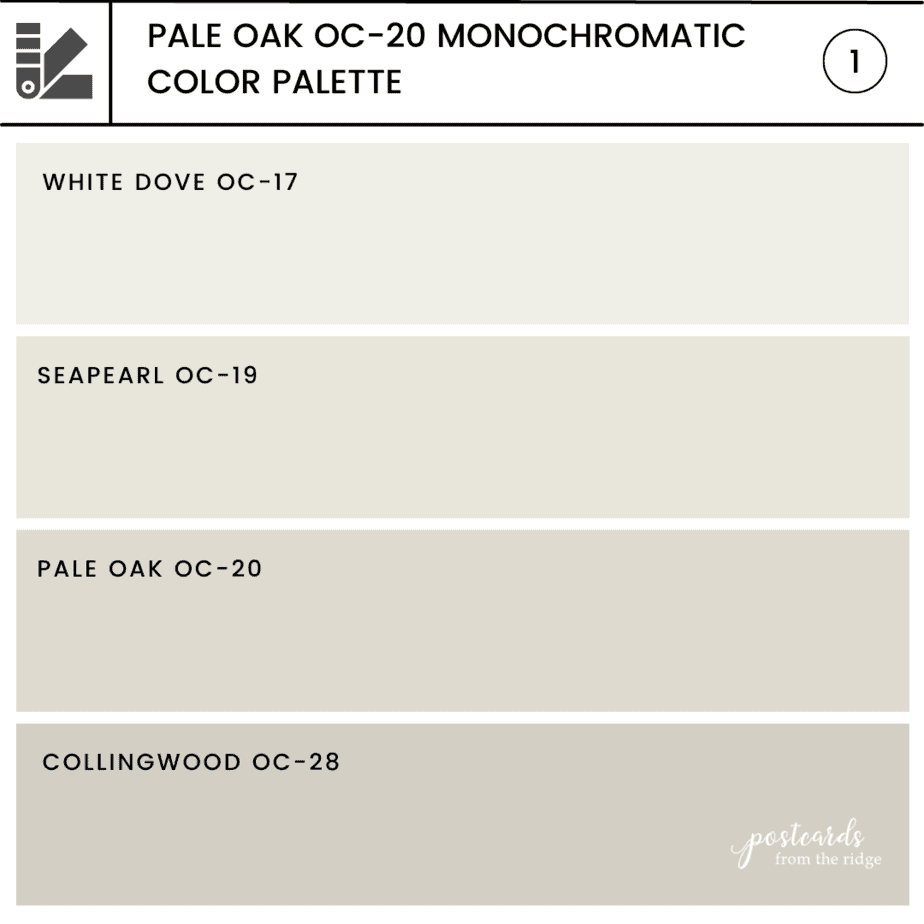
Lighter and darker shades of Benjamin Moore Pale Oak
If Pale Oak isn’t light or dark enough your space, or if you want a monochromatic color scheme, then there are several other good colors with the same undertones. Here are the best ones to consider if you need something a little lighter or darker.
- One shade lighter than Pale Oak is Seapearl OC-19.
- One shade darker than Pale Oak is Collingwood OC-28.
Tips for choosing paint colors
Read my tips for finding the right paint color here: How To Choose the Right Paint Color
Benjamin Moore Pale Oak compared to similar colors
There are many other colors that are similar to Pale Oak if it’s just not the right one for your room. Here are several other popular and similar paint color comparisons. Some are lighter, some are darker, some have different undertones.
Pale Oak vs Balboa Mist OC-27
Balboa Mist OC-27 aka 1549 is a very similar color. It’s slightly lighter with a light reflective value of 65.53 vs the 68.64 of Pale Oak. It’s also cooler than Pale Oak and has a hint more gray to it.
| Pale Oak | Balboa Mist | |
|---|---|---|
| LRV | 68.64 | 65.53 |
| Undertones | warm gray, neutral | warm gray, neutral |

If Pale Oak is too light or warm, then Balboa Mist might be a good choice for you.

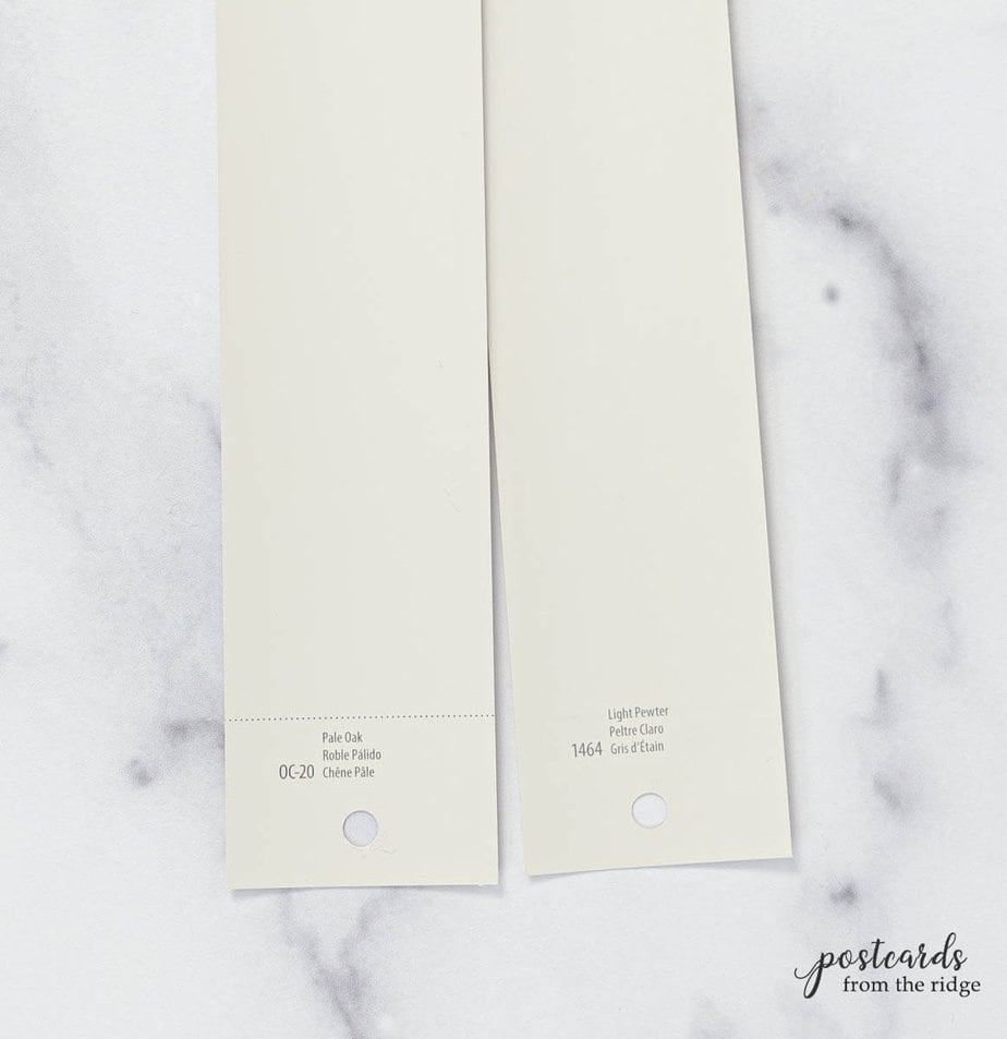
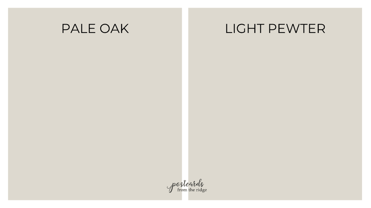
Pale Oak vs Light Pewter
Light Pewter 1464 has a light reflective value of 67.52 and is ever-so-slightly darker and cooler than Pale Oak.
| Pale Oak | Light Pewter | |
|---|---|---|
| LRV | 68.64 | 67.52 |
| Undertones | warm gray, neutral | warm gray, neutral |
There’s not much difference in these two popular colors but if Pale Oak is the tiniest bit too warm, then try Light Pewter.
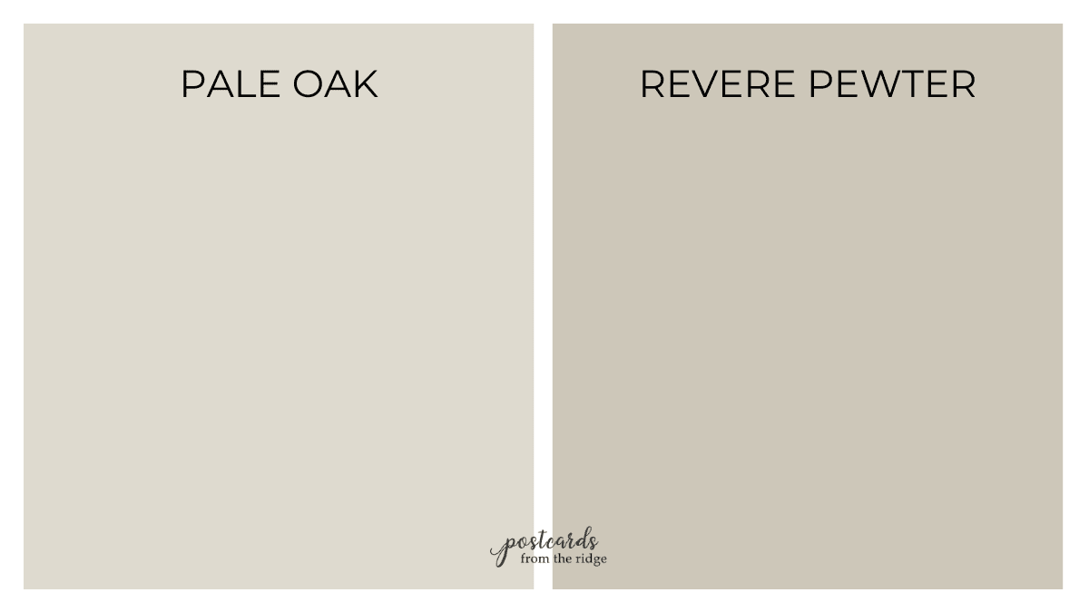
Pale Oak vs Revere Pewter
Revere Pewter HC-172 is one of the most popular neutral paint colors ever. It’s similar to Pale Oak as far as being neutral and taking on different undertones depending on the lighting, etc.
| Pale Oak | Revere Pewter | |
|---|---|---|
| LRV | 68.64 | 55.05 |
| Undertones | warm gray, neutral | warm gray |

But it’s definitely darker with a LRV of 55. If you want the same look as Pale Oak but a bit stronger then this might be the one for you.
Pale Oak vs Swiss Coffee OC-45
Swiss Coffee OC-45 has an of LRV 81.91 and is a couple of shades lighter than Pale Oak. It’s a warm off-white with similar undertones, but is slightly warmer.
| Pale Oak | Swiss Coffee | |
|---|---|---|
| LRV | 68.64 | 81.91 |
| Undertones | warm gray, neutral | neutral, slightly warm |
If you don’t want a stark white but are looking for something lighter than Pale Oak, then give this one a test drive. It’s a subtle almost white that won’t make your room look too sterile.

Pale Oak vs Classic Gray
Classic Gray 1548 (or OC-23) is also part of the Off-White collection from Benjamin Moore. It has an LRV of 74 and is a little lighter and cooler than Pale Oak.
| Pale Oak | Classic Gray | |
|---|---|---|
| LRV | 68.64 | 74 |
| Undertones | warm gray, neutral | slightly warm gray |

If you need a color with a hint less warmth then this might be the one for you.

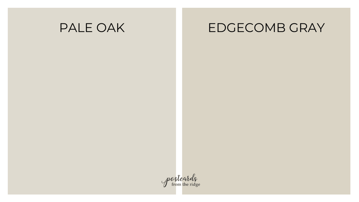
Pale Oak vs Edgecomb Gray HC-173
Edgecomb Gray HC-173 is from the Historical Collection from Benjamin Moore and is a best-selling color. Also known as Alaskan Skies 972 and Baby Fawn OC-15, it has an LRV of 63.09.
| Pale Oak | Edgecomb Gray | |
|---|---|---|
| LRV | 68.64 | 63.09 |
| Undertones | warm gray, neutral | warm gray |
It’s slightly darker than Pale Oak which has an LRV of 68.04, and it has a tiny bit more yellow undertones. It’s a good alternative to Pale Oak if you’re looking for more warmth and color.
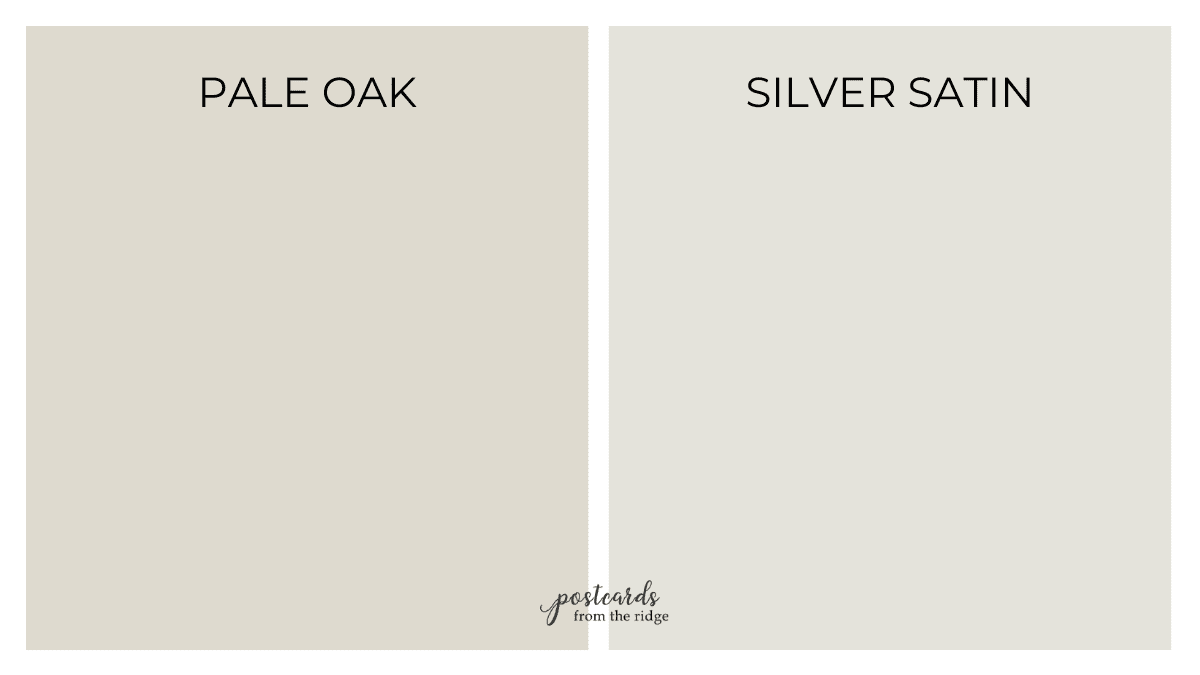
Pale Oak vs Silver Satin
Silver Satin 856, also known as OC-26, is very similar to Pale Oak but is lighter and cooler. It has an LRV of 74.9 and more gray undertones than Pale Oak.
| Pale Oak | Silver Satin | |
|---|---|---|
| LRV | 68.64 | 74.9 |
| Undertones | warm gray, neutral | slightly warm, neutral |

Silver Satin might be a good choice if you’re painting a room that gets a lot of warm afternoon sunlight and Pale Oak looks to warm for you.
Pale Oak vs Agreeable Gray
Agreeable Gray SW7029 is one of the most popular neutrals from Sherwin Williams. Like Pale Oak, it’s light and neutral enough for any room. But it’s the darker and cooler of the two colors.
| Pale Oak | SW Agreeable Gray | |
|---|---|---|
| LRV | 68.64 | 60 |
| Undertones | warm gray, neutral | warm gray to neutral |
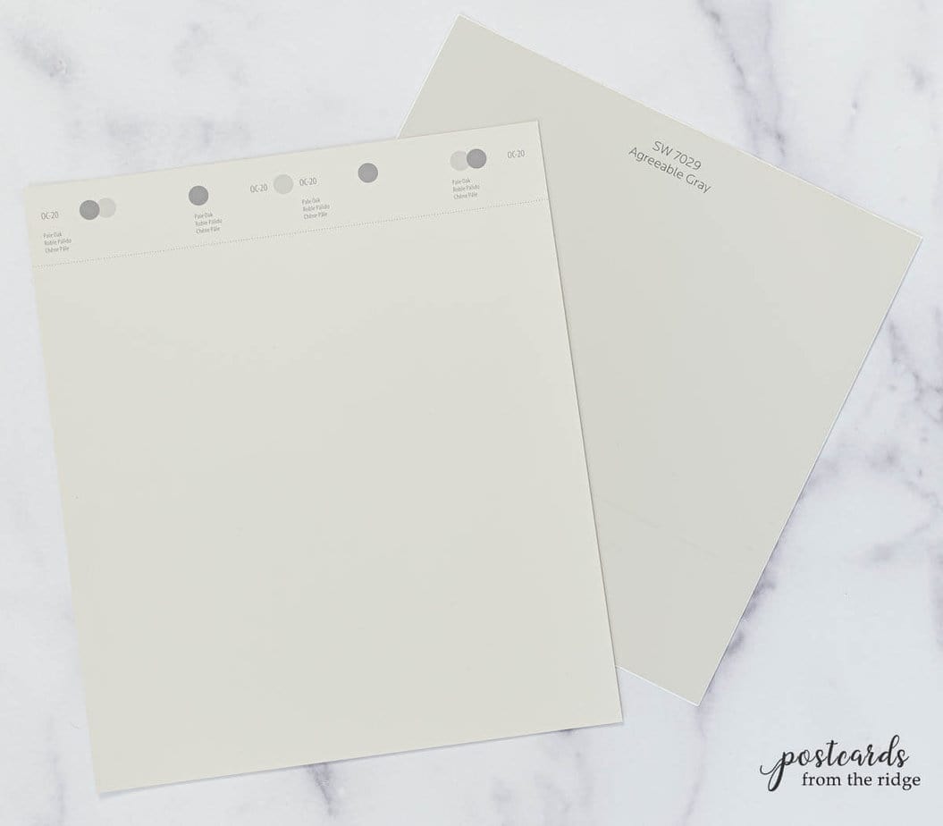
It has an LRV of 60 vs the 68.64 of Pale Oak, and has more gray than Pale Oak.

Rooms painted with Pale Oak
The best way to know how a paint color looks in space is to see it in real rooms, right? You can take a peek at a few spaces below and get an idea of how it will appear in a room setting.
But honestly the best way to know is to test the color in your own home.
I use and recommend Samplize Peel and Stick paint samples because of their accuracy and simplicity. They have two coats of real paint and are mess-free.
You can learn all about them and get a sample of Pale Oak here -> Pale Oak Peel and Stick Paint Sample
Test the Color
See all the options for sampling paint colors here: 5 Ways to Test Paint Colors
Pale Oak Living Room
Neutral paint colors are ideal for living rooms because you can change out your throw pillows and accents without worrying if they’ll clash with the wall color.
Pale Oak will give you a light, neutral backdrop for your furnishings. The living room below is light and refreshing but not too stark.
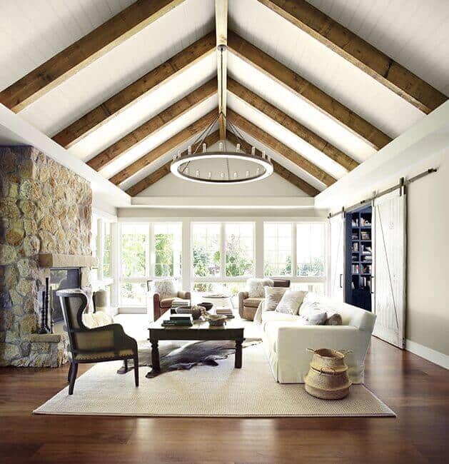
Image courtesy of Benjamin Moore
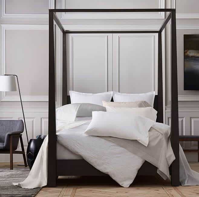
Pale Oak Bedroom
Use Pale Oak on bedroom walls to create a soft and restful retreat.
It contrasts nicely with the white trim in the bedroom below and is the perfect backdrop for all the accent colors.

Courtney at A Thoughtful Place
For a more formal look, add molding and pair it with black and dark gray.
Recap
In summary, Pale Oak is a wonderful paint color choice if you’re looking for one with a bit of color but not too warm or too cool.
It’s ideal for any room, and can also be used on cabinets and trim. It’s one of those go-to colors that designers use over and over, so you know it’s a safe choice.
Try a sample
Try a Sample
Always test paint colors before you buy. I use and recommend Samplize Peel and Stick Paint Samples because they’re mess-free painted with two coats of real paint!
You might also like
Still looking for a good paint color? Check out these popular posts:
- 9 No-Fail Neutral Paint Colors
- Benjamin Moore White Dove & Why It’s So Popular
- Best Benjamin Moore Whites & Off-Whites
- Revere Pewter Color Palette & Best Uses
- Benjamin Moore Edgecomb Gray Color Spotlight
- 25 Best Sage Green Paint Colors
- Sherwin-Williams Shoji White
- Sherwin-Williams Agreeable Gray – A Timeless Neutral
Hi! Thank you for this article, it’s super helpful! I signed up and confirmed to be on your email list, but I’m not sure how to access the color palette.
Hi Jeanette. Thank you for signing up! It looks like your confirmed your subscription but your welcome email with the link hasn’t been opened. Look in your junk/spam folder to see if it landed in there by accident. And be sure to add me to your contacts so you don’t miss any future color palettes. Let me know if you don’t find the email with the link and I can resend it.
I am interested in the pale oak color schemes
Hi Tiffani. You can grab them for free here: Pale Oak Color Palettes
Awesome info! Thank you!
You’re welcome!
Amazing review of Pale Oak. I love all of the minor adjustments and suggestions you make. They are so thoughtful and spot on its like you’re inside my brain! You are talented and I can’t wait to get the color palette! Thank you so much! Liz
This is the best paint color review I have
ever read…and I think I have read
thousands of them! I love your description
of each color and the way you offer lighter
and darker versions with descriptions of
the alternatives. Thanks so much! I have
subscribed to your email and look forward
to reading your reviews.
Thanks so much for your kind comments, Adrienne. I’m glad you found it helpful. I try to think of all the questions anyone would have about a color and answer them. Have a great weekend! ~ Angie
I am interested in the pale oak color palettes
Thank you
I love your color palette ideas!
Thanks! I’m glad you like them! ~ Angie
This is really great information. Thank you!