Benjamin Moore Breath of Fresh Air and 2014 trends
Today we’re talking about a fabulous color, Benjamin Moore Fresh Air, along with trends for 2014. Each year Benjamin Moore chooses a “Color of the Year” from their palette . The color for 2014 is called Breath of Fresh Air, #806. Don’t you love that name? I know I could use a breath of fresh air on most days.
Tips for choosing your paint colors:
- If you don’t know where to begin, start with any items that won’t be changing like large furniture pieces, flooring, or any other permanent features in the area to be painted.
- Look for inspiration on pinterest, instagram, or in home magazines.
- Once you’ve decided on the direction you want to go, narrow your choices down to 5 or less paint colors, ideally.
- Keep in mind that paint colors will look more intense on your walls than they do on paint color strips with multiple shades. This means light colors will look lighter and dark colors will look darker.
- Look at the color you’re considering in the room that you will be painting, not outside in the bright sun.
- See how the paint color looks in that room during different lighting situations…on a sunny day, on a cloudy day, with and without the lights on, and at night. They look different in each of these situations.
- I strongly recommend testing the color either by painting areas of the room (next to the trim) or by using a peel and stick paint samples. You can get them here: Samplize Peel and Stick Paint Samples. They’re reusable, affordable, and you don’t even have to wash out a brush.
- Most importantly, remember that there’s not a “perfect” color. There are likely a few good choices that will look beautiful in your room.
What color is Benjamin Moore Breath of Fresh Air
Breath of Fresh Air is just that…a light, fresh, pastel blue with a hint of gray in it.
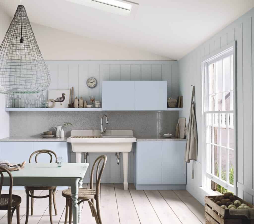
Looking for more coastal paint colors? Read this extensive post with lots of photos and ideas: Coastal Grandmother Paint Colors and Decor Ideas
Where should you use Benjamin Moore Breath of Fresh Air?
It would look nice in a bedroom, bathroom, laundry, office, or a kitchen with white cabinets.
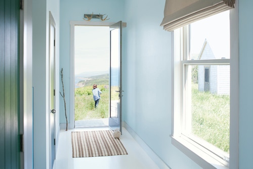
Here’s it’s used in an entry way, and seems to bring the outdoors in.
It mixes nicely with the dark furniture and floor in this space.
What colors go with Benjamin Moore Breath of Fresh Air?
It coordinates well with light greens, lavenders and lilacs, and pale yellows, as shown in the photo below. It’s very refreshing.
Guide to Paint Gloss
Learn all about paint gloss levels and where to use each one here: Ultimate paint Sheen Guide Printables
There are several other blues included in the 2014 trends from Benjamin Moore. I’ve really grown to like blue in the last few years. It’s such a peaceful, restful color. It somehow seems to reduce the stress around our house.
Tips for choosing paint colors
Read my tips for finding the right paint color here: How To Choose the Right Paint Color
Here are the pinks and neutrals that are trending for 2014.
Where would you use Fruit Shake? Maybe it would be a good color for a guest bedroom or half bath. Or any space that you don’t spend too much time in.
Test the Color
See all the options for sampling paint colors here: 5 Ways to Test Paint Colors
Also trending in 2014 are Plums and Lavenders. These have a grayed down tint to them and would be beautiful in a girl’s room or an office, dining room, or laundry room.
Isn’t the Super Nova color dramatic in this photo? I love the natural wood tones against it. And that’s a gorgeous mirror.
Paint Like a Pro
Learn all the trade secrets from professional painters and save hundreds of dollars here: Beginner’s Guide to a Professional Paint Finish
Here are the greens and earthy neutrals that are trending for 2014. Palladian Blue has been one of my favorite colors for years. And Sparrow is a wonderful deep neutral. It would be nice in a dining room, living room, or bedroom.
The Caribbean Teal looks striking against the dark floors and Distant Gray trim in this breakfast room. The yellow throw is a great pop of color in here. And the tan pillows soften the space somewhat.
Test the Color
See all the options for sampling paint colors here: 5 Ways to Test Paint Colors
So what do you think? As usual, I like some and dislike some. But that’s why there are over 4,000 colors in the Benjamin Moore palette…everybody is different!
Thanks so much for dropping by!




These are some great colors. I like the blues even though I don't usually use it in my décor.
Cynthia
There are some great colors here. I've really started liking blues in the last few years although I didn't like it all for many years. I guess our tastes change!
Love the plums and blues…great post !!'
Love the plums and blues…great post…now I want to paint!!!!
Do you know what the trim color is for the super nova/horse picture? Thanks