Sherwin Williams 2027 Colormix Paint Color Forecast Demystified
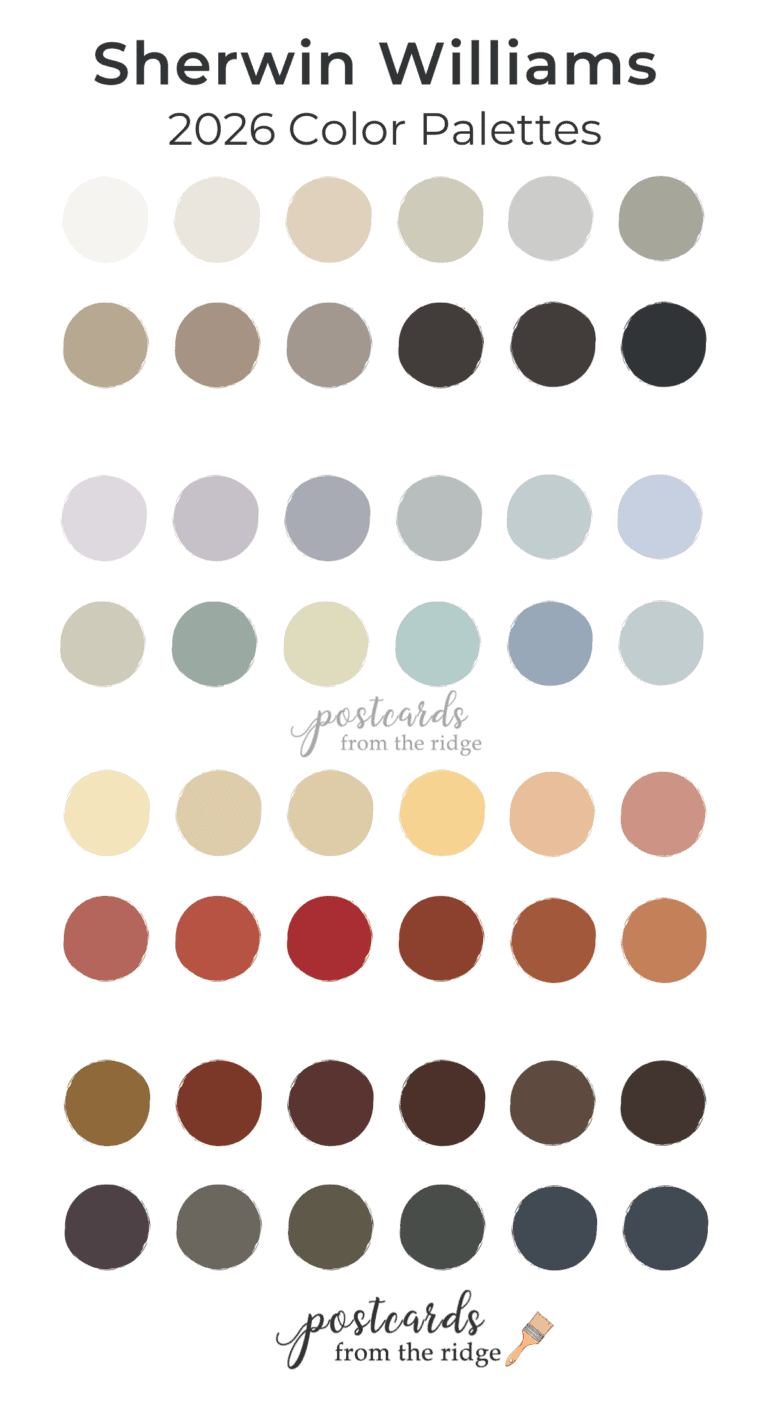
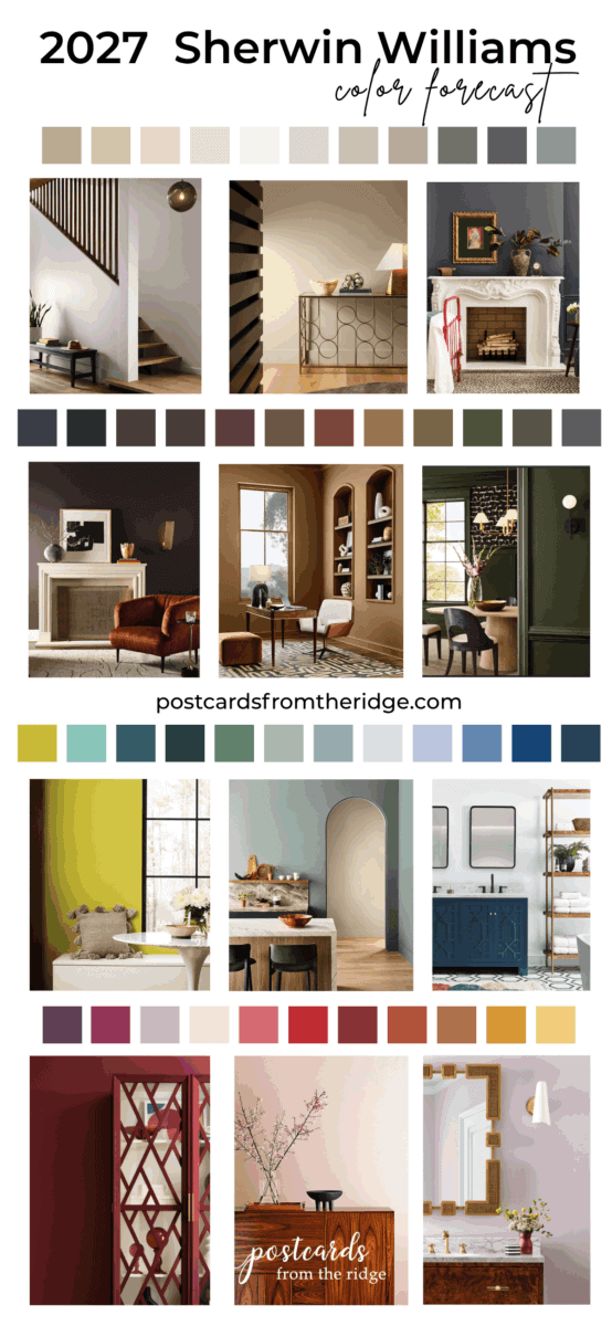
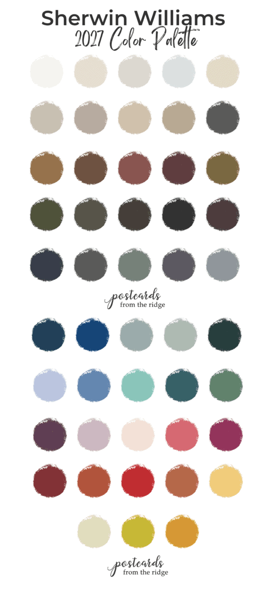
Sherwin Williams has revealed their 2027 color forecast including 48 beautiful paint colors and we’ll be exploring them in this post. They range from off white to almost black wit everything in between. There’s something for everyone here.
This post contains affiliate links for your convenience. I may make a small commission on products purchased with my link, but your price does not change. For full disclosure go here: Disclosure and Policies. Thank you for supporting my site.
2027 Sherwin Williams Paint Colors
Every summer Sherwin Williams releases their color forecast for the coming year and the ones for 2027 have just been announced! This year’s Colormix collection has 48 hues ranging from off white to nearly black with everything in between. There’s a heavy emphasis on warm, deep, earthy neutrals which makes sense with the cottage core and grandma core trends seen everywhere.
Continuity Colors
10 colors have been selected for a special palette called “Continuity Colors”. They’re trusted hues that can be used in a variety of settings and mixed with a large number of other colors.
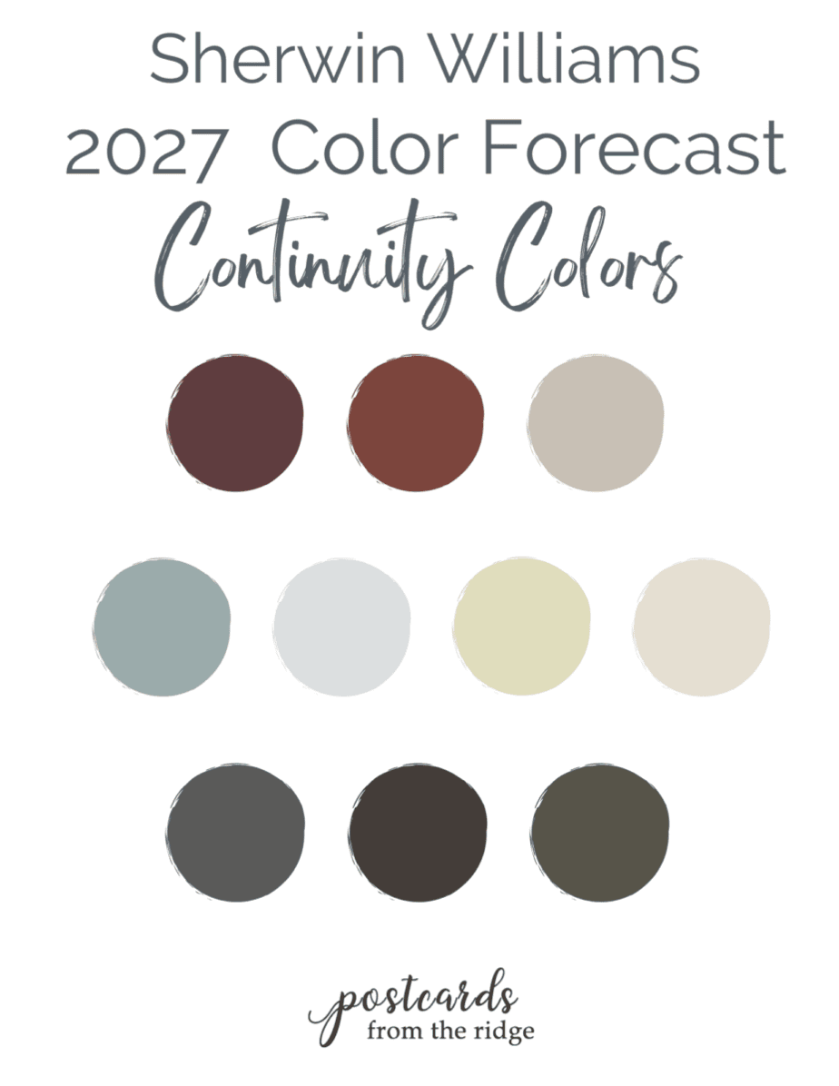
These colors can be used on walls, trim, furniture, kitchen cabinets or wherever you desire.
Color Groups
I’ve broken the 48 colors into 4 different color groups to make it easier for you to view. Each group has 11 -13 colors. These are the four categories you’ll see in this post:
As someone who’s been in the industry long enough to see trending colors cycle through a couple of times, I always look forward to this time of year with paint color forecasts. That doesn’t mean that I’m repainting everything (or anything) in my home, but it is fun to see what the industry insiders see as the up and coming paint colors.
See my past color forecast round-ups in here:
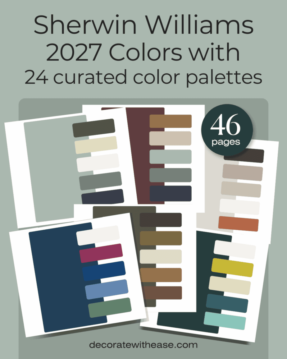
Custom Color Palettes with 2027 paint colors
This 46 page bundle features 24 harmonious paint color palettes created with the 2027 Sherwin Williams color forecast. Each palette contains 6 interchangeable, beautiful colors.
Now let’s take a closer look at all of the 2027 colors.
2027 Sherwin Williams Whites & Neutrals
The first category we’re diving into is whites and neutrals. The lighter colors in this grouping are ideal for a whole home if you want to play it safe. They’re also great to use if you like to go bold with furniture, wall art, area rugs, and decor they won’t compete and will serve as a nice backdrop. Notice the warmer hues compared to the past few years.
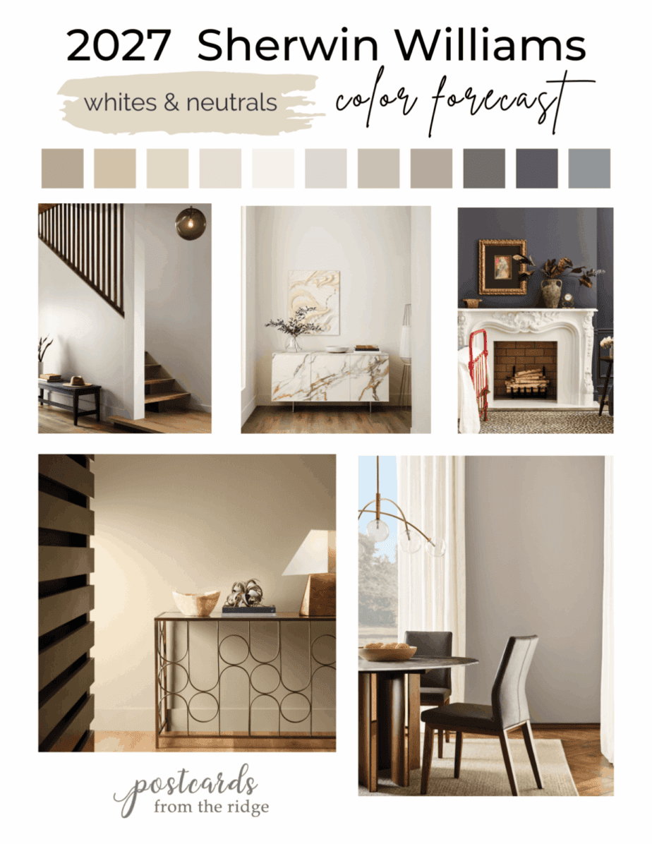
The darker gray hues are still nice and neutral but with a bit more personality and drama.
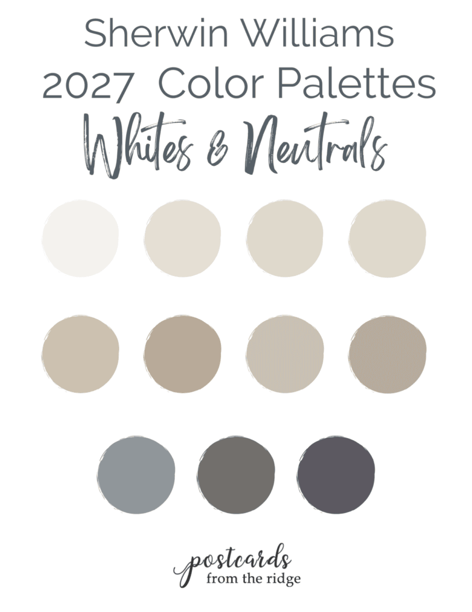
Now let’s look closer at a few of these colors.
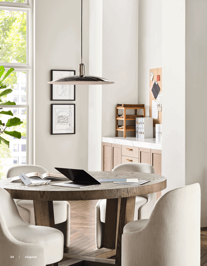
White Snow SW 9541
White Snow SW 95471 is a neutral, almost-white that keeps a space light and airy. Use it in a room that doesn’t get much light or in small area to give the appearance of more space. In the room shown, it has a clean modern feeling.
Peel & Stick Paint Sample
Test the color in your home with a removable, repositionable peel & stick sample made with real paint.


White Duck SW 7010
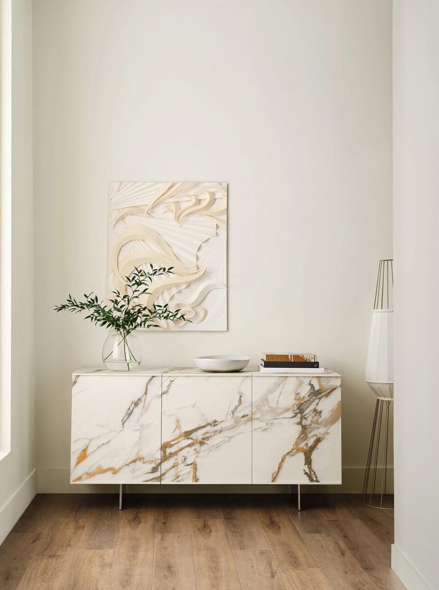
Slightly warmer than White Snow, White Duck also serves as a nice clean backdrop for just about anything. It works well with warm woods and metallics.
Peel & Stick Paint Sample
Test the color in your home with a removable, repositionable peel & stick sample made with real paint.

Drift of Mist SW 9166
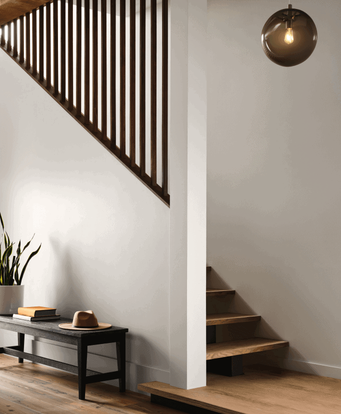
For a slightly cool off white with a hint of color, Drift of Mist might be one to consider. It’s a good choice for common areas like hallway, entry, or open floor plans. Use it with warm woods to balance the cool undertones.
Peel & Stick Paint Sample
Test the color in your home with a removable, repositionable peel & stick sample made with real paint.

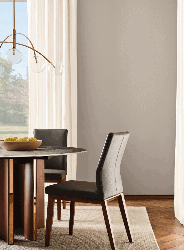
Perfect Greige SW 6073
Perfect Greige SW 6073 is in between gray and beige. It will appear cooler in rooms that face east or north don’t get much direct sunlight, and warmer in rooms that face south or west and receive more natural light. It’s a nice upgrade from the cool grays that were so popular a few years ago. See more like this here ==> 15 Best Greige Paint Colors & Palettes
Peel & Stick Paint Sample
Test the color in your home with a removable, repositionable peel & stick sample made with real paint.

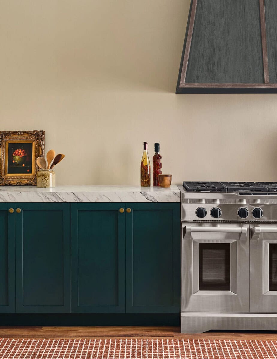
Beachcomber
Beachcomber SW 9617 reminds me of spending the day at the beach, searching for sea shells while walking through the sand. It’s a warm beige and can be used on walls, cabinets, trim, and more. The base cabinets below are painted with Cascades SW 7623 and are gorgeous next to the Beachcomber walls.
Peel & Stick Paint Samples
Test the colors in your home with a removable, repositionable peel & stick sample made with real paint.


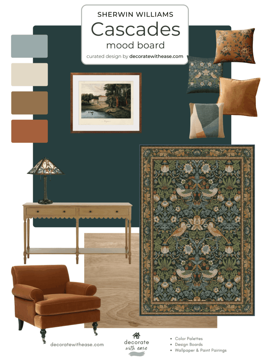
Cascades Mood Board
Do you like this look? Browse this Cascades mood board that I created with coordinating paint colors, area rug, throw pillows, and more.
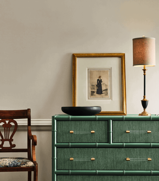
SW 9588 High Sierra
Another neutral sandy tone in the 2027 color forecast is High Sierra SW 9588. It’s a greige that leans cool and looks amazing with the Jadeite painted dresser below. Use it with gold or brass accents and rich deep wood tones for a sophisticated look.
Peel & Stick Paint Samples
Test the colors in your home with a removable, repositionable peel & stick sample made with real paint.


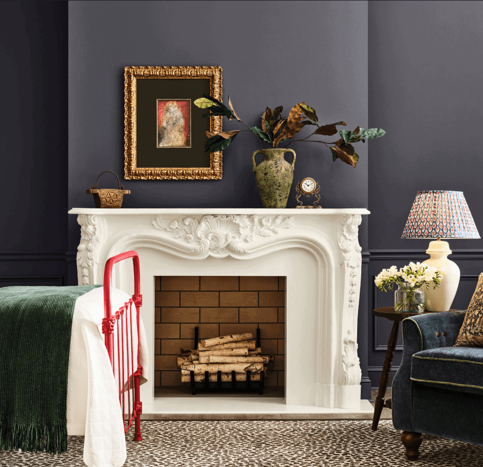
Midnight SW 6264
Midnight is a deep, cool gray with a hint of violet. It’s a great choice for color drenching. Use it anywhere you want to add some drama and an elevated look.
Peel & Stick Paint Sample
Test the color in your home with a removable, repositionable peel & stick sample made with real paint.

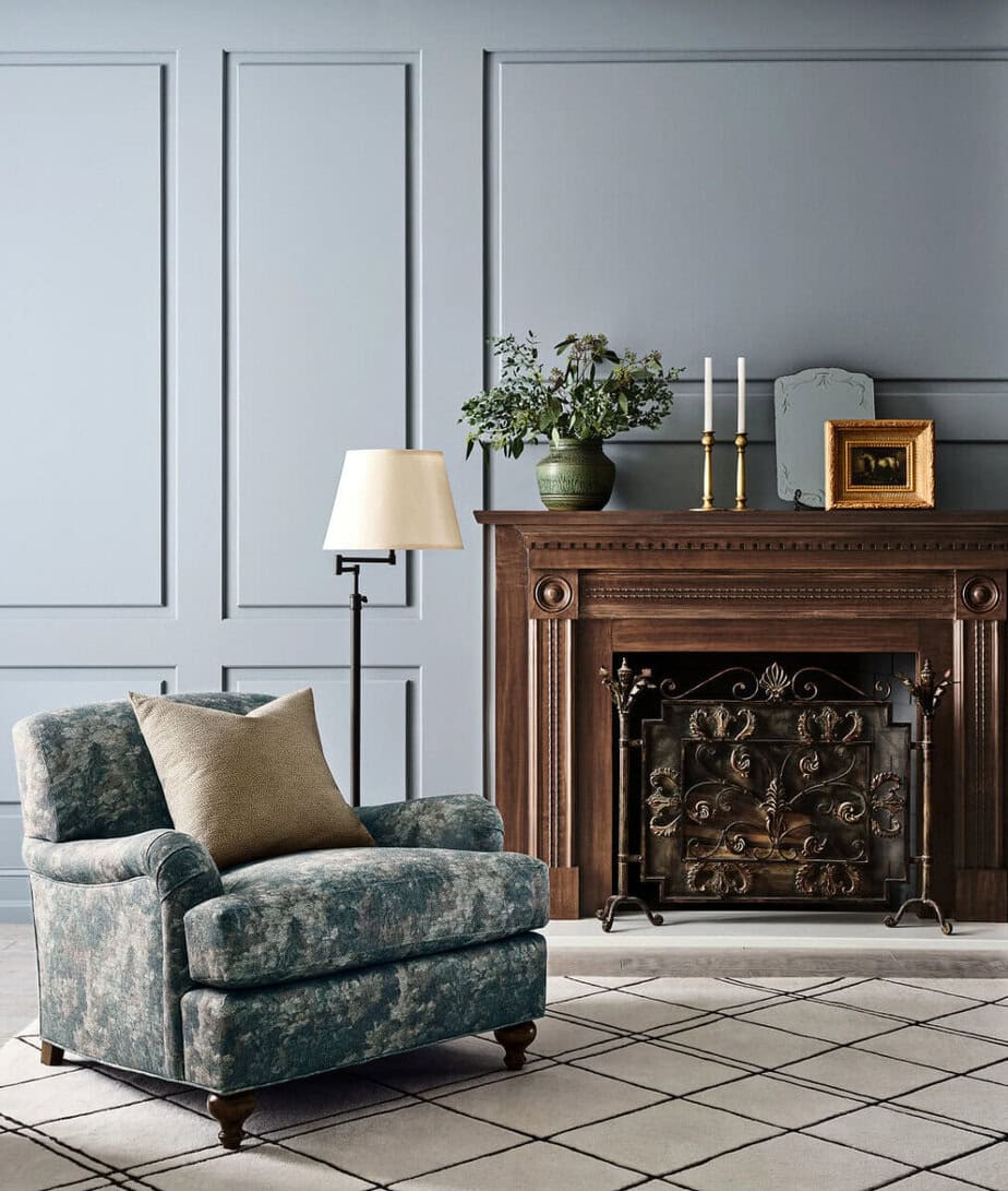
Steely Gray SW 7676
This medium tone gray with blue undertones is Steely Gray SW 7676. It would be perfect for a bedroom, bathroom, cabinets, or a calming living room like the image below.
Peel & Stick Paint Sample
Test the color in your home with a removable, repositionable peel & stick sample made with real paint.

Test the Color
See all the options for sampling paint colors here: 5 Ways to Test Paint Colors
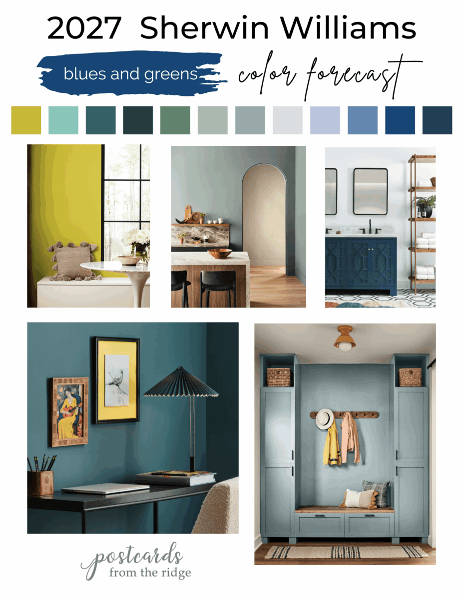
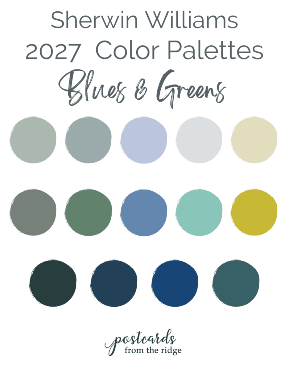
2027 Sherwin Williams Blues & Greens
There are several classic blues and greens and some vibrant options in this collection. This category is more vibrant and less gray than the past few years. It’s full of energy and life.
Salty Dog
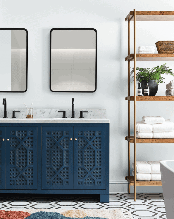
The walls in this bathroom are painted with Icicle SW 6238 which has the tiniest hint of blue. The vanity is Salty Dog SW 9177 and a classic, timeless, and bold blue that never goes out of style.
Peel & Stick Paint Samples
Test the colors in your home with a removable, repositionable peel & stick sample made with real paint.


Dutch Tile Blue SW 0031
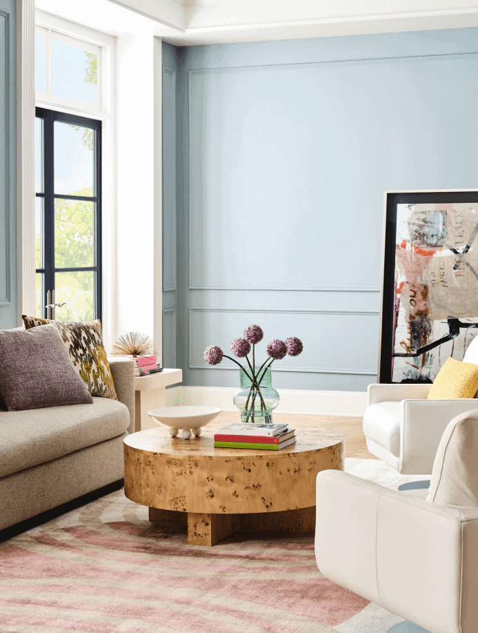
This classic living room is painted with Dutch Tile Blue SW 0031 which is one of Sherwin Williams’ historic colors. It’s a soft timeless blue gray that can be used in any room. It’s one of my favorites from the 2027 color forecast.
Peel & Stick Paint Sample
Test the color in your home with a removable, repositionable peel & stick sample made with real paint.

Taiga SW 9654
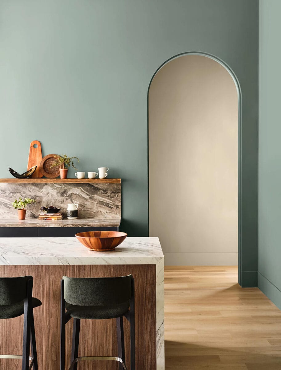
Taiga SW 9654 is a gray-green with a hint of blue and can appear slightly different depending on the lighting and surrounding elements. Use it anywhere you want to create a calming and relaxing atmosphere.
Peel & Stick Paint Samples
Test the colors in your home with a removable, repositionable peel & stick sample made with real paint.


Quietude
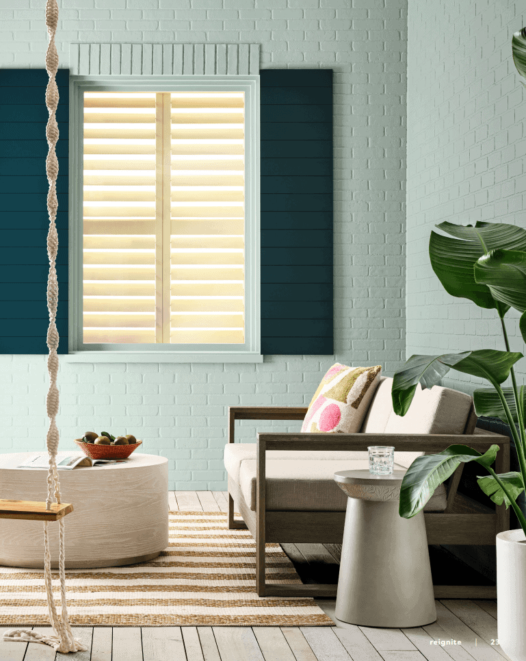
Quietude sounds like the perfect color for a relaxing space and this porch definitely is. The shutters are painted Cascades.
Peel & Stick Paint Samples
Test the colors in your home with a removable, repositionable peel & stick sample made with real paint.

Sherwin Williams Deep Sea Dive
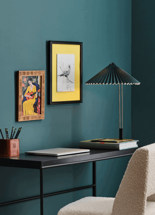
Who wants to go diving? These walls that are painted Deep Sea Dive have the appearance of a deep ocean. It’s a dark teal and would be great for color drenching or for cabinets. built-ins, or any room you want a bold, cool color.
Peel & Stick Paint Sample
Test the color in your home with a removable, repositionable peel & stick sample made with real paint.

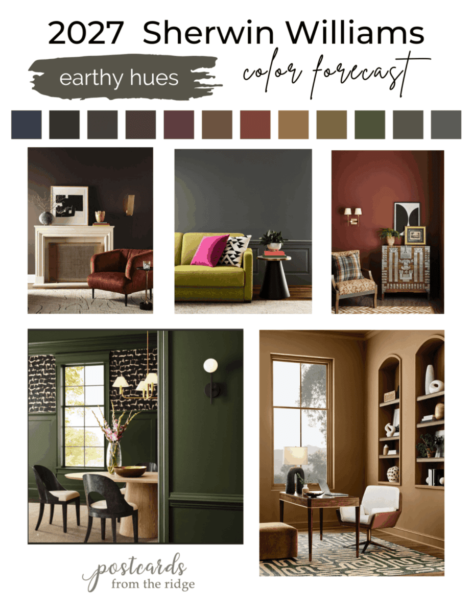
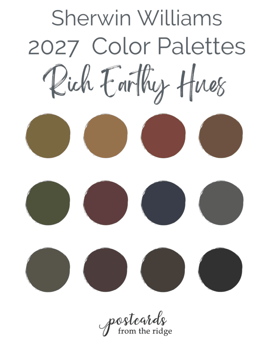
2027 Sherwin Williams Deep Earthy Hues
This collection is full of rich, earthy colors that would make any room for cozy and warm.
Universal Khaki SW 6150
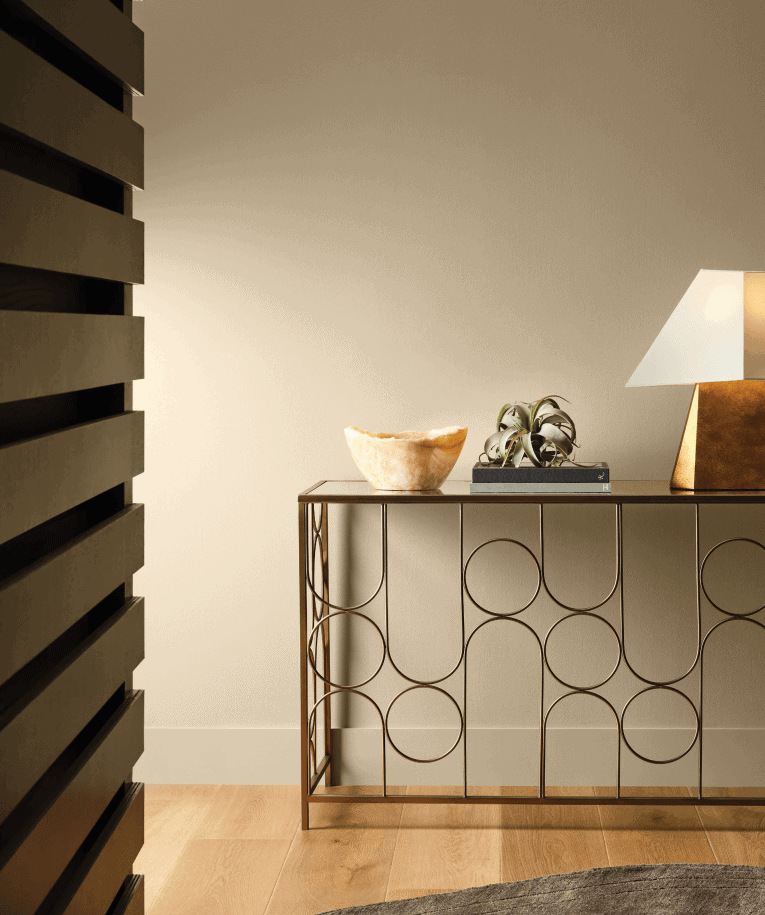
This warm neutral color was the Sherwin Williams 2026 color of the year and is extremely versatile. Use it on walls, cabinets, built-ins, and more. The modern console table really makes a statement in this image.
Peel & Stick Paint Sample
Test the color in your home with a removable, repositionable peel & stick sample made with real paint.
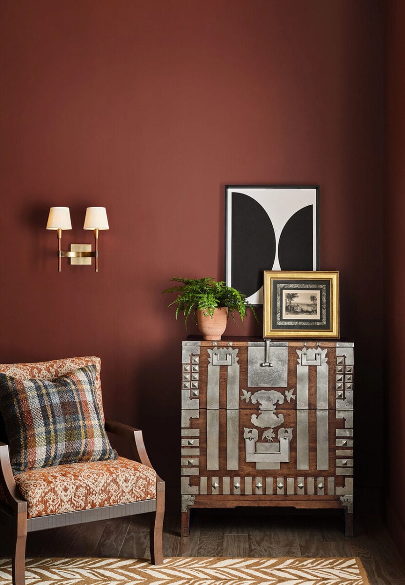
Red Barn SW 7591
Is there anything more cozy than a red barn? This color is warm, rich, and cozy and looks incredible with the warm woods and metallic accents in the image below.
Peel & Stick Paint Sample
Test the color in your home with a removable, repositionable peel & stick sample made with real paint.

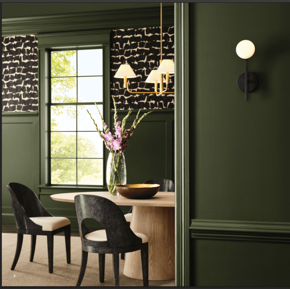
Secret Garden
Secret Garden is a deep green with yellow undertones and is an ideal choice for color drenching. Use it on walls, trim, built-in bookcases, kitchen island or cabinets, or a bathroom vanity. Pair it with brass, warm woods, and natural textiles for an organic theme. See more like this here ==> Sherwin Williams 10 Best Dark Green Paint Colors
Peel & Stick Paint Sample
Test the color in your home with a removable, repositionable peel & stick sample made with real paint.

Renwick Golden Oak
Renwick Golden Oak is one of Sherwin Williams’ Historic colors and has an old world, timeless look to it. The abstract green area rug and modern furniture give it a more updated look in the room below.
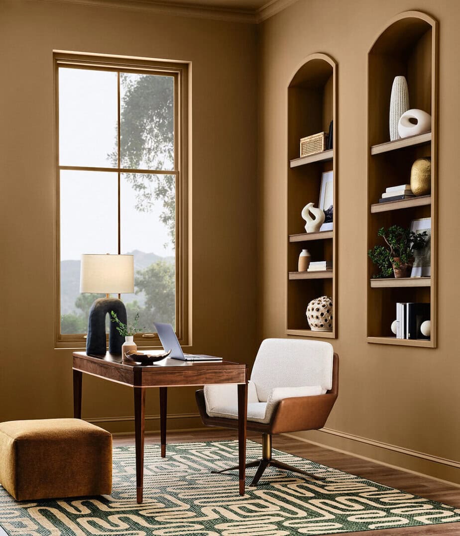
Love this look? I’ve curated a collection of pillows, rugs, and more in warm earthy hues. Swipe through below or view the entire group here: Warm Earthy Decor & Rugs
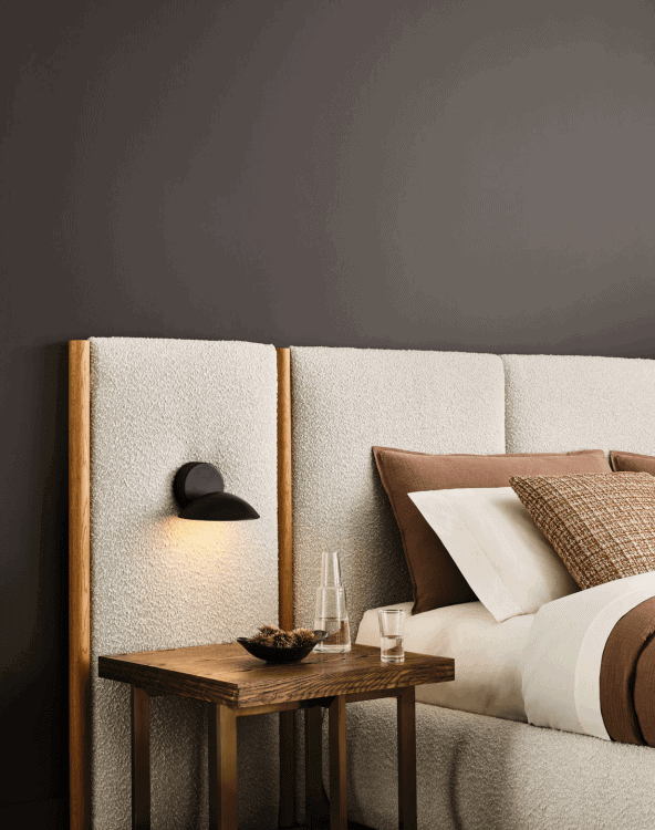
Sherwin Williams Clove SW 9605
Clove SW 9605 is a dark, rich brown with black undertones and is from the Sherwin Williams Designer Color Collection. Use it in a bedroom for a deep sleep. Pair it with greige paint colors, warm woods, and soft clay colored accents.
Peel & Stick Paint Sample
Test the color in your home with a removable, repositionable peel & stick sample made with real paint.

Forged Steel SW 9565
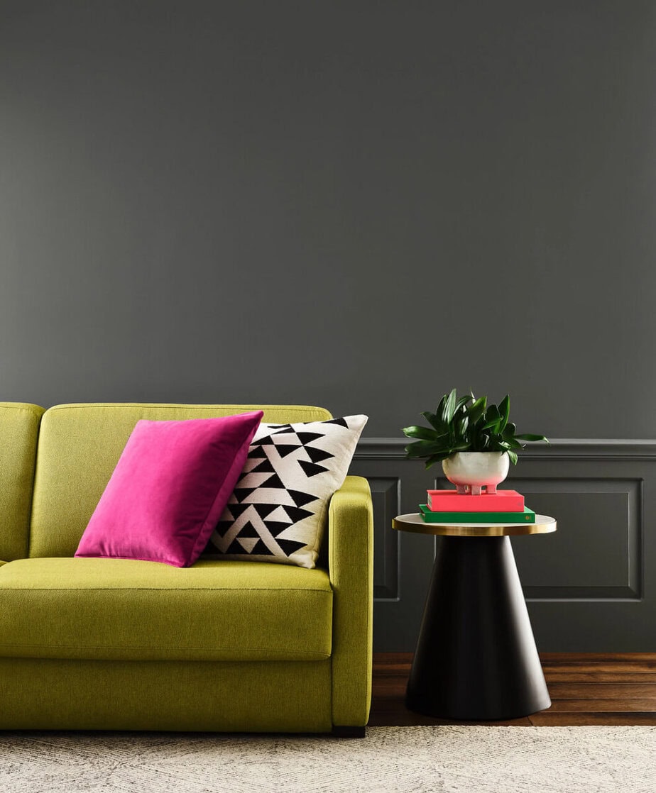
If you’re looking for a dark gray with a tiny hint of blue, Forged Steel might be a good choice for you. It’s a cool, dark, and steely gray and is neutral enough to pair with cool and warm colors as seen in the room below.
Peel & Stick Paint Sample
Test the color in your home with a removable, repositionable peel & stick sample made with real paint.

2027 Sherwin Williams Warm Paint Colors
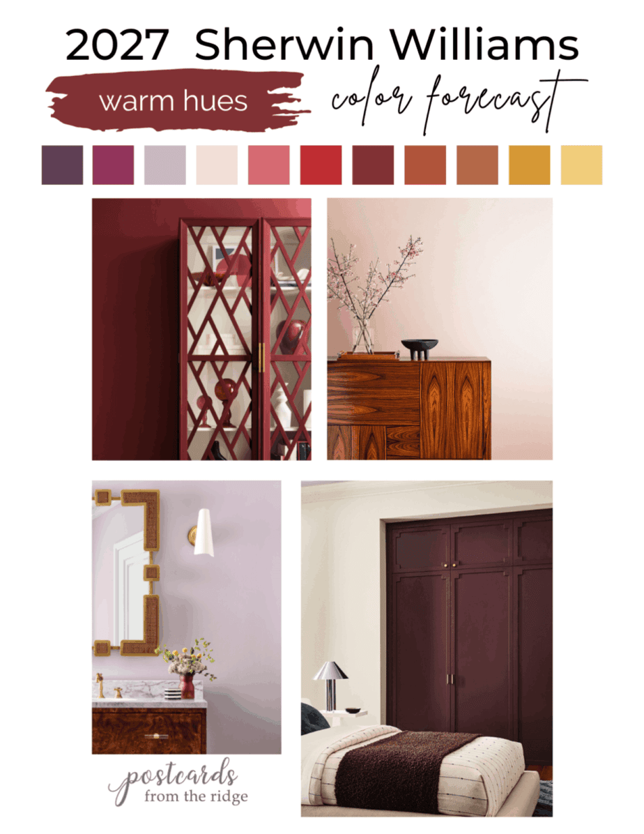
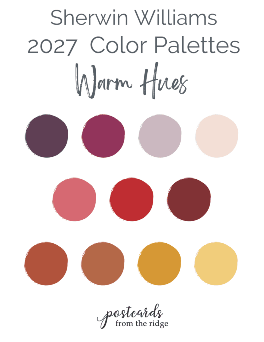
There’s definitely been a trend towards warmer colors of the past few years and this collection has some beautiful ones.
Cordovan
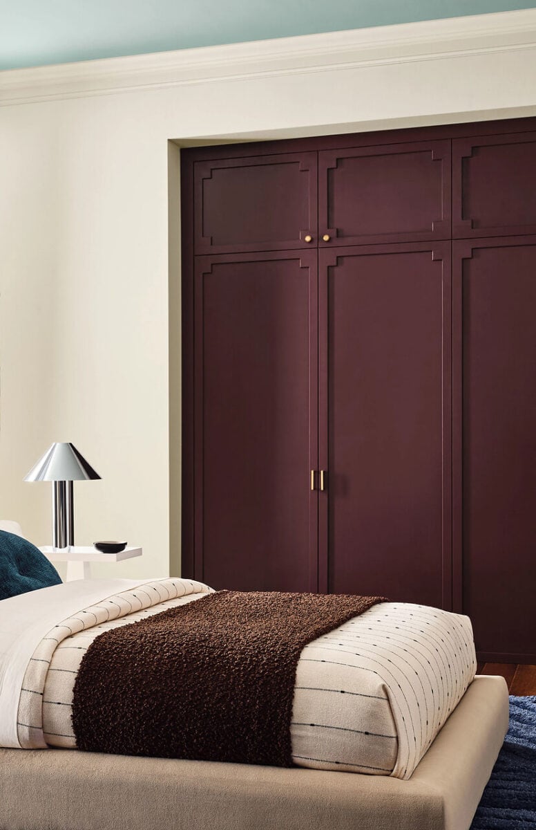
Here’s a nice rich burgundy with hints of blue undertones. Cordovan is a wonderful choice for accents like doors, cabinets, shutters, or a kitchen island. Or you can drench an entire room in it for a dramatic effect. It looks nice with brass accents, deep warm woods, light greige colors, and soft blues like the ceiling in the room below.
Peel & Stick Paint Samples
Test the colors in your home with a removable, repositionable peel & stick sample made with real paint.

Sherwin Williams Bitter Chocolate
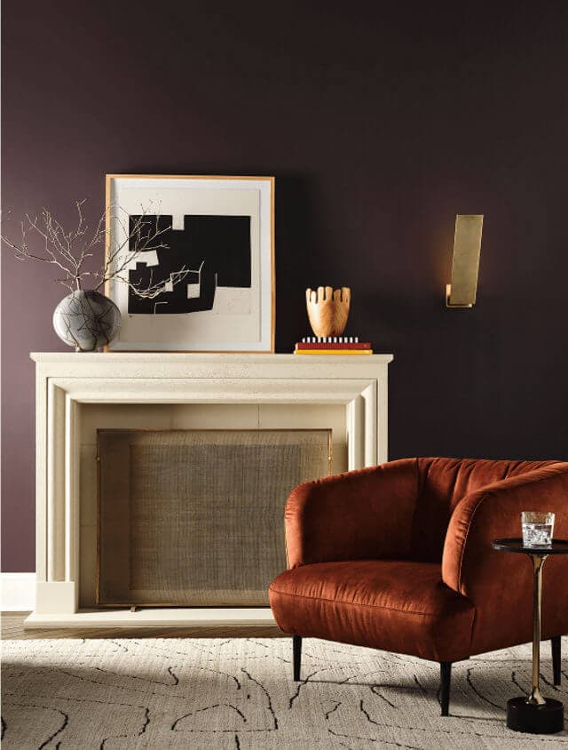
Bitter Chocolate is a dark, rich brown color with slight blue/violet undertones. It contrasts beautifully with the rich rust colored chair and brass accents in the room below. Use it wherever you want to create a rich, elegant space.
Peel & Stick Paint Sample
Test the color in your home with a removable, repositionable peel & stick sample made with real paint.

Lotus Petal SW 9697
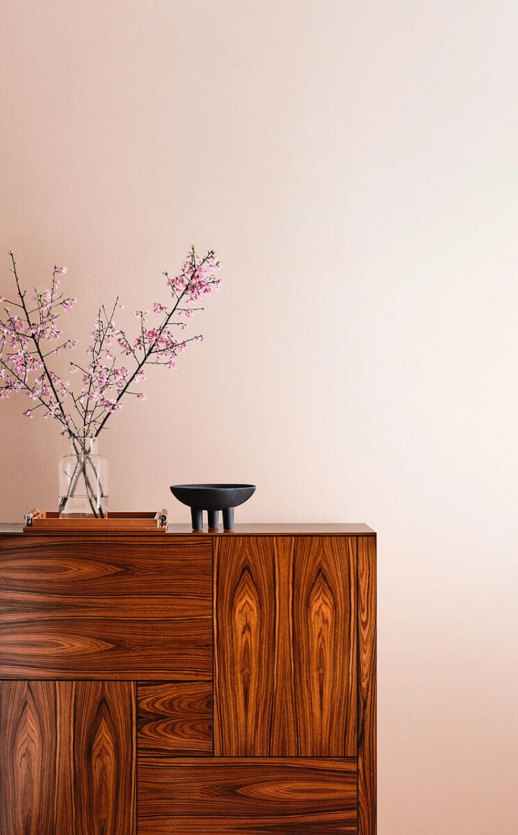
Lotus Petal is a light pink with coral undertones and would brighten any space. Create a warm feminine room with this color. Pair it with warm woods and black accents in a grown-up space, or with warm white and greige for a younger room.
Peel & Stick Paint Sample
Test the color in your home with a removable, repositionable peel & stick sample made with real paint.

Mauve Finery SW 6286
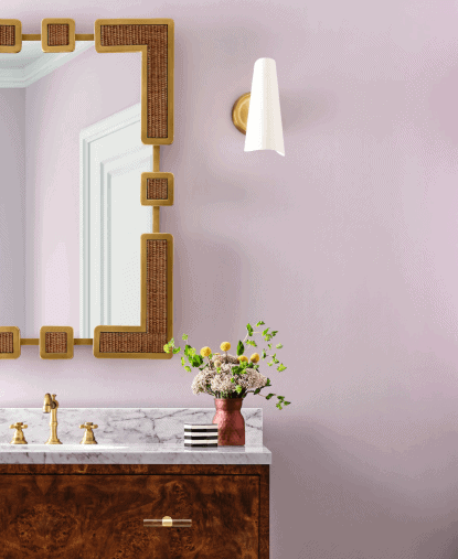
Just as the name implies, Mauve Finery is a mauve that leans towards a soft lilac. It would add personality and charm to any space and coordinates nicely with warm wood and brass, as seen in the room below.
Peel & Stick Paint Sample
Test the color in your home with a removable, repositionable peel & stick sample made with real paint.

That’s a wrap on the 2027 Sherwin Williams Colormix paint color forecast. Let me know your thoughts in the comment section below with your favorite colors and where you might use them. And feel free to browse my other paint-related posts for more inspiration and information.
Paint Categories
Looking for something in particular related to paint? Learn from my 30+ years in the industry and browse through more than 13 years of reviews, palettes, & more.