Benjamin Moore Paint Color Trends 2019
Explore this gorgeous 2019 color palette from Benjamin Moore
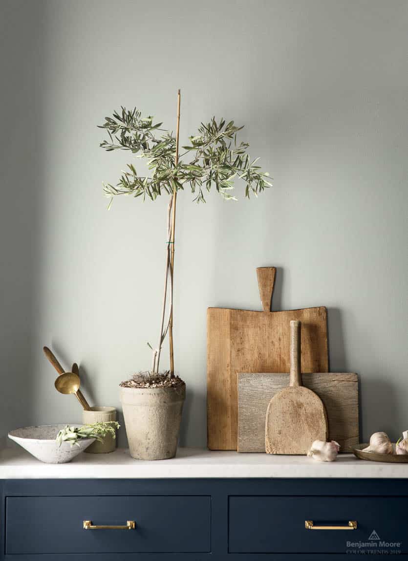
Benjamin Moore has hit a home run with their 2019 paint color palette. And I don’t always say that about predicted color trends. In fact, many times the color palettes of the year include a lot of crazy edgy colors that are great for accents and clothes, but not so great for walls or long term pieces like cabinets. This palette is gorgeous though.
I’ve recommended and sold 12 out of the 15 of these classic colors to clients and customers over the years. And I’m so glad to see colors being featured that can be used in any home, with any style.
Take a look and see what you think.
All photos courtesy of Benjamin Moore.
Benjamin Moore 2019 Color Palette
Hale Navy HC-154
The historical collection from Benjamin Moore is chock full of colors that stand the test of time. (Any color that begins with HC is in this collection). Hale Navy is a perennial favorite and looks stunning on the cabinets in this classic kitchen. And don’t you love the brass pulls against the rich navy blue?
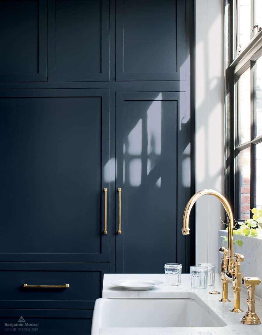
And those floors and the faucet are beautiful too. Can I just have this entire kitchen?

Walls & Cabinets – Decorator’s White OC-149
Hunter Green 2041-10
Here’s another timeless color. Hunter Green is trending for homes and looks beautiful in this room. It’s a color that works well with traditional, boho, modern farmhouse, and other styles.
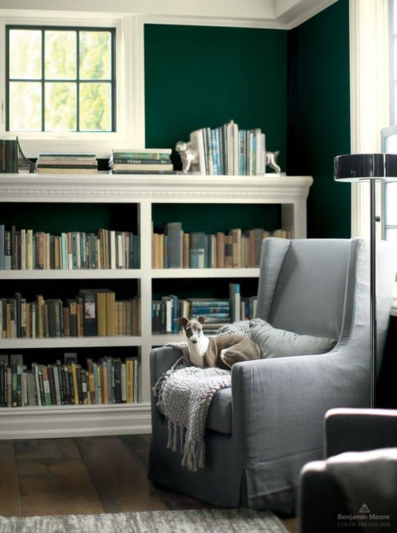
Trim and Bookcase – Cloud White OC-130
Black Pepper 2130-40
Black Pepper is a dark gray with a dash of blue in it and is a beautiful backdrop in any room. Accent colors that go well with it are deep reds and golds.
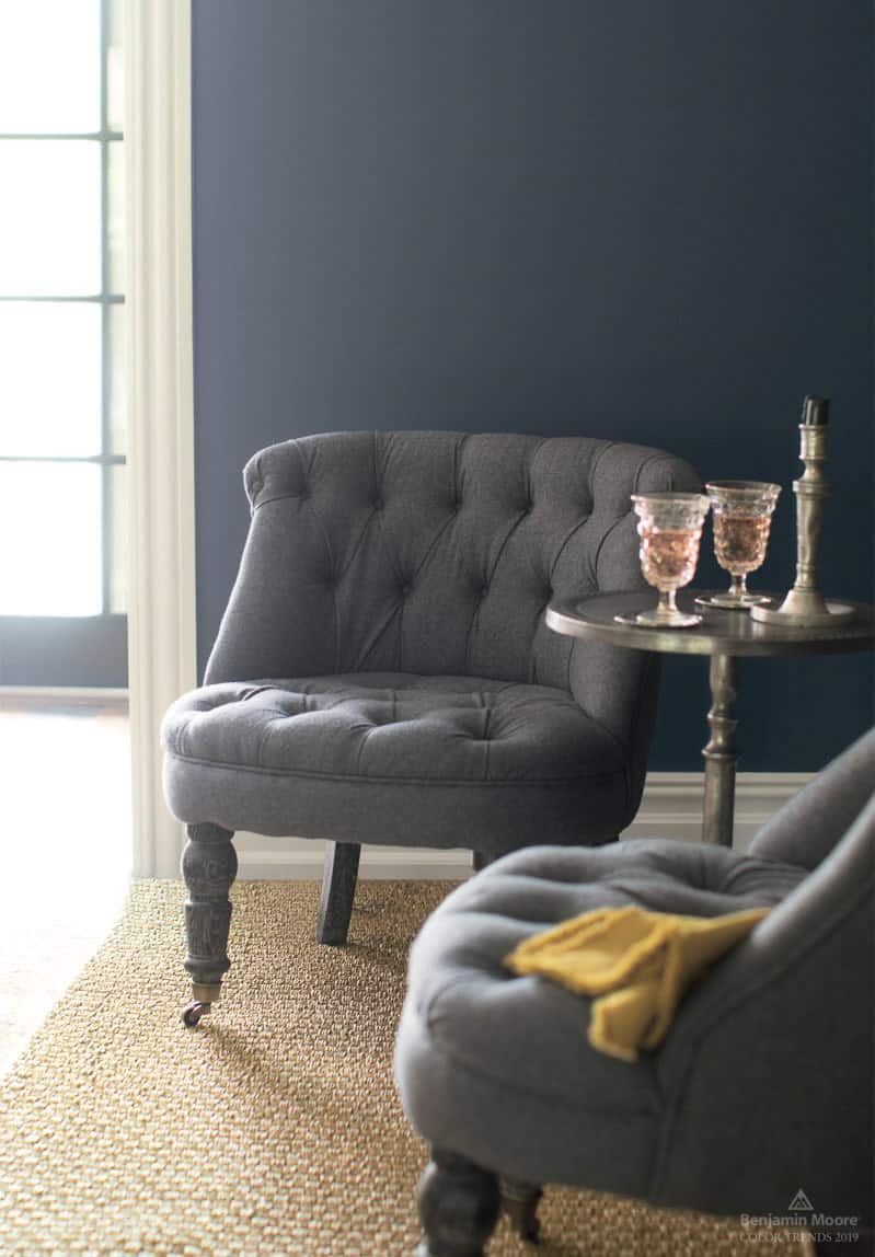
Walls – Black Pepper 2130-40, Trim – Cloud White OC-130
Kendall Charcoal HC-166
For a smoky and moody backdrop that goes with any color, Kendall Charcoal is a great pick. It’s another color from the historical collection and will never go out of style.
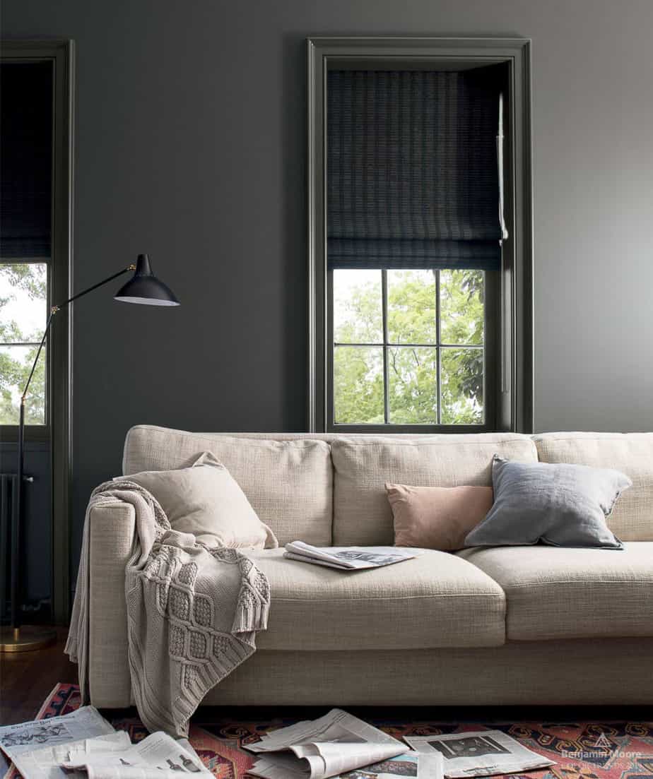
Walls and trim – Kendall Charcoal HC-166
Paint like a pro
See what the pros use for a beautiful paint finish in my Painter’s Toolbox Collection.
Pashmina AF-100
If you’re looking for a warm greige paint color then you might seriously consider Pashmina. It’s from the Benjamin Moore Affinity collection and has enough color that it doesn’t fade away yet it’s not dark either. A great color for any room.
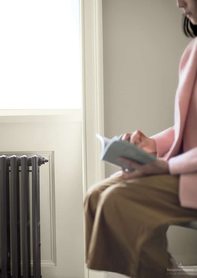
Walls – Pashmina AF-100, Trim – Balboa Mist OC-27
Smoke 2122-40
Smoke 2122-40 is one of my favorites and I’ve recommended it to several clients. It’s a gray blue with hints of green and is perfect in bathrooms, bedrooms, and anywhere you want a refreshing color on the wall.

Walls – Smoke 2122-40, Trim – Decorator’s White OC-149, Door – Hale Navy HC-154
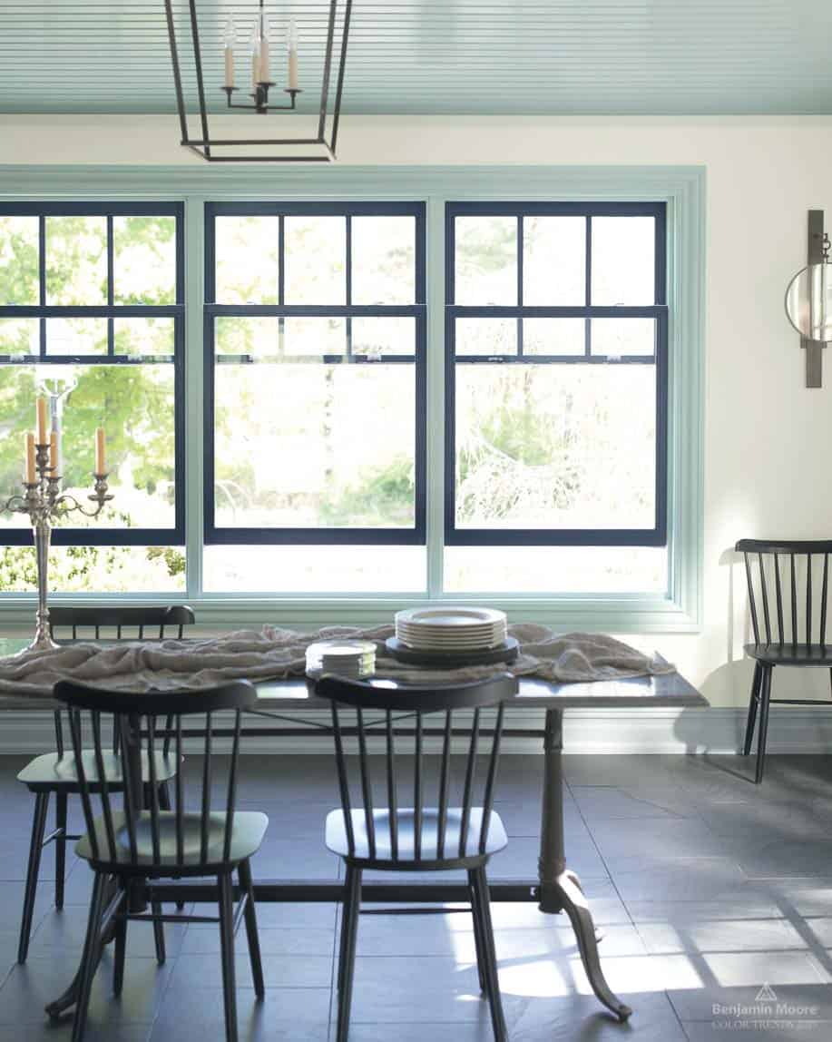
Walls – Cloud White OC-130, Trim – Smoke 2122-40, Windows – Hale Navy HC-154
Tips for choosing paint colors
Read my tips for finding the right paint color here: How To Choose the Right Paint Color
Beau Green 2054-20
Reminiscent of 90’s greens, Beau Green is a strong classic color that makes a statement. It goes beautifully with the warm wood tones in this setting.

Walls and trim – Beau Green 2054-20
Head Over Heels AF-250
For a fun, feminine accent color, Head Over Heels is a nice choice. It has soft warm peach undertones and is a great complement to the cooler grays in this bathroom.
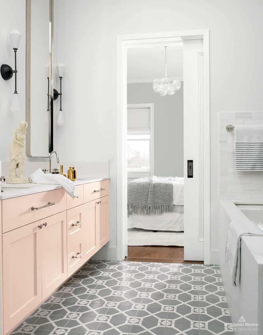
Walls – Decorator’s White OC-146, Cabinets – Head Over Heels AF-250, Walls in far room – Metropolitan AF-690
Guide to Paint Gloss
Learn all about paint gloss levels and where to use each one here: Ultimate paint Sheen Guide Printables
2019 Color of the Year
Metropolitan AF-690
In stark contrast to last year’s color of the year, Caliente, Benjamin Moore Metropolitan AF-690 is a subtle, soothing, cool color that has a zen-like quality.
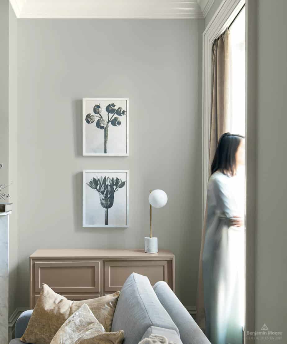
Walls – Metropolitan AF-690, Trim – Decorator’s White OC-149

Walls – Metropolitan AF-690, Trim – Decorator’s White OC-149
It has calming qualities and is a great choice for the bedroom above. It’s very neutral and pairs with virtually any color.

Metropolitan AF-690
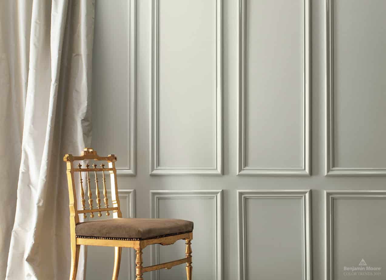
Here’s a roundup of all the colors from the Benjamin Moore 2019 Palette. Isn’t it a beautiful collection? I think it’s one of the best ones they’ve ever had.

Try a Sample
Always test paint colors before you buy. I use and recommend Samplize Peel and Stick Paint Samples because they’re mess-free painted with two coats of real paint!
Leave me a comment below and let me know which one is your favorite or if you’ve used any of them in your home.


The problem with this palette of colors is that it is so hard to choose just one or two!!! But oh my, if I had a pink loving girl, I'd be copying that bathroom in a New York minute. Thanks for sharing.
Haha, that's true. I'd be happy with just about any color from this palette. As for the pink, my oldest daughter's bedroom was painted in a similar soft pink years ago and it was so pretty.
I am so happy because I have a few of these colors! For once I am ahead of the trend! laura
You have excellent taste! I'm sure they look great in your home too.
You are right Angie…they are lovely. Need to do some painting and this was a very helpful post for me.
Hugs, Lynn
I love Beau Green and Hale Navy. The pink bathroom is lovely and I have been hankering for a pink bathroom forever. The other half says no. Thanks for posting all these gorgeous colours and ideas.
Gillian.